码迷,mamicode.com
首页 > 移动开发 > 详细

移动端rem匹配

时间:2018-04-22 12:56:06      阅读:196      评论:0      收藏:0      [点我收藏+]

标签:nts   ons   png   tle   适配   alt   单位   技术   bsp   

Rem是相对于根元素font-size大小的单位

记inphone5屏幕宽度是 320px font-size16px 1rem=16px

  1. <html>
  2.   <head>
  3.     <meta charset="utf-8">
  4.     <meta name="viewport" content="width=device-width,initial-scale=1.0">
  5.     <title>smiledemo</title>
  6.     <style>
  7.        .test{
  8.          width: 20rem;
  9.          height: 10rem;
  10.          background-color:bisque;
  11.          text-align: center;
  12.        }
  13.        .hello{
  14.          color: red;
  15.          font-size: 1rem;
  16.        }
  17.     </style>
  18.   </head>
  19.   <body>
  20.     <div id="app"></div>
  21.     <div class="test">
  22.        <p class="hello" >hello wangyawei</p>
  23.     </div>
  24.   </body>
  25. </html>

技术分享图片 技术分享图片

于是我们在js中写适配方案3行代码即可搞定

  1. <script>
  2.      let htmlwidth=document.documentElement.clientWidth||document.body.clientWidth;
  3.      console.log(htmlwidth);
  4.      let htmlDom=document.getElementsByTagName("html")[0];
  5.      //以imphone5的屏幕作为适配 320/16=20
  6.      htmlDom.style.fontSize=htmlwidth/20+"px";
  7.   </script>

技术分享图片

技术分享图片

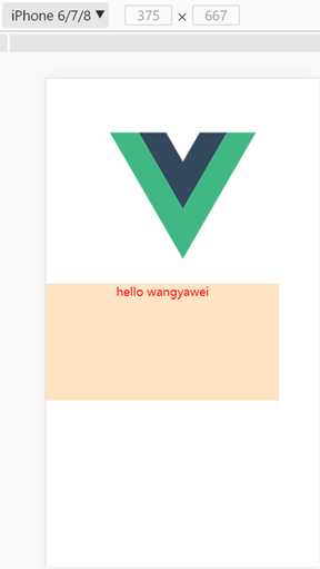
可以看出完美适配,font-size变为了18.75px

移动端rem匹配

标签:nts   ons   png   tle   适配   alt   单位   技术   bsp   

原文地址:https://www.cnblogs.com/wangyawei/p/8906068.html

(0)
(0)
   
举报
评论 一句话评论(0
登录后才能评论!
© 2014 mamicode.com 版权所有  联系我们:gaon5@hotmail.com
迷上了代码!