标签:运行 dynamic otto sys ane 分享 font 使用 class
<!--ExpanderStyle-->
<Style x:Key="ExpanderStyleOne" TargetType="{x:Type Expander}">
<Setter Property="Foreground" Value="#FF217cb5"/>
<Setter Property="FontFamily" Value="宋体" />
<Setter Property="FontSize" Value="14" />
<Setter Property="Background" Value="Transparent"/>
<Setter Property="HorizontalContentAlignment" Value="Stretch"/>
<Setter Property="VerticalContentAlignment" Value="Stretch"/>
<Setter Property="BorderBrush" Value="Transparent"/>
<Setter Property="BorderThickness" Value="0"/>
<Setter Property="Template">
<Setter.Value>
<ControlTemplate TargetType="{x:Type Expander}">
<Canvas Background="{TemplateBinding Background}" SnapsToDevicePixels="true">
<ToggleButton x:Name="HeaderSite"
Canvas.Top="0"
ContentTemplate="{TemplateBinding HeaderTemplate}"
ContentTemplateSelector="{TemplateBinding HeaderTemplateSelector}"
Content="{TemplateBinding Header}"
IsChecked="{Binding IsExpanded, Mode=TwoWay, RelativeSource={RelativeSource TemplatedParent}}"
Style="{DynamicResource ToggleButtonStyleOne}"/>
<Border x:Name="ExpandSite" HorizontalAlignment="{TemplateBinding HorizontalContentAlignment}"
VerticalAlignment="{TemplateBinding VerticalContentAlignment}"
Visibility="Collapsed"
Canvas.Top="56" Canvas.Left="0"
Focusable="false"
BorderBrush="{TemplateBinding BorderBrush}"
BorderThickness="{TemplateBinding BorderThickness}"
Width="{Binding ElementName=HeaderSite,Path=Width}"
Background="#FF6a8d9c">
<ContentPresenter Margin="0 0"
HorizontalAlignment="{TemplateBinding HorizontalContentAlignment}"
VerticalAlignment="{TemplateBinding VerticalContentAlignment}" />
</Border>
</Canvas>
<ControlTemplate.Triggers>
<Trigger Property="IsExpanded" Value="False">
<Setter Property="Visibility" TargetName="ExpandSite" Value="Visible"/>
</Trigger>
<Trigger Property="IsEnabled" Value="false">
<Setter Property="Foreground" Value="{DynamicResource {x:Static SystemColors.GrayTextBrushKey}}"/>
</Trigger>
</ControlTemplate.Triggers>
</ControlTemplate>
</Setter.Value>
</Setter>
</Style>
<Style x:Key="ToggleButtonStyleOne" TargetType="{x:Type ToggleButton}">
<Setter Property="FocusVisualStyle" Value="{x:Null}"/>
<Setter Property="Width" Value="285"/>
<Setter Property="Height" Value="56" />
<Setter Property="Background" Value="{DynamicResource ReviewGridbackground}" />
<Setter Property="Foreground" Value="#FF217cb5"/>
<Setter Property="FontSize" Value="14" />
<Setter Property="FontFamily" Value="宋体" />
<Setter Property="FontWeight" Value="Bold" />
<Setter Property="BorderThickness" Value="0"/>
<Setter Property="HorizontalContentAlignment" Value="Left"/>
<Setter Property="VerticalContentAlignment" Value="Center"/>
<Setter Property="Padding" Value="0 0"/>
<Setter Property="Template">
<Setter.Value>
<ControlTemplate TargetType="{x:Type ToggleButton}">
<Canvas Width="{TemplateBinding Width}" Height="{TemplateBinding Height}"
Background="{TemplateBinding Background}" SnapsToDevicePixels="True">
<Canvas x:Name="canvNormal" Visibility="Visible"
Width="{TemplateBinding Width}" Height="{TemplateBinding Height}"
Background="{TemplateBinding Background}" SnapsToDevicePixels="True" Canvas.Right="0">
<Button Width="235" Height="56" Opacity="0"/>
<Rectangle Width="15" Height="56" Fill="#4a5f6a" Canvas.Right="0"/>
<Image Source="../Image/1.PNG" Margin="235,0,0,0" Height="55" Width="15"/>
<!--<Path Data="M13.494,10.697l-3.497-3.6l-3.497,3.6L6.494,8.328l3.503-3.631l3.48,3.592L13.494,10.697z" Fill="#297eb4" Canvas.Right="4" Canvas.Top="15"/>
<Path Data="M13.494,10.697l-3.497-3.6l-3.497,3.6L6.494,8.328l3.503-3.631l3.48,3.592L13.494,10.697z" Fill="#297eb4" Canvas.Right="4" Canvas.Top="25"/>-->
<!--<Line X1="0" Y1="0" X2="0" Y2="15" Stroke="#297eb4" StrokeThickness="3"
Margin="6 10" StrokeDashArray="1" Canvas.Right="0"/>-->
<!--<Rectangle Width="{TemplateBinding Width}" Height="1" Canvas.Bottom="0" Fill="#FFbacfda" />-->
</Canvas>
<Canvas x:Name="canvChecked" Visibility="Hidden"
Width="{TemplateBinding Width}" Height="{TemplateBinding Height}"
Background="{TemplateBinding Background}" SnapsToDevicePixels="True" Canvas.Right="0">
<Button Width="235" Height="56" Opacity="0"/>
<Rectangle Width="15" Height="56" Fill="#4a5f6a" Canvas.Right="0"/>
<!--<Path Data="M13.494,10.697l-3.497-3.6l-3.497,3.6L6.494,8.328l3.503-3.631l3.48,3.592" Fill="#297eb4" Canvas.Right="4" Canvas.Top="8"/>
<Path Data="M13.494,10.697l-3.497-3.6l-3.497,3.6L6.494,8.328l3.503-3.631l3.48,3.592" Fill="#297eb4" Canvas.Right="4" Canvas.Top="15"/>-->
<Image Source="../Image/2.PNG" Margin="235,0,0,0" Height="55" Width="15"/>
<!--<Rectangle Width="{TemplateBinding Width}" Height="1" Canvas.Bottom="0" Fill="#FFbacfda" />-->
</Canvas>
<ContentPresenter HorizontalAlignment="{TemplateBinding HorizontalContentAlignment}"
Margin="{TemplateBinding Padding}"
RecognizesAccessKey="True"
SnapsToDevicePixels="{TemplateBinding SnapsToDevicePixels}"
VerticalAlignment="{TemplateBinding VerticalContentAlignment}"/>
</Canvas>
<ControlTemplate.Triggers>
<!--<Trigger Property="IsPressed" Value="true">
<Setter Property="Background" Value="#FFd2e7f4" />
</Trigger>-->
<Trigger Property="IsChecked" Value="true">
<Setter Property="Visibility" TargetName="canvChecked" Value="Visible" />
<Setter Property="Visibility" TargetName="canvNormal" Value="Hidden" />
</Trigger>
<!--<Trigger Property="IsEnabled" Value="false">
<Setter Property="Foreground" Value="{DynamicResource {x:Static SystemColors.GrayTextBrushKey}}"/>
</Trigger>-->
</ControlTemplate.Triggers>
</ControlTemplate>
</Setter.Value>
</Setter>
</Style>
<Style x:Key="ExpanderStyleTwo" TargetType="{x:Type Expander}">
<Setter Property="Foreground" Value="#FF217cb5"/>
<Setter Property="FontFamily" Value="宋体" />
<Setter Property="FontSize" Value="14" />
<Setter Property="Background" Value="Transparent"/>
<Setter Property="HorizontalContentAlignment" Value="Stretch"/>
<Setter Property="VerticalContentAlignment" Value="Stretch"/>
<Setter Property="BorderBrush" Value="Transparent"/>
<Setter Property="BorderThickness" Value="0"/>
<Setter Property="Template">
<Setter.Value>
<ControlTemplate TargetType="{x:Type Expander}">
<Canvas Background="{TemplateBinding Background}" SnapsToDevicePixels="true">
<ToggleButton x:Name="HeaderSite"
Canvas.Top="0"
ContentTemplate="{TemplateBinding HeaderTemplate}"
ContentTemplateSelector="{TemplateBinding HeaderTemplateSelector}"
Content="{TemplateBinding Header}"
IsChecked="{Binding IsExpanded, Mode=TwoWay, RelativeSource={RelativeSource TemplatedParent}}"
Style="{DynamicResource ToggleButtonStyleTwo}"/>
<Border x:Name="ExpandSite" HorizontalAlignment="{TemplateBinding HorizontalContentAlignment}"
VerticalAlignment="{TemplateBinding VerticalContentAlignment}"
Visibility="Collapsed"
Canvas.Top="35" Canvas.Left="0"
Focusable="false"
BorderBrush="{TemplateBinding BorderBrush}"
BorderThickness="{TemplateBinding BorderThickness}"
Width="{Binding ElementName=HeaderSite,Path=Width}"
Background="#4a5f6a">
<ContentPresenter Margin="0 0"
HorizontalAlignment="{TemplateBinding HorizontalContentAlignment}"
VerticalAlignment="{TemplateBinding VerticalContentAlignment}" />
</Border>
</Canvas>
<ControlTemplate.Triggers>
<Trigger Property="IsExpanded" Value="False">
<Setter Property="Visibility" TargetName="ExpandSite" Value="Visible"/>
</Trigger>
<Trigger Property="IsEnabled" Value="false">
<Setter Property="Foreground" Value="{DynamicResource {x:Static SystemColors.GrayTextBrushKey}}"/>
</Trigger>
</ControlTemplate.Triggers>
</ControlTemplate>
</Setter.Value>
</Setter>
</Style>
<Style x:Key="ToggleButtonStyleTwo" TargetType="{x:Type ToggleButton}">
<Setter Property="FocusVisualStyle" Value="{x:Null}"/>
<Setter Property="Width" Value="250"/>
<Setter Property="Height" Value="56" />
<Setter Property="Background" Value="{DynamicResource ReviewGridbackground}" />
<Setter Property="Foreground" Value="#FF217cb5"/>
<Setter Property="FontSize" Value="14" />
<Setter Property="FontFamily" Value="宋体" />
<Setter Property="FontWeight" Value="Bold" />
<Setter Property="BorderThickness" Value="0"/>
<Setter Property="HorizontalContentAlignment" Value="Left"/>
<Setter Property="VerticalContentAlignment" Value="Center"/>
<Setter Property="Padding" Value="0 0"/>
<Setter Property="Template">
<Setter.Value>
<ControlTemplate TargetType="{x:Type ToggleButton}">
<Canvas Width="{TemplateBinding Width}" Height="{TemplateBinding Height}"
Background="{TemplateBinding Background}" SnapsToDevicePixels="True">
<Canvas x:Name="canvNormal" Visibility="Visible"
Width="{TemplateBinding Width}" Height="{TemplateBinding Height}"
Background="{TemplateBinding Background}" SnapsToDevicePixels="True" Canvas.Right="0">
<Button Width="250" Height="{TemplateBinding Height}" Opacity="0"/>
<!--<Rectangle Width="15" Height="35" Fill="#FFc7ebff" Canvas.Right="0"/>-->
<!--<Path Data="M13.494,10.697l-3.497-3.6l-3.497,3.6L6.494,8.328l3.503-3.631l3.48,3.592L13.494,10.697z" Fill="#297eb4" Canvas.Right="4" Canvas.Top="8"/>
<Path Data="M13.494,10.697l-3.497-3.6l-3.497,3.6L6.494,8.328l3.503-3.631l3.48,3.592L13.494,10.697z" Fill="#297eb4" Canvas.Right="4" Canvas.Top="15"/>-->
<!--<Line X1="0" Y1="0" X2="0" Y2="15" Stroke="#297eb4" StrokeThickness="3"
Margin="6 10" StrokeDashArray="1" Canvas.Right="0"/>-->
</Canvas>
<Canvas x:Name="canvChecked" Visibility="Hidden"
Width="{TemplateBinding Width}" Height="{TemplateBinding Height}"
Background="{TemplateBinding Background}" SnapsToDevicePixels="True" Canvas.Right="0">
<Button Width="250" Height="{TemplateBinding Height}" Opacity="0"/>
<!--<Rectangle Width="15" Height="35" Fill="#FFc7ebff" Canvas.Right="0"/>-->
<!--<Path Data="M13.494,10.697l-3.497-3.6l-3.497,3.6L6.494,8.328l3.503-3.631l3.48,3.592" Fill="#297eb4" Canvas.Right="4" Canvas.Top="8"/>
<Path Data="M13.494,10.697l-3.497-3.6l-3.497,3.6L6.494,8.328l3.503-3.631l3.48,3.592" Fill="#297eb4" Canvas.Right="4" Canvas.Top="15"/>-->
<!--<Image Source="image/1.PNG" Margin="228,-1,0,0"/>-->
<Rectangle Width="{TemplateBinding Width}" Height="1" Canvas.Bottom="0" Fill="#FFbacfda" />
</Canvas>
<ContentPresenter HorizontalAlignment="{TemplateBinding HorizontalContentAlignment}"
Margin="{TemplateBinding Padding}"
RecognizesAccessKey="True"
SnapsToDevicePixels="{TemplateBinding SnapsToDevicePixels}"
VerticalAlignment="{TemplateBinding VerticalContentAlignment}"/>
</Canvas>
<!--<ControlTemplate.Triggers>
<Trigger Property="IsPressed" Value="true">
<Setter Property="Background" Value="#FFd2e7f4" />
</Trigger>
<Trigger Property="IsChecked" Value="true">
<Setter Property="Visibility" TargetName="canvChecked" Value="Visible" />
<Setter Property="Visibility" TargetName="canvNormal" Value="Hidden" />
</Trigger>
<Trigger Property="IsEnabled" Value="false">
<Setter Property="Foreground" Value="{DynamicResource {x:Static SystemColors.GrayTextBrushKey}}"/>
</Trigger>
</ControlTemplate.Triggers>-->
</ControlTemplate>
</Setter.Value>
</Setter>
</Style>
<Style x:Key="ExpanderStyleThree" TargetType="{x:Type Expander}">
<Setter Property="Foreground" Value="#FF217cb5"/>
<Setter Property="FontFamily" Value="宋体" />
<Setter Property="FontSize" Value="14" />
<Setter Property="Background" Value="Transparent"/>
<Setter Property="HorizontalContentAlignment" Value="Stretch"/>
<Setter Property="VerticalContentAlignment" Value="Stretch"/>
<Setter Property="BorderBrush" Value="Transparent"/>
<Setter Property="BorderThickness" Value="0"/>
<Setter Property="Template">
<Setter.Value>
<ControlTemplate TargetType="{x:Type Expander}">
<Canvas Background="{TemplateBinding Background}" SnapsToDevicePixels="true">
<ToggleButton x:Name="HeaderSite"
Canvas.Top="0"
ContentTemplate="{TemplateBinding HeaderTemplate}"
ContentTemplateSelector="{TemplateBinding HeaderTemplateSelector}"
Content="{TemplateBinding Header}"
IsChecked="{Binding IsExpanded, Mode=TwoWay, RelativeSource={RelativeSource TemplatedParent}}"
Style="{DynamicResource ToggleButtonStyleThree}"/>
<Border x:Name="ExpandSite" HorizontalAlignment="{TemplateBinding HorizontalContentAlignment}"
VerticalAlignment="{TemplateBinding VerticalContentAlignment}"
Visibility="Collapsed"
Canvas.Top="35" Canvas.Left="0"
Focusable="false"
BorderBrush="{TemplateBinding BorderBrush}"
BorderThickness="{TemplateBinding BorderThickness}"
Width="{Binding ElementName=HeaderSite,Path=Width}"
Background="#4a5f6a">
<ContentPresenter Margin="0 0"
HorizontalAlignment="{TemplateBinding HorizontalContentAlignment}"
VerticalAlignment="{TemplateBinding VerticalContentAlignment}" />
</Border>
</Canvas>
<ControlTemplate.Triggers>
<Trigger Property="IsExpanded" Value="False">
<Setter Property="Visibility" TargetName="ExpandSite" Value="Visible"/>
</Trigger>
<Trigger Property="IsEnabled" Value="false">
<Setter Property="Foreground" Value="{DynamicResource {x:Static SystemColors.GrayTextBrushKey}}"/>
</Trigger>
</ControlTemplate.Triggers>
</ControlTemplate>
</Setter.Value>
</Setter>
</Style>
<Style x:Key="ToggleButtonStyleThree" TargetType="{x:Type ToggleButton}">
<Setter Property="FocusVisualStyle" Value="{x:Null}"/>
<Setter Property="Width" Value="250"/>
<Setter Property="Height" Value="114" />
<Setter Property="Background" Value="{DynamicResource ReviewGridbackground}" />
<Setter Property="Foreground" Value="#FF217cb5"/>
<Setter Property="FontSize" Value="14" />
<Setter Property="FontFamily" Value="宋体" />
<Setter Property="FontWeight" Value="Bold" />
<Setter Property="BorderThickness" Value="0"/>
<Setter Property="HorizontalContentAlignment" Value="Left"/>
<Setter Property="VerticalContentAlignment" Value="Center"/>
<Setter Property="Padding" Value="0 0"/>
<Setter Property="Template">
<Setter.Value>
<ControlTemplate TargetType="{x:Type ToggleButton}">
<Canvas Width="{TemplateBinding Width}" Height="{TemplateBinding Height}"
Background="{TemplateBinding Background}" SnapsToDevicePixels="True">
<Canvas x:Name="canvNormal" Visibility="Visible"
Width="{TemplateBinding Width}" Height="{TemplateBinding Height}"
Background="{TemplateBinding Background}" SnapsToDevicePixels="True" Canvas.Right="0">
<Button Width="250" Height="{TemplateBinding Height}" Opacity="0"/>
<!--<Rectangle Width="15" Height="35" Fill="#FFc7ebff" Canvas.Right="0"/>-->
<!--<Path Data="M13.494,10.697l-3.497-3.6l-3.497,3.6L6.494,8.328l3.503-3.631l3.48,3.592L13.494,10.697z" Fill="#297eb4" Canvas.Right="4" Canvas.Top="8"/>
<Path Data="M13.494,10.697l-3.497-3.6l-3.497,3.6L6.494,8.328l3.503-3.631l3.48,3.592L13.494,10.697z" Fill="#297eb4" Canvas.Right="4" Canvas.Top="15"/>-->
<!--<Line X1="0" Y1="0" X2="0" Y2="15" Stroke="#297eb4" StrokeThickness="3"
Margin="6 10" StrokeDashArray="1" Canvas.Right="0"/>-->
</Canvas>
<Canvas x:Name="canvChecked" Visibility="Hidden"
Width="{TemplateBinding Width}" Height="{TemplateBinding Height}"
Background="{TemplateBinding Background}" SnapsToDevicePixels="True" Canvas.Right="0">
<Button Width="250" Height="{TemplateBinding Height}" Opacity="0"/>
<!--<Rectangle Width="15" Height="35" Fill="#FFc7ebff" Canvas.Right="0"/>-->
<!--<Path Data="M13.494,10.697l-3.497-3.6l-3.497,3.6L6.494,8.328l3.503-3.631l3.48,3.592" Fill="#297eb4" Canvas.Right="4" Canvas.Top="8"/>
<Path Data="M13.494,10.697l-3.497-3.6l-3.497,3.6L6.494,8.328l3.503-3.631l3.48,3.592" Fill="#297eb4" Canvas.Right="4" Canvas.Top="15"/>-->
<!--<Image Source="image/1.PNG" Margin="228,-1,0,0"/>-->
<Rectangle Width="{TemplateBinding Width}" Height="1" Canvas.Bottom="0" Fill="#4a5f6a" />
</Canvas>
<ContentPresenter HorizontalAlignment="{TemplateBinding HorizontalContentAlignment}"
Margin="{TemplateBinding Padding}"
RecognizesAccessKey="True"
SnapsToDevicePixels="{TemplateBinding SnapsToDevicePixels}"
VerticalAlignment="{TemplateBinding VerticalContentAlignment}"/>
</Canvas>
<!--<ControlTemplate.Triggers>
<Trigger Property="IsPressed" Value="true">
<Setter Property="Background" Value="#FFd2e7f4" />
</Trigger>
<Trigger Property="IsChecked" Value="true">
<Setter Property="Visibility" TargetName="canvChecked" Value="Visible" />
<Setter Property="Visibility" TargetName="canvNormal" Value="Hidden" />
</Trigger>
<Trigger Property="IsEnabled" Value="false">
<Setter Property="Foreground" Value="{DynamicResource {x:Static SystemColors.GrayTextBrushKey}}"/>
</Trigger>
</ControlTemplate.Triggers>-->
</ControlTemplate>
</Setter.Value>
</Setter>
</Style>
使用Expander的示例:
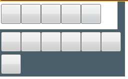
 <Expander Name="ExpanderTools" Style="{DynamicResource ExpanderStyleOne}" IsExpanded="True" ExpandDirection="Down">
                    <Expander.Header>
                        <Grid Name="ExpanderToolsHeaderGrid">
                            <Grid.ColumnDefinitions>
                                <ColumnDefinition Width="2"/>
                                <ColumnDefinition Width="40"/>
                                <ColumnDefinition Width="40"/>
                                <ColumnDefinition Width="40"/>
                                <ColumnDefinition Width="40"/>
                                <ColumnDefinition Width="40"/>
                                <ColumnDefinition Width="40"/>
                                <ColumnDefinition Width="2"/>
                            </Grid.ColumnDefinitions>
                            <Grid.RowDefinitions>
                                <RowDefinition Height="5"/>
                                <RowDefinition Height="40"/>
                                <RowDefinition Height="5"/>
                                <RowDefinition/>
                            </Grid.RowDefinitions>
                            <ToggleButton Grid.Column="1" Grid.Row="1"  />
                            <ToggleButton Grid.Column="2" Grid.Row="1" />
                            <Button Grid.Column="3" Grid.Row="1"/>
                            <ToggleButton Grid.Column="4" Grid.Row="1" />
                            <ToggleButton Grid.Column="5" Grid.Row="1" />
                        </Grid>
                    </Expander.Header>
                    <Expander.Content>
                        <Grid Name="ExpanderToolsContentGrid" Background="#4a5f6a">
                            <Grid.ColumnDefinitions>
                                <ColumnDefinition Width="2"/>
                                <ColumnDefinition Width="40"/>
                                <ColumnDefinition Width="40"/>
                                <ColumnDefinition Width="40"/>
                                <ColumnDefinition Width="40"/>
                                <ColumnDefinition Width="40"/>
                                <ColumnDefinition Width="40"/>
                                <ColumnDefinition Width="2"/>
                            </Grid.ColumnDefinitions>
                            <Grid.RowDefinitions>
                                <RowDefinition Height="5"/>
                                <RowDefinition Height="40"/>
                                <RowDefinition Height="5"/>
                                <RowDefinition Height="40"/>
                                <RowDefinition Height="5"/>
                                <RowDefinition/>
                            </Grid.RowDefinitions>
                            <ToggleButton Grid.Column="1" Grid.Row="1" />
                            <ToggleButton Grid.Column="2" Grid.Row="1" />
                            <ToggleButton Grid.Column="3" Grid.Row="1" />
                            <ToggleButton Grid.Column="4" Grid.Row="1" />
                            <ToggleButton Grid.Column="5" Grid.Row="1" />
                            <ToggleButton Grid.Column="6" Grid.Row="1"/>
                            <ToggleButton Grid.Column="1" Grid.Row="3" />
                        </Grid>
                    </Expander.Content>
                </Expander>
运行效果:
需要注意的是:Expander展开后,有可能会出现Expander内容区域范围到达其他内容区域时,显示其他区域的内容,造成交叉背景显示。
此时需要将被当区域控件的 Panel.ZIndex="-1" 该值设置为负数。
标签:运行 dynamic otto sys ane 分享 font 使用 class
原文地址:https://www.cnblogs.com/runningRain/p/8946035.html