标签:order class css 平面 ado shadow http dde height
|-变化 transform
|--2D
|----rotate(deg) 平面内旋转 deg角度
|----translate(横向,纵向) 移动
|----scale(宽,高) 缩放
|----skew(水平角度,垂直角度) 扭曲
|--3D
|----rotateX(deg) 沿X轴旋转
|----rotateY(deg) 沿Y轴旋转
|-过度 transition: 3s 时间3秒 谁发生变化给谁加transition
|-动画
|--属性:animation:动画名称、时长、执行方式
|--@keyframes 动画名称{
0%{} 开始的状态
1%~99%{} 过程中的状态
100{} 结束的状态
}
|--@keyframes 动画名称{
from{}
to{}
}
/*变化*/
.first{
width: 200px;
height: 200px;
background-color: gold;
transition: 3s;
}
.first:hover{
/*2D*/
transform: rotate(30deg);/*平面内旋转*/
transform:translate(50px,50px);/*位置移动:向右,向下*/
transform:scale(1.5,2);/*倍数缩放*/
transform:skew(20deg,20deg);/*扭曲*/
/*3D*/
transform:rotateX(180deg);/*沿X轴旋转*/
transform:rotateY(360deg);/*沿Y轴旋转*/
}
.second{
width: 300px;
height: 300px;
background: black;
position: relative;/*由于需要进位置改变,所以增加了position属性*/
animation: donghua 5s infinite alternate;/*infinite无限循环alternate倒序播放*/
}
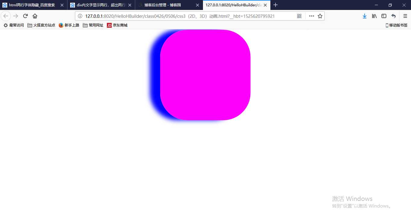
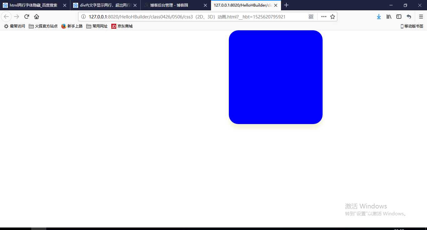
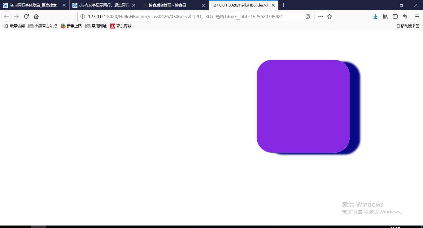
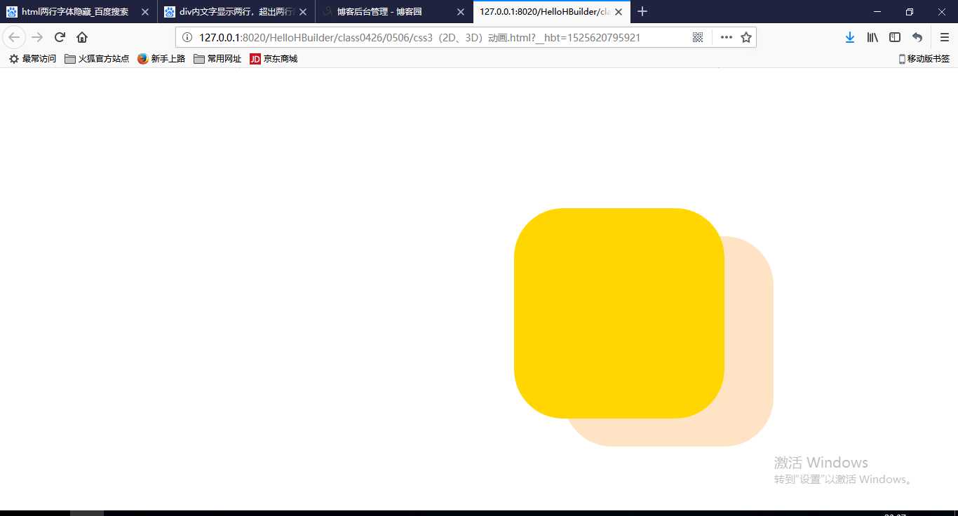
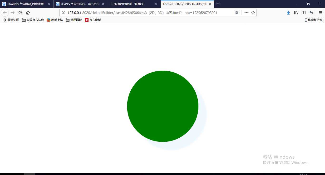
@keyframes donghua{/*改变位置颜色阴影......*/
0%{background:red; border-radius: 90px; box-shadow: -35px 0px 15px gray; left: 0px; top: 0px;}
20%{background:blue; border-radius: 30px; box-shadow: 0px 15px 10px beige; left: 200px; top: 0px;}
40%{background:blueviolet; border-radius: 50px; box-shadow: 35px 5px 5px navy; left: 300px; top: 100px;}
60%{background:gold; border-radius: 70px; box-shadow: 70px 40px 0px bisque; left: 200px; top: 200px;}
80%{background:green; border-radius: 150px; box-shadow: 35px 35px 5px aliceblue; left: 0px; top: 200px;}
100%{background:magenta; border-radius: 90px; box-shadow: -35px 0px 15px blue; left: 0px; top: 0px;}
from{background:red; border-radius: 90px; box-shadow: -35px 0px 15px gray; left: 0px; top: 0px;}
to{background:gold; border-radius: 70px; box-shadow: 70px 40px 0px bisque; left: 200px; top: 200px;}
}
.fangda{
width: 55px;
height: 55px;
border: 1px solid blueviolet;
overflow: hidden;
}
img{
transition: 3s;
}
img:hover{
transform: scale(1.5);
}
标签:order class css 平面 ado shadow http dde height
原文地址:https://www.cnblogs.com/zhangbaozhong/p/9000376.html