标签:如何 auto com .com ali 根据 100% bsp src
一.三栏布局
1. 经典的圣杯布局(双飞翼布局)
<style type="text/css">
    *{margin: 0;padding: 0;}
    body{min-width: 700px;}
    .header,
    .footer{
        border: 1px solid #333;
        background: #aaa;
        text-align: center;
    }
    .sub,
    .main,
    .extra{
        float: left;
        min-height: 130px;
    }
    .sub{
        margin-left: -100%;
        width: 200px;
        background: red;
    }
    .extra{
        margin-left: -220px;
        width: 220px;
        background: blue;
    }
    .main{
        width: 100%;
    }
    .main-inner{
        margin-left: 200px;
        margin-right: 220px;
        min-height: 130px;
        background: green;
        word-break: break-all;
    }
    .footer{
        clear: both;
    }
</style>
<div class="header">
    <h4>header</h4>
</div>
    <div class="main">
    <div class="main-inner">
        <h4>main</h4>
        <p>HHHHHHHHHHHHHHHHHHHHHH
        hhhhhhhhhhhhhhhhhhhhhhhhhhhhhhh
        HHHHHHHHHHHHHHHHHHHHHH
        hhhhhhhhhhhhhhhhhhhhhhhhhhhhhhh
        </p>
        </div>
    </div>
    <div class="sub">
    <h4>sub</h4>
        <p>oooooooooooooo
        0000000000000000
        00000000000000000
        ooooooooooooooo
        ooooooooooooooo
        000000000000000</p>
    </div>

      <div class="extra">
    <h4>extra</h4>
        <p>BBBBBBBBBBBBBB
        888888888888888888
        BBBBBBBBBBBBBBBBBB
        88888888888888888888</p>
    </div>
    <div class="footer">
        <h4>footer</h4>
    </div>
2.绝对定位法
<style type="text/css">
	*{
		margin: 0px;
		padding: 0px;
	}
		.left{
			position: absolute;
			background-color: orange;
			width: 100px;
			height: 300px;
		}
		.center{
			height: 300px;
			background-color: blue;
			text-align: center;
		}
		.right{
			position: absolute;
			background-color: green;
			top: 0px;
			right: 0px;
			width: 100px;
			height: 300px;
		}
	</style>

<body>
<div class="left">left</div>
<div class="center">center</div>
<div class="right">right</div>
</body>
优点:三个div顺序可以任意变
缺点:top值要注意
3. 自身浮动
<style type="text/css">
		.left{
			float: left;
			background-color: orange;
			width: 100px;
			height: 300px;
		}
		.center{
			height: 300px;
			background-color: blue;
			text-align: left;
		}
		.right{
			float: right;
			background-color: green;
			width: 100px;
			height: 300px;
		}
	</style>
<body>
		<div class="left">left</div>
		<div class="right">right</div>
		<div class="center">center</div>


</body>
优点 页面影响小
缺点:center必须在最下面
4.css3新特性
#box{
		display: flex;
		width: 100%;
	}
		.left{

			background-color: orange;
			width: 100px;
			height: 300px;
		}
		.center{
			height: 300px;
			background-color: blue;
			text-align: left;
			flex: 1;
		}
		.right{

			background-color: green;
			width: 100px;
			height: 300px;
		}
	</style>
<body>
<div id="box">
<div class="left">left</div>
<div class="center">center</div>
<div class="right">right</div>
</div>
flex 属性用于设置或检索弹性盒模型对象的子元素如何分配空间。
flex: flex-grow flex-shrink flex-basis|auto|initial|inherit;
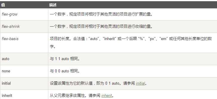
flex计算时 规则:先计算所有子元素的总基准和 计算剩余空间 根据剩余空间和系数分配比计算剩余空间的分配情况 得到最终宽度
二.两栏布局
1.position:absolute;
2.float和margin
扩展
calc() 函数用于动态计算长度值。
标签:如何 auto com .com ali 根据 100% bsp src
原文地址:https://www.cnblogs.com/theworldofbeisong/p/9021366.html