标签:ips span 渐变 bubuko round city radius cto infinite
1. 闲来无事时在网上看一些前辈的博客文章,自己尝试了一下。学习到最重要的一点就是box-shadow的叠加使用,受益非线。先上一下效果图:
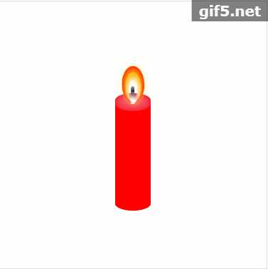
其中有以下重要的几点:
1. 蜡烛底座的border-radius的水平圆角与垂直圆角设置,即 border-radius:左上水平 右上水平 右下水平 左下水平 / 左上垂直 右上垂直 右下垂直 左下垂直;即border-radius其实是可以设置八个值的。
2. box-shadow的多层叠加(详细可见代码)。
3. 镜像渐变的方式(circle、ellipse),详细可见代码。
4. box-shadow的内嵌
5. 烟的径向渐变虚化效果
代码如下:
<!DOCTYPE html>
<html lang="en">
<head>
    <meta charset="UTF-8">
    <title>Document</title>
    <style>
        .candle-box{
            border: 1px solid #ddd;
            width: 300px;
            height: 300px;
            display: flex;
            justify-content: center;
            align-items: center;
        }
        .box{
            width: 300px;
        }
        .box .title{
            color: #ccc;
            text-align: center;
        }
        .candle-main{
            position: relative;
            width: 40px;
            height: 120px;
            background: #f00;
            border-radius: 0 0 60px 60px / 0 0 25px 25px;
            margin-top: 50px;
        }
        .candle-tip{
            position: relative;
            top: -17px;
        }
        .candle-top{
            position: absolute;
            top: 5px;
            left: 0;
            width: 40px;
            height: 20px;
            z-index: 10;
            background: #EF4D65;
            box-shadow:0 0 10px #f00 inset;
            border-radius: 60px / 25px;
        }
        .candle-top:after{
            content: "";
            position: absolute;
            top: -8px;
            left: calc( 50% - 2px);
            width: 4px;
            height: 20px;
            border-radius: 2px 2px 0 0;
            background: linear-gradient(to bottom ,#000 0%,#fff 100%);
        }
        .candle-fame{
            width: 10px;
            height: 20px;
            border-radius: 20px / 40px;
            background: radial-gradient(circle,transparent 20%,#fff 75%);
            box-shadow: 0 -3px 8px 2px #fff, 0 -8px 15px 5px #ff0, 0 -8px 0 8px #f00;
            position: relative;
            z-index: 50;
            top: -5px;
            -webkit-animation: flicker 3s linear infinite;
            -o-animation: flicker 3s linear infinite;
            animation: flicker 3s linear infinite;
        }
        .candle-fame-box{
            height: 20px;
            display: flex;
            justify-content: center;
        }

        .smoke{
            position: relative;
            width: 20px;
            height: 20px;
            z-index: 50;
            top: -7px;
            display: none;
        }
        .smoke span{
            display: block;
            width: 20px;
            height:20px;
            opacity: 0;
            border-radius: 50%;
            position: absolute;
            top:0;
            left: 0;
            background: radial-gradient(#333, transparent);
        }
        .l-smoke1{animation:smokeL linear 10s 1s infinite;}
        .l-smoke2{animation:smokeL linear 10s 2s infinite;}
        .l-smoke3{animation:smokeL linear 10s 3s infinite;}
        .l-smoke4{animation:smokeL linear 10s 4s infinite;}
        .l-smoke5{animation:smokeL linear 10s 5s infinite;}
        .l-smoke6{animation:smokeL linear 10s 6s infinite;}
        .l-smoke7{animation:smokeL linear 10s 7s infinite;}
        .l-smoke8{animation:smokeL linear 10s 8s infinite;}
        .l-smoke9{animation:smokeL linear 10s 9s infinite;}
        .l-smoke10{animation:smokeL linear 10s 10s infinite;}
        .r-smoke1{animation:smokeR linear 10s 1.5s infinite;}
        .r-smoke2{animation:smokeR linear 10s 2.5s infinite;}
        .r-smoke3{animation:smokeR linear 10s 3.5s infinite;}
        .r-smoke4{animation:smokeR linear 10s 4.5s infinite;}
        .r-smoke5{animation:smokeR linear 10s 5.5s infinite;}
        .r-smoke6{animation:smokeR linear 10s 6.5s infinite;}
        .r-smoke7{animation:smokeR linear 10s 7.5s infinite;}
        .r-smoke8{animation:smokeR linear 10s 8.5s infinite;}
        .r-smoke9{animation:smokeR linear 10s 9.5s infinite;}
        .r-smoke10{animation:smokeR linear 10s 10.5s infinite;}
        @keyframes flicker{
          0% {
            transform:scale(1);
          }
          20% {
            transform:scale(1.1,0.9) rotate(3deg);
          }
          50% {
            transform:scale(1,1.2);
          }
          80% {
            transform:scale(0.9,1.1) rotate(-3deg);
          }
          100% {
            transform:scale(1);
          }
        }
        @keyframes smokeL {
            0%{
                transform:scale(0.2);
            }
            5%{
                transform:scale(0.2) translate(-5px, 0);
                opacity: 1;
            }
            100%{
                transform:scale(1) translate(-5px, -100px);
                opacity:0;
            }
        }
        @keyframes smokeR {
            0%{
                transform:scale(0.2);
            }
            5%{
                transform:scale(0.2) translate(2px, 0);
                opacity: 1;
            }
            100%{
                transform:scale(1) translate(2px, -100px);
                opacity:0;
            }
        }
    </style>
</head>
<body>
    <div class="box">
        <h2 class="title">点击蜡烛点亮或熄灭</h2>
        <div class="candle-box">
            <div class="candle-main" id="candle">
                <div class="candle-tip">
                    <div class="candle-top"></div>
                    <div class="candle-fame-box">
                        <div class="candle-fame" id="fame"></div>
                        <div class="smoke" id="smoke">
                            <span class="l-smoke1"></span>
                            <span class="r-smoke1"></span>
                            <span class="l-smoke2"></span>
                            <span class="r-smoke2"></span>
                            <span class="l-smoke3"></span>
                            <span class="r-smoke3"></span>
                            <span class="l-smoke4"></span>
                            <span class="r-smoke4"></span>
                            <span class="l-smoke5"></span>
                            <span class="r-smoke5"></span>
                            <span class="l-smoke6"></span>
                            <span class="r-smoke6"></span>
                            <span class="l-smoke7"></span>
                            <span class="r-smoke7"></span>
                            <span class="l-smoke8"></span>
                            <span class="r-smoke8"></span>
                            <span class="l-smoke9"></span>
                            <span class="r-smoke9"></span>
                            <span class="l-smoke10"></span>
                            <span class="r-smoke10"></span>
                        </div>
                    </div>
                </div>
            </div>
        </div>
    </div>
    <script>
        var candle = document.querySelector("#candle");
        var fame = document.querySelector("#fame");
        var smoke = document.querySelector("#smoke")
        var flag = 1;
        candle.addEventListener("click",function(){
            if(flag){
                fame.style.display = "none";
                smoke.style.display = "block";
                flag = 0;
            }else{
                fame.style.display = "block";
                smoke.style.display = "none";
                flag = 1;
            }
        })
    </script>
</body>
</html>
标签:ips span 渐变 bubuko round city radius cto infinite
原文地址:https://www.cnblogs.com/pomelott/p/9180499.html