标签:图片 [1] panda ax1 col minor integer src default
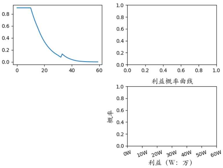
打开画布,传入x,y的值,可以简单的画出曲线图
 1 import matplotlib.pyplot as plt
 2
 3 c = [
 4     0.9012051747628913, 0.9012051747628913, 0.9012051747628913, 0.9012051747628913,
 5     0.9012051747628913, 0.9012051747628913, 0.9012051747628913, 0.9012051747628913,
 6     0.9012051747628913, 0.9012051747628913, 0.9012051747628913, 0.8246557944522697,
 7     0.7544842280408721, 0.6902265689813546, 0.6313864504646931, 0.5775093282079332,
 8     0.5211950040503636, 0.46780543149450055, 0.41969125813285063, 0.37634483770567245,
 9     0.33730644971557494, 0.30215984264922796, 0.2705281787178777, 0.24207035338627686,
10     0.2164776560859111, 0.19347074047424476, 0.17279687546043812, 0.15422745095614654,
11     0.13755571478805428, 0.12259471943174775, 0.10917545922273249, 0.09238916892440648,
12     0.07810309775699459, 0.132592491963472, 0.11187615362102099, 0.09429909803049094,
13     0.07939692421648169, 0.06677264402087058, 0.0560870414573683, 0.04705039444088354,
14     0.039415368208175136, 0.03203425502245122, 0.02583224107946905, 0.020769682030363956,
15     0.016646574068682765, 0.013296693161182788, 0.010582068906654783, 0.008388339009249155,
16     0.006620847041428546, 0.005201367205062169, 0.004065357659143943, 0.003159659141824776,
17     0.002440568476024901, 0.0018722274554178776, 0.0014252768539108648, 0.0010757331361786078,
18     0.0008040520819562571, 0.0005943491533515433, 0.0004337511864414913, 0.00031185800679816146
19      ]
20
21 plt.plot(range(0, 60), c)
22 plt.show()
允许结果:
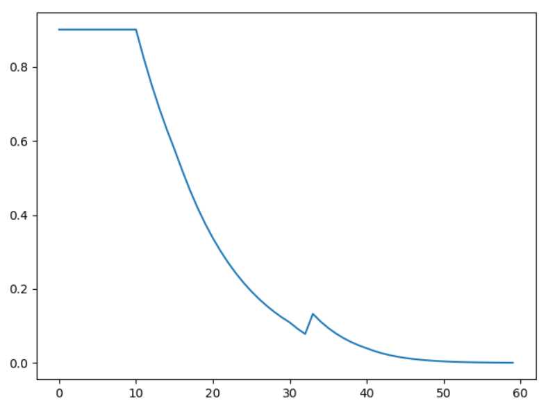
画出来的图像简单,且单调。一般为了美观我们需要更多的参数指定。
对x轴的一些操作
Get the current locations and labels:

    >>> locs, labels = xticks()

Set label locations:

    >>> xticks(np.arange(0, 1, step=0.2))

Set text labels:

    >>> xticks(np.arange(5), (‘Tom‘, ‘Dick‘, ‘Harry‘, ‘Sally‘, ‘Sue‘))

Set text labels and properties:

    >>> xticks(np.arange(12), calendar.month_name[1:13], rotation=20)
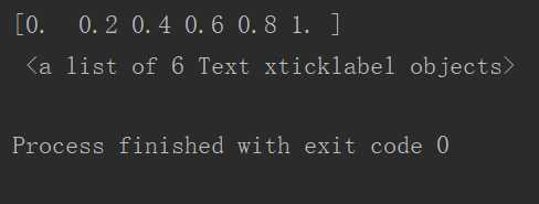
如下案例:
1 plt.plot(range(0, 60), c)
2 # xticks(*args, **kwargs) -----> xticks(locs, [labels], **kwargs)  # Set locations and labels
3 # np.arange(0, 60, step=5) 是指定刻度的位置;
4 # 第二个参数("0", "10万", "20万", "30万", "40万", "50万", "60万")指定对应刻度的标识
5 # 第三个我们可以用 rotation=20 指定标识的角度。
6 plt.xticks(np.arange(0, 61, step=10), ("0W", "10W", "20W", "30W", "40W", "50W", "60W"), rotation=20)
7 plt.show()
8 loc_, labels = plt.xticks()  # 获取刻度的位置与标识
9 print(loc_, "\n", labels)
运行结果:
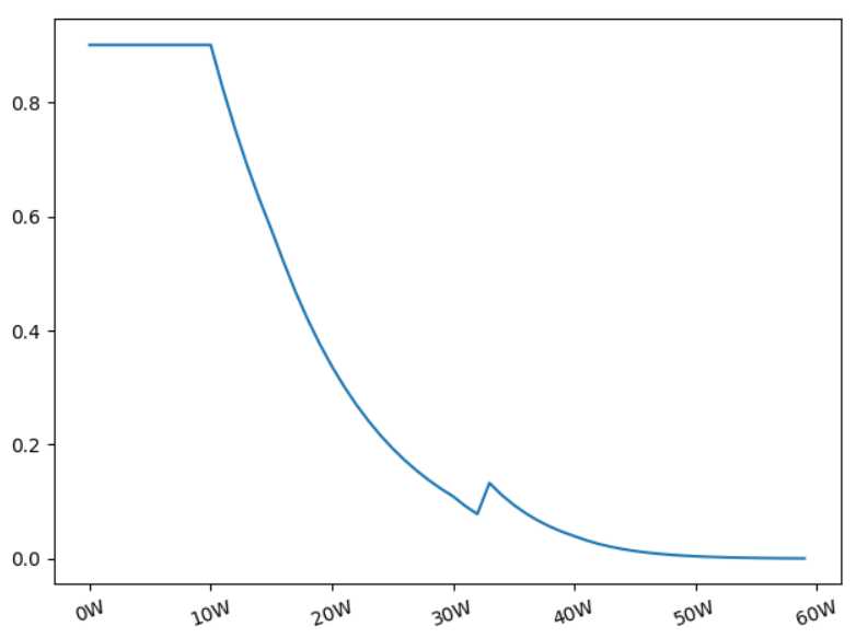
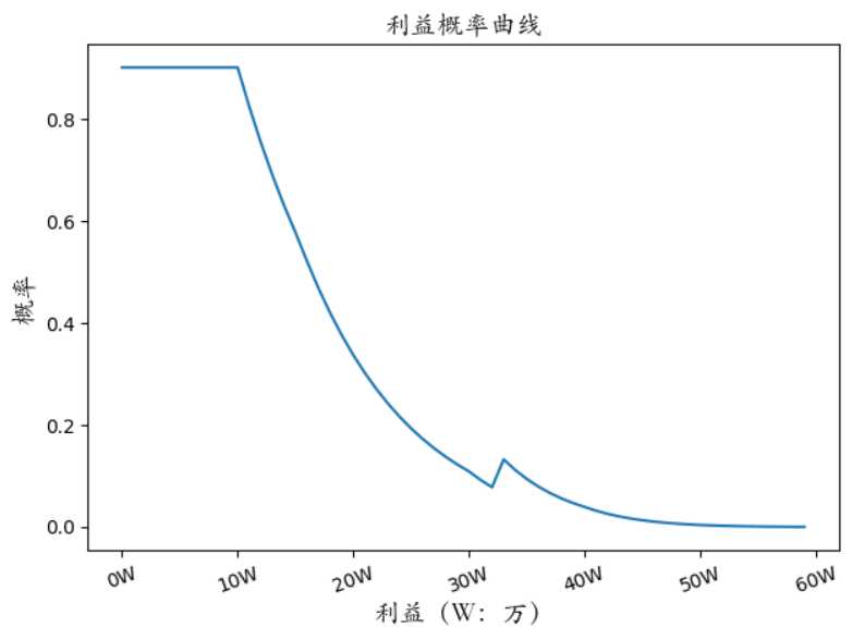
添加横坐标标签和纵坐标标签,以及标题
1 # matplotlib默认不支持中文,这里我们用, fontproperties=font指定字体
2 from matplotlib.font_manager import FontProperties
3 font = FontProperties(fname=r"c:\windows\fonts\STKAITI.TTF", size=14)
4 plt.plot(range(0, 60), c)
5 plt.xticks(np.arange(0, 61, step=10), ("0W", "10W", "20W", "30W", "40W", "50W", "60W"), rotation=20)
6 plt.xlabel("利益(W:万)", fontproperties=font)
7 plt.ylabel("概率", fontproperties=font)
8 plt.title("利益概率曲线", fontproperties=font)
9 plt.show()
运行结果:
在一个画布上花多个子图
 1 # figure(num=None,  # autoincrement if None, else integer from 1-N
 2 #        figsize=None,  # defaults to rc figure.figsize
 3 #        dpi=None,  # defaults to rc figure.dpi
 4 #        facecolor=None,  # defaults to rc figure.facecolor
 5 #        edgecolor=None,  # defaults to rc figure.edgecolor
 6 #        frameon=True,
 7 #        FigureClass=Figure,
 8 #        clear=False,
 9 #        **kwargs
10 #        )
11 fig = plt.figure()
12 ax1 = fig.add_subplot(2, 2, 1)  # 子图的实例化
13 ax2 = fig.add_subplot(2, 2, 2)
14 ax3 = fig.add_subplot(2, 2, 4)
15 # 在子画布上画图要用前面的实例
16 ax1.plot(range(0, 60), c)
17 # set_xticklabels(self, labels, fontdict=None, minor=False, **kwargs)
18 plt.figure(1)
19 plt.xticks(np.arange(0, 61, step=10), ("0W", "10W", "20W", "30W", "40W", "50W", "60W"), rotation=20)
20 plt.xlabel("利益(W:万)", fontproperties=font)
21 plt.ylabel("概率", fontproperties=font)
22 plt.title("利益概率曲线", fontproperties=font)
23 plt.show()
运行结果:
此时,也许你会疑惑,我们想将坐标标识等示例画到第一个字画布上,然而matplotlib默认画在最后一个字画布
上面了,怎么办呢?关于更多知识点请跳转到其他博客,那里有更详细的说明。
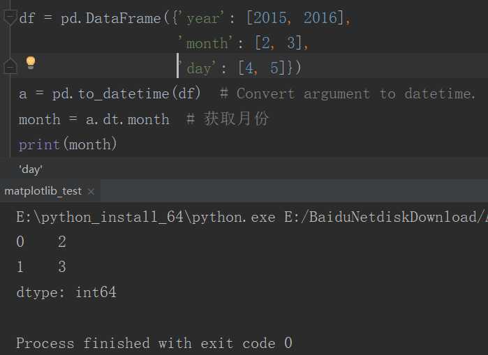
pandas导入时间数据进行格式转化
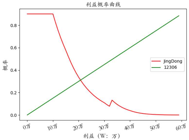
在一个画布上画多张图,并添加图例
 1 from matplotlib.font_manager import FontProperties
 2 font = FontProperties(fname=r"c:\windows\fonts\STKAITI.TTF", size=14)
 3 colors = ["red", "green"]  # 用来指定线的颜色
 4 labels = ["JingDong", "12306"]  # 用来指定图例
 5 plt.plot(range(0, 60), c, c=colors[0], label=labels[0])
 6 plt.plot(range(0, 60), np.arange(0, 0.89, step=0.015), c=colors[1], label=labels[1])
 7 plt.legend(loc="best")  # 指定图例显示的位置,没有plt.legend()不会显示图例
 8 plt.xticks(np.arange(0, 61, step=10), ("0万", "10万", "20万", "30万", "40万", "50万", "60万"),
 9            rotation=20, fontproperties=font)
10 plt.xlabel("利益(W:万)", fontproperties=font)
11 plt.ylabel("概率", fontproperties=font)
12 plt.title("利益概率曲线", fontproperties=font)
13 plt.show()
运行结果:
Python数据分析库pandas ------ 初识 matpoltlib:matplotliab画图怎么显示中文;设置坐标标签;主题;画子图;pandas时间数据格式转化;图例;
标签:图片 [1] panda ax1 col minor integer src default
原文地址:https://www.cnblogs.com/dan-baishucaizi/p/9465396.html