标签:tran 绝对定位 serve 分享图片 展开 添加 image line http
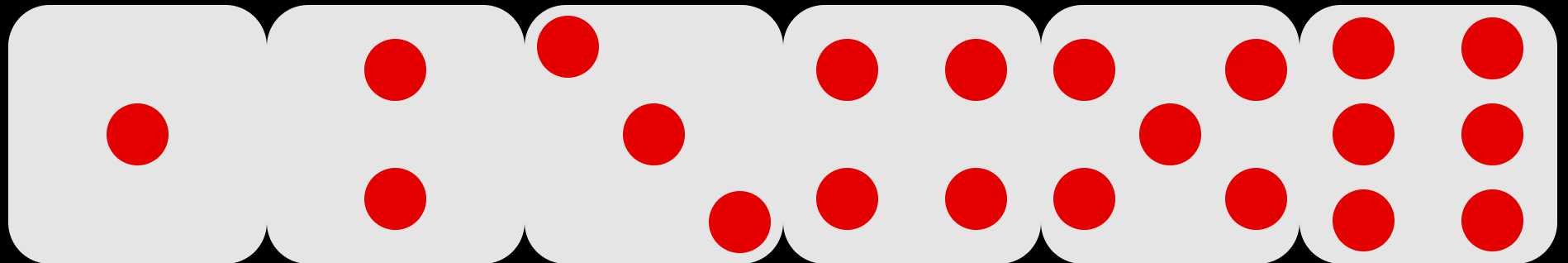
今天利用CSS3来画一个自动滚动的骰子。
思路:骰子的六个面分别用六个ul标签,每个面的点数就是li标签,点数的排列采用伸缩布局,然后采用定位和transform属性将六个面翻转折叠成立方体。
1、HTML结构:用一个类名为box的大盒子将六个面(ul)包起来,方便给整个骰子定位和添加动画;每个ul里的li代表每个面的点数,其中第四、五、六面每一列的点数分别用一个div包起来
 1  <div class="box">
 2         <ul class="one">
 3             <li></li>
 4         </ul>
 5         <ul class="two">
 6             <li></li>
 7             <li></li>
 8         </ul>
 9         <ul class="three">
10             <li></li>
11             <li></li>
12             <li></li>
13         </ul>
14         <ul class="gtThree four">
15             <div>
16                 <li></li>
17                 <li></li>
18             </div>
19             <div>
20                 <li></li>
21                 <li></li>
22             </div>
23
24         </ul>
25         <ul class="gtThree five">
26             <div>
27                 <li></li>
28                 <li></li>
29             </div>
30             <div>
31                 <li></li>
32             </div>
33             <div>
34                 <li></li>
35                 <li></li>
36             </div>
37         </ul>
38         <ul class="gtThree six">
39             <div>
40                 <li></li>
41                 <li></li>
42                 <li></li>
43             </div>
44             <div>
45                 <li></li>
46                 <li></li>
47                 <li></li>
48             </div>
49         </ul>
50     </div>
2、利用伸缩(弹性)布局画出骰子六个面的点数
2.1给每个ul添加一个弹性布局,把每个li切成圆
 1 ul {
 2     width: 250px;
 3     height: 250px;
 4     background-color: white;
 5     padding: 0;
 6     list-style: none;
 7     border-radius: 40px;
 8     display: flex;
 9 }
10
11 li {
12     width: 60px;
13     height: 60px;
14     border-radius: 50%;
15     background-color: red;
16 }
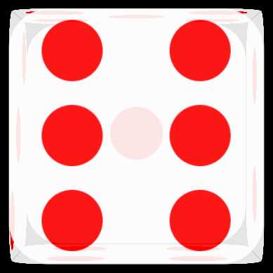
2.2 第一面:主轴居中,副轴居中
1 .one {
2      justify-content: center;
3      align-items: center;
4 }
2.2第二面:将主轴改为垂直方向,两点均匀分开(space-around:两点之间的空白部分是两点前后各空白部分的两倍),副轴居中
1 .two {
2     flex-direction: column;
3     align-items: center;
4     justify-content: space-around;
5 }
2.3第三面:将三点(水平)均匀分成三列,再分别给中间点设置副轴(垂直)居中,第三点设置位于副轴结尾
 1 .three {
 2     justify-content: space-around;
 3 }
 4
 5 .three li:first-child {
 6     margin-top: 10px;
 7 }
 8
 9 .three li:nth-child(2) {
10     align-self: center;
11 }
12
13 .three li:nth-child(3) {
14     align-self: flex-end;
15     margin-bottom: 10px;
16 }
2.4第四,五,六面:每一列均分(flex:1)排列,然后每一列再分别添加一个弹性布局,并将主轴改为垂直方向,其中的点数在主轴上均匀排列,副轴居中
1 .gtThree div {
2     flex: 1;
3     display: flex;
4     flex-direction: column;
5     justify-content: space-around;
6     align-items: center;
7 }
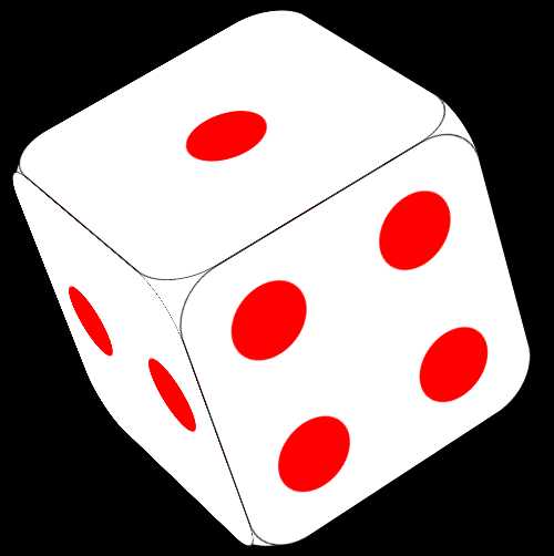
3、利用定位和transform属性将每个面折叠成一个立方体:给每个ul设置一个绝对定位(定位父级是div.box),这样每个面都叠在一起,然后分别:
第一面(后面):不动;
第二面(右侧面):沿Y轴旋转90度,旋转轴是其右边框
第三面(左侧面):沿Y轴旋转-90度,旋转轴是其左边框
第四面(底面):沿X轴旋转-90度,旋转轴是其下边框
第五面(顶面):沿X轴旋转90度,旋转轴是其上边框
第六面(前面):沿Z轴平移250个像素
注:记得给body添加视距属性perspective(视距就是模拟一个镜头到元素的距离),否则看不出立体的效果
 1 body {
 2     perspective: 1800px;
 3     background-color: black;
 4 }
 5 ul {
 6     position: absolute;
 7     left: 0;
 8     top: 0;
 9 }
10 .one {
11     transform: translateZ(0);
12 }
13
14 .two {
15     transform: rotateY(90deg);
16     transform-origin: right;
17
18 }
19
20 .three {
21     transform: rotateY(-90deg);
22     transform-origin: left;
23
24 }
25
26 .four{
27     transform: rotateX(-90deg);
28     transform-origin: bottom;
29 }
30 .five{
31     transform: rotateX(90deg);
32     transform-origin: top;
33 }
34 .six{
35     transform: translateZ(250px);
36 }
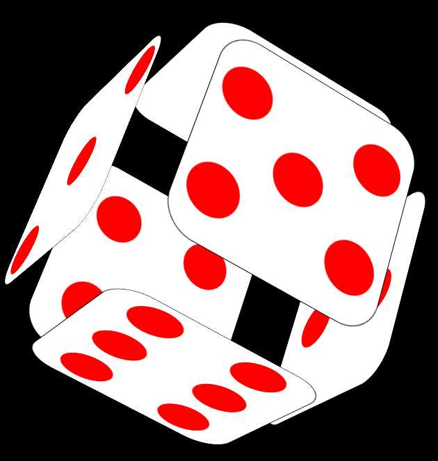
4、给骰子添加动画,让骰子动起来:定义一个change动画,让骰子自由旋转,角度可以自己慢慢调
注:transform-style: preserve-3d; 开启3D动画,必须写,否则没有3D动画效果
 1 .box{
 2     transform-style: preserve-3d;
 3     animation: change 30s linear infinite;
 4 }
 5 @keyframes change {
 6     from{
 7         transform: rotateY(360deg) rotateX(720deg) rotateZ(-720deg);
 8     }to{
 9         transform:  rotateY(-360deg) rotateX(-720deg) rotateZ(720deg);
10         }
11 }
4.1鼠标移入事件:各个面分别展开
 1 .box:hover .one{
 2     transform: translateZ(-50px);
 3 }
 4 .box:hover .two{
 5     left: 50px;
 6 }
 7 .box:hover .three{
 8     left: -50px;
 9 }
10 .box:hover .four{
11     top: 50px;
12 }
13 .box:hover .five{
14     top: -50px;
15 }
16 .box:hover .six{
17     transform: translateZ(300px);
18 }
★★★附上完整CSS代码(HTML见上方)
  1 body {
  2     perspective: 1800px;
  3     background-color: black;
  4 }
  5 .box{
  6     width: 250px;
  7     height: 250px;
  8     position: relative;
  9     margin: 150px auto;
 10     transform-style: preserve-3d;
 11     animation: change 30s linear infinite;
 12
 13 }
 14 .box:hover .one{
 15     transform: translateZ(-50px);
 16 }
 17 .box:hover .two{
 18     left: 50px;
 19 }
 20 .box:hover .three{
 21     left: -50px;
 22 }
 23 .box:hover .four{
 24     top: 50px;
 25 }
 26 .box:hover .five{
 27     top: -50px;
 28 }
 29 .box:hover .six{
 30     transform: translateZ(300px);
 31 }
 32 ul {
 33     width: 250px;
 34     height: 250px;
 35     background-color: white;
 36     padding: 0;
 37     list-style: none;
 38     border-radius: 40px;
 39     display: flex;
 40     position: absolute;
 41     /* opacity: .9; */
 42     transition: all 1s;
 43     left: 0;
 44     top: 0;
 45     border: 1px solid black;
 46 }
 47
 48 li {
 49     width: 60px;
 50     height: 60px;
 51     border-radius: 50%;
 52     background-color: red;
 53 }
 54
 55 .one {
 56     justify-content: center;
 57     align-items: center;
 58     transform: translateZ(0);
 59 }
 60
 61 .two {
 62     flex-direction: column;
 63     align-items: center;
 64     justify-content: space-around;
 65
 66     transform: rotateY(90deg);
 67     transform-origin: right;
 68
 69 }
 70
 71 .three {
 72     justify-content: space-around;
 73
 74     transform: rotateY(-90deg);
 75     transform-origin: left;
 76
 77 }
 78
 79 .three li:first-child {
 80     margin-top: 10px;
 81 }
 82
 83 .three li:nth-child(2) {
 84     align-self: center;
 85 }
 86
 87 .three li:nth-child(3) {
 88     align-self: flex-end;
 89     margin-bottom: 10px;
 90 }
 91
 92 .four{
 93     transform: rotateX(-90deg);
 94     transform-origin: bottom;
 95 }
 96 .five{
 97     transform: rotateX(90deg);
 98     transform-origin: top;
 99 }
100 .six{
101     transform: translateZ(250px);
102 }
103 .gtThree div {
104     flex: 1;
105     display: flex;
106     flex-direction: column;
107     justify-content: space-around;
108     align-items: center;
109 }
110
111 @keyframes change {
112     from{
113         transform: rotateY(360deg) rotateX(720deg) rotateZ(-720deg);
114     }to{
115         transform:  rotateY(-360deg) rotateX(-720deg) rotateZ(720deg);
116         }
117 }
标签:tran 绝对定位 serve 分享图片 展开 添加 image line http
原文地址:https://www.cnblogs.com/linqb/p/9515090.html