标签:class gradient alt shadow mil dde gre display rgba
<!DOCTYPE html>
<html lang="en">
<head>
<meta charset="UTF-8">
<title>CSS3渐变</title>
<style>
body, ul, li, dl, dt, dd, h1, h2, h3, h4, h5 {
margin: 0;
padding: 0;
}
body {
background-color: #F7F7F7;
}
.wrapper {
width: 1000px;
margin: 0 auto;
padding: 20px;
box-sizing: border-box;
}
header {
padding: 20px 0;
margin-bottom: 20px;
text-align: center;
}
header h3 {
line-height: 1;
font-weight: normal;
font-size: 28px;
}
.main {
/*overflow: hidden;*/
}
.main:after {
content: ‘‘;
clear: both;
display: block;
}
.main .item {
width: 210px;
height: 210px;
margin: 0 30px 30px 0;
display: flex;
position: relative;
backround-color: #FFF;
float: left;
box-shadow: 2px 2px 5px #CCC;
}
.main .item:after {
content: attr(data-brief);
display: block;
width: 100%;
height: 100%;
text-align: center;
line-height: 210px;
position: absolute;
top: 0;
left: 0;
color: #FFF;
font-family: ‘微软雅黑‘;
font-size: 18px;
background-color: rgba(170, 170, 170, 0);
z-index: -1;
transition: all 0.3s ease-in;
}
.main .item:hover:after {
background-color: rgba(170, 170, 170, 0.6);
z-index: 100;
}
.main .item:nth-child(4n) {
margin-right: 0;
}
/*.main .item:nth-last-child(-n+5) {
margin-bottom: 0;
}*/
/* 以上是骨架样式 */
.linear-gradient {
width: 170px;
height: 80px;
margin: auto;
}
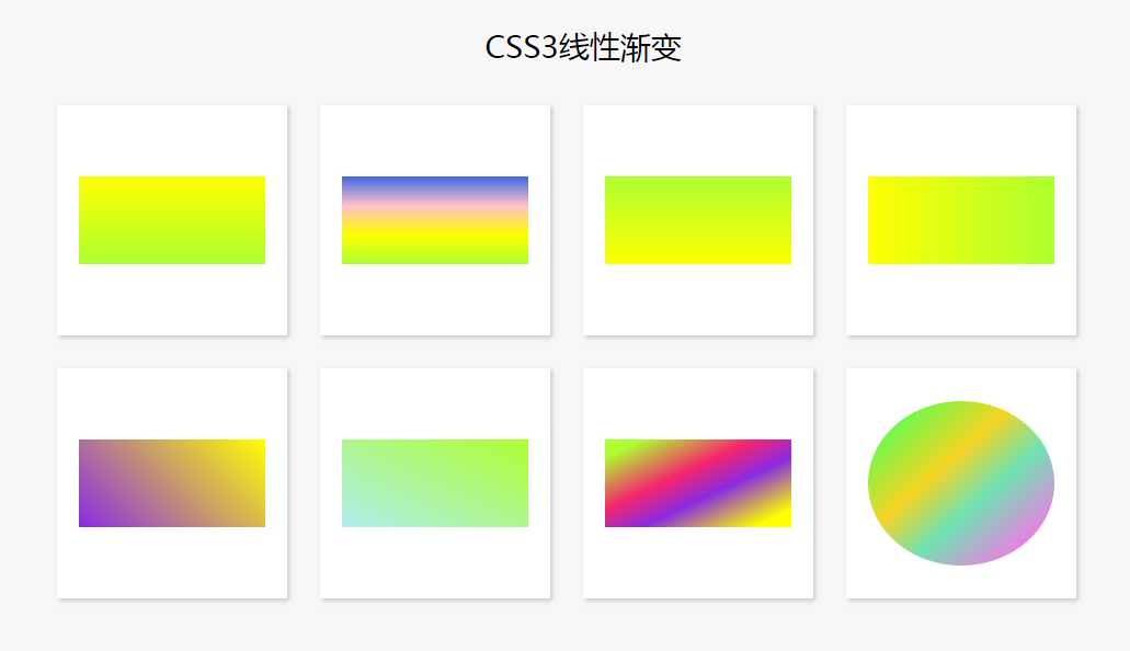
/*标准写法*/
.item:nth-child(1) .linear-gradient {
background: linear-gradient(yellow, greenyellow);
}
/*多个颜色渐变*/
.item:nth-child(2) .linear-gradient {
background: linear-gradient(royalblue, pink, yellow, greenyellow);
}
/*用角度确定方向 180deg 正上方为0度 顺时针旋转*/
.item:nth-child(3) .linear-gradient {
background: linear-gradient(0deg, yellow, greenyellow);
}
.item:nth-child(4) .linear-gradient {
background: linear-gradient(90deg, yellow, greenyellow);
}
.item:nth-child(5) .linear-gradient {
background: linear-gradient(135deg, yellow, blueviolet);
}
.item:nth-child(5) .linear-gradient {
background: linear-gradient(225deg, yellow, blueviolet);
}
/*用关键字来确定方向*/
.item:nth-child(6) .linear-gradient {
/*background: linear-gradient(to left top, yellow, blueviolet);*/
background: linear-gradient(to right top , paleturquoise, greenyellow);
}
/*控制渐变*/
/*
0 - 10
10 - 40
40 - 60
60 - 90
90 - 100
*/
.item:nth-child(7) .linear-gradient {
background: linear-gradient(to left top, yellow 10%, blueviolet 40%, #f5256b 60%, greenyellow 90%);
}
.item:nth-child(8) .linear-gradient {
height: 150px;
border-radius: 60%;
background: linear-gradient(to left top, #ff6fea 10%, #6fe2b2 40%, #f5d423 60%, #58ff52 90%);
}
</style>
</head>
<body>
<div class="wrapper">
<header>
<h3>CSS3线性渐变</h3>
</header>
<div class="main">
<div class="item" data-brief="">
<div class="linear-gradient"></div>
</div>
<div class="item">
<div class="linear-gradient"></div>
</div>
<div class="item">
<div class="linear-gradient"></div>
</div>
<div class="item">
<div class="linear-gradient"></div>
</div>
<div class="item">
<div class="linear-gradient"></div>
</div>
<div class="item">
<div class="linear-gradient"></div>
</div>
<div class="item">
<div class="linear-gradient"></div>
</div>
<div class="item">
<div class="linear-gradient"></div>
</div>
</div>
</div>
</body>
</html>
标签:class gradient alt shadow mil dde gre display rgba
原文地址:https://www.cnblogs.com/zlinger/p/9516908.html