标签:元素 tools 识别 horizon ref 10个 ogr int erer
① 单系列柱状图
② 多系列柱状图
③ 堆叠图
④ 直方图
import numpy as np
import pandas as pd
import matplotlib.pyplot as plt
% matplotlib inline

import warnings
warnings.filterwarnings(‘ignore‘)
# 不发出警告

from bokeh.io import output_notebook
output_notebook()
# 导入notebook绘图模块

from bokeh.plotting import figure,show
from bokeh.models import ColumnDataSource
# 导入图表绘制、图标展示模块
# 导入ColumnDataSource模块

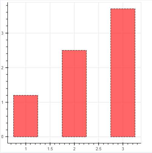
# 1、单系列柱状图
# vbar
df = pd.Series(np.random.randint(0,100,30))
#print(df.head())

p = figure(plot_width=400, plot_height=400)
p.vbar(x=[1, 2, 3], width=0.5, bottom=0,top=[1.2, 2.5, 3.7],  # x:横轴坐标,width:宽度,bottom:底高度,top:顶高度 ; bottom=[1,2,3]
       #color = [‘red‘,‘blue‘,‘green‘], alpha = 0.8   # 整体颜色设置,也可单独设置 → color="firebrick"
       line_width = 1,line_alpha = 0.8,line_color = ‘black‘, line_dash = [5,2],    # 单独设置线参数
       fill_color = ‘red‘,fill_alpha = 0.6    # 单独设置填充颜色参数
      )
# 绘制竖向柱状图
# p.vbar(x=df.index, width=0.5, bottom=0,top=df.values,  # x:横轴坐标,width:宽度,bottom:底高度,top:顶高度 ; bottom=[1,2,3]
#        #color = [‘red‘,‘blue‘,‘green‘], alpha = 0.8   # 整体颜色设置,也可单独设置 → color="firebrick"
#        line_width = 1,line_alpha = 0.8,line_color = ‘black‘, line_dash = [5,2],    # 单独设置线参数
#        fill_color = ‘red‘,fill_alpha = 0.6    # 单独设置填充颜色参数
#       )

show(p)
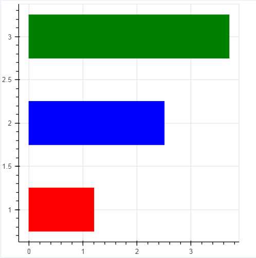
# 1、单系列柱状图
# hbar
# df = pd.DataFrame({‘value‘:np.random.randn(100)*10,
#                   ‘color‘:np.random.choice([‘red‘, ‘blue‘, ‘green‘], 100)})
# print(df.head())
p = figure(plot_width=400, plot_height=400)
p.hbar(y=[1, 2, 3], height=0.5, left=0,right=[1.2, 2.5, 3.7],  # y:纵轴坐标,height:厚度,left:左边最小值,right:右边最大值
       color = [‘red‘,‘blue‘,‘green‘])
# 绘制竖向柱状图

# p.hbar(y=df.index, height=0.5, left=0,right=df[‘value‘],  # y:纵轴坐标,height:厚度,left:左边最小值,right:右边最大值
#        color = df[‘color‘])

show(p)
# 1、单系列柱状图 - 分类设置标签
# ColumnDataSource

from bokeh.palettes import Spectral6
from bokeh.transform import factor_cmap
# 导入相关模块

fruits = [‘Apples‘, ‘Pears‘, ‘Nectarines‘, ‘Plums‘, ‘Grapes‘, ‘Strawberries‘]
counts = [5, 3, 4, 2, 4, 6]
source = ColumnDataSource(data=dict(fruits=fruits, counts=counts))
colors = [ "salmon", "olive", "darkred", "goldenrod", "skyblue", "orange"]
# 创建一个包含标签的data,对象类型为ColumnDataSource

p = figure(x_range=fruits, y_range=(0,9), plot_height=350, title="Fruit Counts",tools="") #x_range一开始就要设置成一个字符串的列表;要一一对应

p.vbar(x=‘fruits‘, top=‘counts‘, source=source,    # 加载数据另一个方式
       width=0.9, alpha = 0.8,
       color = factor_cmap(‘fruits‘, palette=Spectral6, factors=fruits),    # 设置颜色
       legend="fruits")
# 绘制柱状图,横轴直接显示标签
# factor_cmap(field_name, palette, factors, start=0, end=None, nan_color=‘gray‘):颜色转换模块,生成一个颜色转换对象
# field_name:分类名称
# palette:调色盘
# factors:用于在调色盘中分颜色的参数
# 参考文档:http://bokeh.pydata.org/en/latest/docs/reference/transform.html

p.xgrid.grid_line_color = None
p.legend.orientation = "horizontal"
p.legend.location = "top_center"
# 其他参数设置
#cmd -->> conda install bokeh  ;  conda install json
show(p)

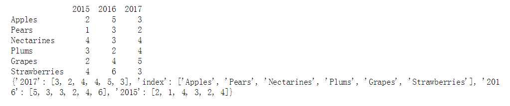
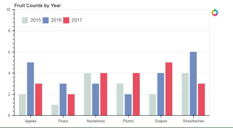
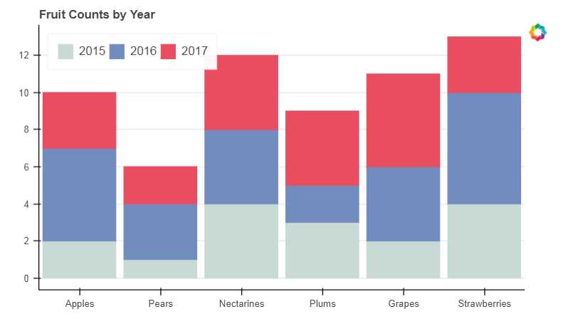
# 2、多系列柱状图
# vbar

from bokeh.transform import dodge
from bokeh.core.properties import value
# 导入dodge、value模块

df = pd.DataFrame({‘2015‘:[2, 1, 4, 3, 2, 4],‘2016‘:[5, 3, 3, 2, 4, 6], ‘2017‘:[3, 2, 4, 4, 5, 3]},
                 index = [‘Apples‘, ‘Pears‘, ‘Nectarines‘, ‘Plums‘, ‘Grapes‘, ‘Strawberries‘])
# 创建数据
print(df)
fruits = df.index.tolist()   # 横坐标
years = df.columns.tolist()    # 系列名
data = {‘index‘:fruits}
for year in years:
    data[year] = df[year].tolist()
print(data)
# 生成数据,数据格式为dict; 专门把dataframe转换为字典,然后再转换为ColumnDataSource;可以把这些步骤给都省了,也可以的。

source = ColumnDataSource(data=data)  #把上面转换字典步骤直接去掉也是可以的,这时把 data = df
# 将数据转化为ColumnDataSource对象


p = figure(x_range=fruits, y_range=(0, 10), plot_height=350, title="Fruit Counts by Year",tools="")

p.vbar(x=dodge(‘index‘, -0.25, range=p.x_range), top=‘2015‘, width=0.2, source=source,color="#c9d9d3", legend=value("2015")) #用dodge的方法把3个柱状图拼到了一起
p.vbar(x=dodge(‘index‘,  0.0,  range=p.x_range), top=‘2016‘, width=0.2, source=source,color="#718dbf", legend=value("2016"))
p.vbar(x=dodge(‘index‘,  0.25, range=p.x_range), top=‘2017‘, width=0.2, source=source,color="#e84d60", legend=value("2017"))
# 绘制多系列柱状图       0.25和width=0.2是柱状图之间的空隙间隔,都是0.2了就没有空隙了
# dodge(field_name, value, range=None) → 转换成一个可分组的对象,value为元素的位置(配合width设置)
# value(val, transform=None) → 按照年份分为dict

p.xgrid.grid_line_color = None
p.legend.location = "top_left"
p.legend.orientation = "horizontal"
# 其他参数设置

show(p)
官方示例很多情况是用的列表的形式,bokeh本身不是基于pandas构建的可视化工具,所以它基本上是用的python自己的数据结构字典、列表;我们做数据分析肯定是基于pandas,以上就是做了一个模拟,如果数据结构是DataFrame,怎么把它变成一个字典,再把它变成一个ColumnDataSource,同样的也可以直接用dataframe来创建
from bokeh.transform import dodge
from bokeh.core.properties import value
# 导入dodge、value模块

df = pd.DataFrame({‘2015‘:[2, 1, 4, 3, 2, 4],‘2016‘:[5, 3, 3, 2, 4, 6], ‘2017‘:[3, 2, 4, 4, 5, 3]},
                 index = [‘Apples‘, ‘Pears‘, ‘Nectarines‘, ‘Plums‘, ‘Grapes‘, ‘Strawberries‘])
# # 创建数据
# print(df)

source = ColumnDataSource(data=df)
# 将数据转化为ColumnDataSource对象

p = figure(x_range=fruits, y_range=(0, 10), plot_height=350, title="Fruit Counts by Year",tools="")

p.vbar(x=dodge(‘index‘, -0.25, range=p.x_range), top=‘2015‘, width=0.2, source=source,color="#c9d9d3", legend=value("2015")) #用dodge的方法把3个柱状图拼到了一起
p.vbar(x=dodge(‘index‘,  0.0,  range=p.x_range), top=‘2016‘, width=0.2, source=source,color="#718dbf", legend=value("2016"))
p.vbar(x=dodge(‘index‘,  0.25, range=p.x_range), top=‘2017‘, width=0.2, source=source,color="#e84d60", legend=value("2017"))
# 绘制多系列柱状图       0.25和width=0.2是柱状图之间的空隙间隔,都是0.2了就没有空隙了
# dodge(field_name, value, range=None) → 转换成一个可分组的对象,value为元素的位置(配合width设置)
# value(val, transform=None) → 按照年份分为dict

p.xgrid.grid_line_color = None
p.legend.location = "top_left"
p.legend.orientation = "horizontal"
# 其他参数设置

show(p)
# 3、堆叠图

from bokeh.core.properties import value
# 导入value模块

fruits = [‘Apples‘, ‘Pears‘, ‘Nectarines‘, ‘Plums‘, ‘Grapes‘, ‘Strawberries‘]
years = ["2015", "2016", "2017"]
colors = ["#c9d9d3", "#718dbf", "#e84d60"]
data = {‘fruits‘ : fruits,
        ‘2015‘   : [2, 1, 4, 3, 2, 4],
        ‘2016‘   : [5, 3, 4, 2, 4, 6],
        ‘2017‘   : [3, 2, 4, 4, 5, 3]}
# df = pd.DataFrame(data)
# print(df)
# source = ColumnDataSource(data = df) #也可以使用DataFrame
source = ColumnDataSource(data=data)


# 创建数据

p = figure(x_range=fruits, plot_height=350, title="Fruit Counts by Year",tools="")
renderers = p.vbar_stack(["2015", "2016", "2017"], #可以用years代替,就是上边设置的变量 # 设置堆叠值,这里source中包含了不同年份的值,years变量用于识别不同堆叠层
                         x=‘fruits‘,     # 设置x坐标
                         source=source, #包含了2015/2016/2017的数据的;  主要设置的就是这3个参数
                         width=0.9, color=colors,
                         legend=[value(x) for x in years], name=years) #对整个数据做一个分组集合变成一个列表
# 绘制堆叠图
# 注意第一个参数需要放years

p.xgrid.grid_line_color = None
p.axis.minor_tick_line_color = None
p.outline_line_color = None
p.legend.location = "top_left"
p.legend.orientation = "horizontal"
# 设置其他参数

show(p)
[value(x) for x in years]
[{‘value‘: ‘2015‘}, {‘value‘: ‘2016‘}, {‘value‘: ‘2017‘}]
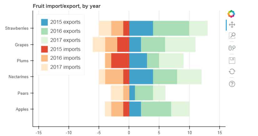
# 3、堆叠图

from bokeh.palettes import GnBu3, OrRd3
# 导入颜色模块

fruits = [‘Apples‘, ‘Pears‘, ‘Nectarines‘, ‘Plums‘, ‘Grapes‘, ‘Strawberries‘]
years = ["2015", "2016", "2017"]
exports = {‘fruits‘ : fruits,
           ‘2015‘   : [2, 1, 4, 3, 2, 4],
           ‘2016‘   : [5, 3, 4, 2, 4, 6],
           ‘2017‘   : [3, 2, 4, 4, 5, 3]}
imports = {‘fruits‘ : fruits,
           ‘2015‘   : [-1, 0, -1, -3, -2, -1],
           ‘2016‘   : [-2, -1, -3, -1, -2, -2],
           ‘2017‘   : [-1, -2, -1, 0, -2, -2]}

p = figure(y_range=fruits, plot_height=350, x_range=(-16, 16), title="Fruit import/export, by year")

p.hbar_stack(years, y=‘fruits‘, height=0.9, color=GnBu3, source=ColumnDataSource(exports),
             legend=["%s exports" % x for x in years])      # 绘制出口数据堆叠图

p.hbar_stack(years, y=‘fruits‘, height=0.9, color=OrRd3, source=ColumnDataSource(imports),
             legend=["%s imports" % x for x in years])      # 绘制进口数据堆叠图,这里值为负值

p.y_range.range_padding = 0.2     # 调整边界间隔
p.ygrid.grid_line_color = None
p.legend.location = "top_left"
p.axis.minor_tick_line_color = None
p.outline_line_color = None
# 设置其他参数

show(p)
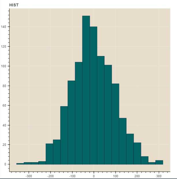
# 4、直方图
# np.histogram + figure.quad()
# 不需要构建ColumnDataSource对象

df = pd.DataFrame({‘value‘: np.random.randn(1000)*100})
df.index.name = ‘index‘
print(df.head())
# 创建数据

hist, edges = np.histogram(df[‘value‘],bins=20) #把这1000个值拆分成20个箱子,整个箱子肯定会有一个value值的也就是它的个数
print(hist) #代表不同箱子的个数
print(edges) #把它分成不同箱子之后,每个箱子的位置坐标
# 将数据解析成直方图统计格式
# 高阶函数np.histogram(a, bins=10, range=None, weights=None, density=None)
# a:数据
# bins:箱数
# range:最大最小值的范围,如果不设定则为(a.min(), a.max())
# weights:权重
# density:为True则返回“频率”,为False则返回“计数”
# 返回值1 - hist:每个箱子的统计值(top)
# 返回值2 - edges:每个箱子的位置坐标,这里n个bins将会有n+1个edges;假如有10个箱子,就会有10+1个位置

p = figure(title="HIST", tools="save",background_fill_color="#E8DDCB")
p.quad(top=hist, bottom=0, left=edges[:-1], right=edges[1:],   # 分别代表每个柱子的四边值,上下左右,top=hist计数的值,第一个箱子的左跟右就是第一个值+第二个值
        fill_color="#036564", line_color="#033649")
# figure.quad绘制直方图

show(p)
            value
index
0      109.879109
1      -49.315234
2     -149.590185
3       83.290324
4      -16.367743
[  1   2   2   3  21  25  59  85 104 151 140 110 101  82  47  31  22   8   #这里1就是在-356.79345893到-323.021329之间有1个;在-323.021329到-289.2491919906之间有2个
   2   4]
[-356.79345893 -323.021329   -289.24919906 -255.47706913 -221.7049392
 -187.93280926 -154.16067933 -120.3885494   -86.61641947  -52.84428953
  -19.0721596    14.69997033   48.47210027   82.2442302   116.01636013
  149.78849006  183.56062     217.33274993  251.10487986  284.8770098
  318.64913973]
In [ ]:
Python交互图表可视化Bokeh:5 柱状图| 堆叠图| 直方图
标签:元素 tools 识别 horizon ref 10个 ogr int erer
原文地址:https://www.cnblogs.com/shengyang17/p/9739373.html