标签:blog child cap class red container text log tps
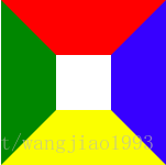
1、创建一个div,设置样式如下
div{
width: 50px;
height: 50px;
border-top: 50px solid red;
border-bottom: 50px solid yellow;
border-left: 50px solid green;
border-right: 50px solid blue;
}
浏览器运行结果如下: 边框之间的相接处的线都是斜的,
 ? ?
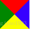
? ?
当元素的框和高都设置为0时,即
div{
width: 0;
height: 0;
border-top: 50px solid red;
border-bottom: 50px solid yellow;
border-left: 50px solid green;
border-right: 50px solid blue;
}
运行结果如下:
?
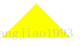
2、css3形成三角形
可以给div设置如下样式:
div{
width: 0;
height: 0;
border-top: 50px solid transparent;
border-bottom: 50px solid yellow;
border-left: 50px solid transparent;
border-right: 50px solid transparent;
}
浏览器运行结果如下:
?
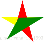
3、通过transform: rotate()成五角星
创建三个div,设置样式如下:
div{
position: absolute;
top: 50px;
left: 50px;
}
div:nth-child(1){
width: 0;
height: 0;
border-top: 50px solid yellow;
border-left: 86.6px solid transparent; // 86.6=50*(根号3),使得写出来的三角形顶角为120deg
border-right: 86.6px solid transparent;
}
div:nth-child(2){
width: 0;
height: 0;
border-top: 50px solid red;
border-left: 86.6px solid transparent;
border-right: 86.6px solid transparent;
transform: rotate(73deg); //通过调整旋转的角度,形成五角星
}
div:nth-child(3){
width: 0;
height: 0;
border-top: 50px solid green;
border-left: 86.6px solid transparent;
border-right: 86.6px solid transparent;
transform: rotate(148deg);
}
或者创建一个div使用两个伪类的方式来实现,样式设置如下:
div{
width: 0;
height: 0;
border-top: 50px solid yellow;
border-left: 86.6px solid transparent;
border-right: 86.6px solid transparent;
margin-top: 100px;
position: relative;
}
div::before{
content: "";
display: block;
width: 0;
height: 0;
border-top: 50px solid red;
border-left: 86.6px solid transparent;
border-right: 86.6px solid transparent;
transform: rotate(75deg);
position: absolute;
top: -50px;
left: -86.6px;
}
div::after{
content: "";
display: block;
width: 0;
height: 0;
border-top: 50px solid green;
border-left: 86.6px solid transparent;
border-right: 86.6px solid transparent;
transform: rotate(149deg);
position: absolute;
top: -50px;
left: -86.6px;
}
浏览器运行结果:
? 改变边框颜色都为黄色 ?
标签:blog child cap class red container text log tps
原文地址:https://www.cnblogs.com/annbest/p/9975616.html