标签:pre oop alc 交互 ext rgba 分享图片 UNC 地址
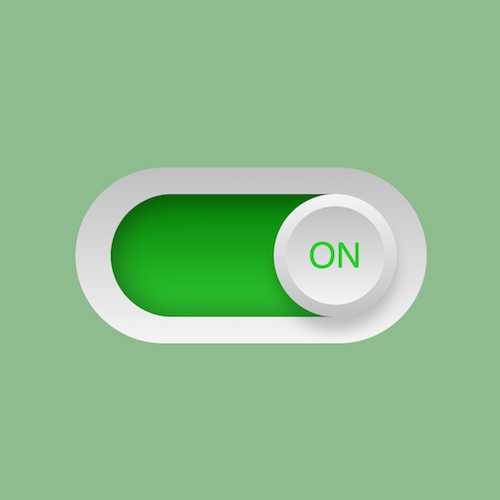
按下右侧的“点击预览”按钮在当前页面预览,点击链接全屏预览。
https://codepen.io/zhang-ou/pen/zjoOgX
此视频是可以交互的,你可以随时暂停视频,编辑视频中的代码。
请用 chrome, safari, edge 打开观看。
请从 github 下载。
https://github.com/comehope/front-end-daily-challenges/tree/master/005-sleek-sliding-toggle-checkbox
定义 dom,是嵌套了3层的容器:
<div class="checkbox">
    <div class="inner">
        <div class="toggle"></div>
    </div>
</div>
居中显示:
html,
body,
.checkbox,
.checkbox .inner,
.checkbox .inner .toggle {
    height: 100%;
    display: flex;
    align-items: center;
    justify-content: center;
}
画出外侧椭圆:
.checkbox {
    width: 10em;
    height: 5em;
    background: linear-gradient(silver, whitesmoke);
    border-radius: 2.5em;
    font-size: 40px;
}
画出内侧椭圆:
.checkbox .inner {
    width: 8em;
    height: 3.5em;
    background: linear-gradient(dimgray, silver);
    border-radius: 2em;
    box-shadow: inset 0 0 1.5em rgba(0, 0, 0, 0.5);
}
画出圆形按钮:
.checkbox .inner .toggle {
    width: 3.5em;
    height: 3.5em;
    background: linear-gradient(to top, silver, whitesmoke);
    border-radius: 50%;
    box-shadow: 0 0.4em 0.6em rgba(0, 0, 0, 0.2);
    position: relative;
    left: -30%;
}
为圆形按钮增加立体效果:
.checkbox .inner .toggle::before {
    content: '';
    position: absolute;
    height: 80%;
    width: 80%;
    background: linear-gradient(whitesmoke, silver);
    border-radius: 50%;
}
在按钮上写上 OFF,行高是根据父元素的高度计算出的:
.checkbox .inner .toggle::before {
    content: 'OFF';
    text-align: center;
    line-height: calc(3.5em * 0.8);
    font-family: sans-serif;
    color: gray;
}
引入jquery:
<script src="http://code.jquery.com/jquery-3.3.1.min.js"></script>编写脚本,在点击按钮时切换样式类:
$(document).ready(function() {
    $('.toggle').click(function() {
        $('.inner').toggleClass('active');
    });
});
设置 active 时控件的样式:
.checkbox .inner.active {
    background: linear-gradient(green, limegreen);
}

.checkbox .inner.active .toggle {
    left: 30%;
}

.checkbox .inner.active .toggle::before {
    content: 'ON';
    color: limegreen;
}
最后,为按钮设置缓动时间,实现动画效果
.checkbox .inner .toggle {
    transition: 0.5s;
}
大功告成!
原文地址:https://segmentfault.com/a/1190000014638655
标签:pre oop alc 交互 ext rgba 分享图片 UNC 地址
原文地址:https://www.cnblogs.com/lalalagq/p/9986037.html