标签:nim str 技术分享 app lin body 效果图 for http
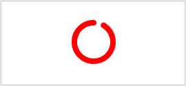
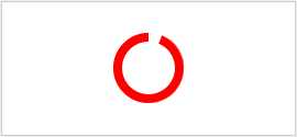
效果图
原理剖析
1.先完成这样一个半圆(这个很简单吧)

2.overflow: hidden;
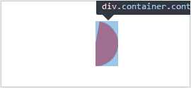
3.在中间定位一个白色的圆形做遮挡

4.完成另一半

5.使用animate配合时间完成衔接
源码
<!DOCTYPE html>
<html>
<head>
    <meta charset="UTF-8">
    <title>环形进度条</title>
    <style>
        .wrapper {
            position: absolute;
            top: 0;
            right: 0;
            bottom: 0;
            left: 0;
            width: 4em;
            height: 4em;
            margin: auto;
        }
        .container {
            position: absolute;
            top: 0;
            bottom: 0;
            width: 2em;
            overflow: hidden;
        }
        .halfCir {
            width: 2em;
            height: 4em;
            background: red;
        }
        .container1 {
            left: 2em;
        }
        .container1 .halfCir {
            left: 0;
            border-radius: 0 4em 4em 0;
            transform-origin: 0 50%;
            animation: halfCir1 4s infinite linear;
        }
        .container2 {
            left: 0;
        }
        .container2 .halfCir {
            border-radius: 4em 0 0 4em;
            transform-origin: 2em 2em;
            animation: halfCir2 4s infinite linear;
        }
        @keyframes halfCir1 {
            50%, 100% {
                transform: rotateZ(180deg);
            }
        }
        @keyframes halfCir2 {
            0%, 50% {
                transform: rotateZ(0);
            }
            100% {
                transform: rotateZ(180deg);
            }
        }
        .wrapper::after {
            position: absolute;
            top: 0.5em;
            left: 0.5em;
            width: 3em;
            height: 3em;
            background: #fff;
            border-radius: 50%;
            content: "";
        }
        .cir {
            position: absolute;
            top: 0;
            right: 0;
            left: 0;
            width: 0.5em;
            height: 0.5em;
            margin: auto;
            background: red;
            border-radius: 50%;
        }
        .cir2 {
            transform-origin: 50% 2em;
            animation: cir2 4s infinite linear;
        }
        @keyframes cir2 {
            100% {
                transform: rotateZ(360deg);
            }
        }
    </style>
</head>
<body>
    <div class="wrapper">
        <div class="container container1">
            <div class="halfCir"></div>
        </div>
        <div class="container container2">
            <div class="halfCir"></div>
        </div>
        <div class="cir cir1"></div>
        <div class="cir cir2"></div>
    </div>
</body>
</html>
标签:nim str 技术分享 app lin body 效果图 for http
原文地址:https://www.cnblogs.com/linxian95/p/10141653.html