标签:现在 文档 abs html com bsp ike auto 浮动
实现一侧定宽,一侧自适应的布局的方法a 、b
a、利用左侧元素浮动,或者绝对定位的方式使其脱离常规文档流
1、方法一:利用float和margin来实现
css
<style>
.father{border:1px solid #444;overflow:hidden;}
.father img{width:60px;height:64px;float:left}
.father p{margin-left:70px;padding-right:20px;}
</style>
html
<div class="father">
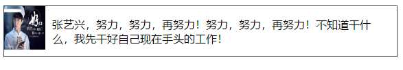
<img src="https://gss3.bdstatic.com/-Po3dSag_xI4khGkpoWK1HF6hhy/baike/c0%3Dbaike150%2C5%2C5%2C150%2C50/sign=e8e9a996dac451dae2fb04b9d7943903/b219ebc4b74543a9711acb0419178a82b80114f0.jpg" >
<p>张艺兴,努力,努力,再努力!努力,努力,再努力!不知道干什么,我先干好自己现在手头的工作!</p>
</div>
浏览器(591 x 806)效果图:
2、方法二:利用定位position:absolute和margin来实现
css
<style>
.container{border:2px solid red;position:relative;height:500px;}
.left{width:200px;height:200px;background:pink;position:absolute;}
.right{height:200px;background:#333;margin-left:200px;}
</style>
html
<div class="container">
<div class="left"></div>
<div class="right"></div>
</div>
b、利用float BFC(块级格式化上下文)BFC就是一个相对独立的布局环境,它内部元素的布局不受外面布局的影响
3.方法三:
css
<style>
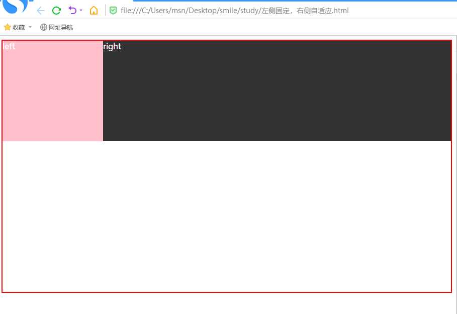
.container{border:2px solid red;height:500px;color:#fff;}
.left{width:200px;height:200px;background:pink;float:left;}
.right{height:200px;background:#333; /*overflow: auto;display:flex;*/ }
</style>
html
<div class="container">
<div class="left">left</div>
<div class="right">right</div>
</div>
2、3浏览器效果图:
标签:现在 文档 abs html com bsp ike auto 浮动
原文地址:https://www.cnblogs.com/studyh5/p/10142196.html