标签:复杂 display 符号 result eve 颜色 图片 gradient text
title: HTML5与CSS3权威指南之CSS3学习记录
toc: true
date: 2018-10-14 00:06:09
学习资料——《HTML5与CSS3权威指南》(第3版)
官方网站:
书中所有代码下载链接:
链接:http://pan.baidu.com/s/1c0oGMn2 密码:f7zt
[att=val]选择器——选择属性att值为val的元素[att*=val]选择器——选择属性att值包含val的元素[att^=val]选择器——选择属性att值以val开头的元素[att$=val]选择器——选择属性att值以val结尾的元素root选择器——文档的根元素,HTML中即为html元素not选择器——对除了:not()内的其他元素使用样式empty选择器——当元素内内容为空白时使用样式target选择器——当一个元素的id被其他元素用来跳转时,跳转后对跳转到的那个元素使用样式
first-child选择器last-child选择器nth-child选择器——nth-child(odd)、nth-child(even)、nth-child(3)nth-last-child选择器
nth-child的问题:h2:nth-child(add)指的是如果一个元素是其父元素的第奇数个子元素,且这个元素是h2,则应用样式。
因此需要一个对第奇数个h2子元素应用样式的选择器:
nth-of-type——例如h2:nth-of-type(odd),参数还可以设置为可循环的an+b的形式:h2:nth-of-type(4n+1)nth-last-of-type
only-child——当父元素只有一个子元素时,对子元素使用样式,等价于:nth-child(1):nth-last-child(1)only-of-type——等价于:nth-of-type(1):nth-last-of-type(1)
| 选择器 | Firefox | Safari | Opera | IE | Chrome |
|---|---|---|---|---|---|
| E:hover | √ | √ | √ | √ | √ |
| E:active | √ | √ | √ | x | √ |
| E:focus | √ | √ | √ | √ | √ |
| E:enable | √ | √ | √ | x | √ |
| E:disable | √ | √ | √ | x | √ |
| E:read-only | √ | √ | √ | x | √ |
| E:read-write | √ | √ | √ | x | √ |
| E:checked | √ | √ | √ | x | √ |
| E:selection | √ | √ | √ | x | √ |
| E:default | √ | x | √ | x | x |
| E:indeterminate | √ | x | √ | x | x |
| E:invalid | √ | √ | √ | x | √ |
| E:valid | √ | √ | √ | x | √ |
| E:required | √ | √ | √ | x | √ |
| E:optional | √ | √ | √ | x | √ |
| E:in-range | √ | √ | √ | x | √ |
| E:out-of-range | √ | √ | √ | x | √ |
E:hover
E:active——被激活(鼠标按下还未松开)时使用样式
E:focus——获得光标焦点时
E:enabled
E:disabled
E:read-only——处于只读状态是应用样式
E:read-write——处于非只读状态是应用样式
E:checked——radio或checkbox处于选取状态时应用样式
E:default——对页面打开时默认处于选取状态的单选框或复选框应用样式,需要注意的是,即使用户将其设置为非选取状态,E:default样式对其仍然有效
E:indeterminate——当页面打开时,一组单选框中没有一个单选框时整组单选框的样式,当有任意一个单选框被选中时,该样式被取消
E::selection——处于选中状态时的样式
在HTML5中input元素新增了两个属性:required和pattern,其中
required属性是一个布尔属性,规定必需在提交表单之前填写输入字段
pattern 属性规定一个用于验证 input 元素的值的正则表达式。
E:required——当一个input/select/textarea元素允许使用required属性且指定了required属性时应用样式
E:optional——当一个input/select/textarea元素允许使用required属性且未指定required属性时应用样式
E:invalid——当一个元素设置了required和pattern且其内容不符合这两个属性的要求时应用样式
E:valid——当一个元素设置了required和pattern且其内容符合这两个属性的要求时应用样式
input元素可以设置max和min
E:in-range——元素的值在max和min之间
E:out-of-rang——元素的值不在max和min之间
例如:
<!-- 其他代码 -->
<style type="text/css">
  input[type="number"]:in-range{
    background-color: white;
  }
  input[type="number"]:out-of-range{
    background-color: red;
  }
</style>
<!-- 其他代码 -->
<form>
  请输入1到100之间的数值:<input type=number min=1 max=100>
</form>
<!-- 其他代码 -->使用content指定内容:
h2:before {
  content: ‘COLUMN‘;
  color: white;
  background-color: orange;
  /* 其他代码 */
}其中content还可以设置为:
noneurl(xxx.png)——图片attr(alt)——设置图片的alt样式counter(计数器名, 编号种类),同时在原元素中使用counter-increment: 计数器名来增加计数,其中编号种类是可选项open-quote和close-quote——设置开头和结尾文字符号,并在原元素中设置quotes来设置具体是什么符号。text-shadow: length length length color
四个属性值分别为:
可以指定多个阴影,用逗号隔开:
div {
  text-shadow: 10px 10px black, 20px 25px red, 30px 40px blue;
}设置文字自动换行
| 值 | 描述 |
|---|---|
| normal | 使用浏览器默认的换行规则。 |
| break-all | 允许在单词内换行。 |
| keep-all | 只能在半角空格或连字符处换行。 |
word-wrap属性允许长的内容可以自动换行。
| 值 | 描述 |
|---|---|
| normal | 只在允许的断字点换行(浏览器保持默认处理)。 |
| break-word | 在长单词或 URL 地址内部进行换行。 |
CSS3新增了Web Fonts功能,使得网页可以使用服务器端字体。
@font-face {
  font-family: myFont;
  src: url(‘Sansation_Light.ttf‘),
       url(‘Sansation_Light.eot‘);
}

div {
  font-family: myFont;
}
同时可以设置斜体或粗体字体:
@font-face {
  font-family: myFont;
  src: url(‘Fontin_Sans_R_45b.otf‘);
}

@font-face {
  font-family: myFont;
  font-style: italic;
  src: url(‘Fontin_Sans_I_45b.otf‘);
}

@font-face {
  font-family: myFirstFont;
  font-weight: bold;
  src: url(‘Fontin_Sans_B_45b.otf‘);
}

@font-face {
  font-family: myFirstFont;
  font-weight: bold;
  font-style: italic;
  src: url(‘Fontin_Sans_BI_45b.otf‘);
}还可以使用src: local(‘Arial‘)来设置客户端本地字体。
可以元素中设置font-size-adjust来使得修改字体种类时保持文字大小不变。
当然也可以使用font-size。
当文本溢出包含它的元素,应该发生什么。
| 值 | 描述 |
|---|---|
| clip | 修剪文本。 |
| ellipsis | 显示省略符号来代表被修剪的文本。 |
| string | 使用给定的字符串来代表被修剪的文本。 |
box-shadow: length length length color
四个属性值分别为:
还可以创建盒内阴影,例如:
box-shadow: inset 0 0 5px 5px #888
其中第二个5px为展开半径。
| 值 | 说明 |
|---|---|
| content-box | 标准盒模型 |
| border-box | IE盒模型 |
| inherit | 指定box-sizing属性的值,应该从父元素继承 |
background-clip属性指定背景绘制区域。
| 值 | 说明 |
|---|---|
| border-box | 默认值。背景绘制在边框方框内(剪切成边框方框)。 |
| padding-box | 背景绘制在衬距方框内(剪切成衬距方框)。 |
| content-box | 背景绘制在内容方框内(剪切成内容方框)。 |
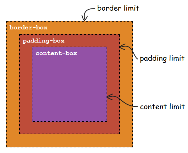
背景图片的绘制起点,默认为padding的左上角。
| 值 | 描述 |
|---|---|
| padding-box | 背景图像填充框的相对位置 |
| border-box | 背景图像边界框的相对位置 |
| content-box | 背景图像的相对位置的内容框 |
指定背景图片大小。
background-size: length|percentage|cover|contain;
| 值 | 描述 |
|---|---|
| length | 设置背景图片高度和宽度。第一个值设置宽度,第二个值设置的高度。如果只给出一个值,第二个是设置为 auto(自动) |
| percentage | 将计算相对于背景定位区域的百分比。第一个值设置宽度,第二个值设置的高度。如果只给出一个值,第二个是设置为"auto(自动)" |
| cover | 此时会保持图像的纵横比并将图像缩放成将完全覆盖背景定位区域的最小大小。 |
| contain | 此时会保持图像的纵横比并将图像缩放成将适合背景定位区域的最大大小。 |
repeat-x:背景图像在横向上平铺
repeat-y:背景图像在纵向上平铺
repeat:背景图像在横向和纵向平铺
no-repeat:背景图像不平铺
round:背景图像自动缩放直到适应且填充满整个容器。(CSS3)
space:背景图像以相同的间距平铺且填充满整个容器或某个方向。(CSS3)

http://www.runoob.com/css3/css3-gradients.html
border-radius: 20px;——四个角半径都为20px
border-radius: 40px 20px;——左上角和右下角半径为40px,右上角和左下角半径为20px
更多的看这里
border-image: source slice width outset repeat|initial|inherit
border-image是速记属性,用于设置border-image-source、border-image-slice、border-image-width、border-image-outset、border-image-repeat的值。
border-image-source属性指定要使用的图像
border-image-slice属性指定图像的边界向内偏移
border-image-width属性指定图像边界的宽度
border-image-outset用于指定在边框外部绘制 border-image-area 的量
border-image-repeat属性用于图像边界是否应重复(repeated)、拉伸(stretched)或铺满(rounded)
具体取值方式可以看这个。
transform: scale(0.5);水平垂直都缩小为原来的一半transform: scale(0.5, 2);水平缩小为原来的一半,垂直放大为原来的两倍transform: skew(30deg);只在水平方向上倾斜30度,垂直方向不倾斜transform: skew(30deg, 40deg);水平倾斜30度,垂直倾斜40度transform: translate(50px);只在水平方向上移动50px,垂直方向不移动transform: translate(50px, 60px);水平移动50px,垂直移动60pxtransform: rotate(45deg);上述四种方法还可以组合使用,如:
transform: translate(150px, 200px) rotate(45deg) scale(1.5);
在上边这些方法后加上X、Y、Z
如rotateZ(45deg)
或加上3d
如scale3d(0.8, 0.5, 1);
使用3D动画可以触发GPU加速来提高性能
使用如transform: matrix(1, 0, 0, 1, tx, ty);的形式来指定2d变形矩阵
使用如transform: matrix3d(0.8, 0, 0, 0, 0, 0.5, 0, 0, 0, 0, 1, 0, 0, 0, 0, 1);的形式来指定3d变形矩阵
变形矩阵上课有学过,这里不再赘述
transition功能支持从一个属性值平滑过渡到另一个属性值
animation功能支持通过关键帧的指定来在页面上产生更复杂的动画效果
transition: property duration timing-function delay
其中delay是可选的
例子:
<!DOCTYPE html>
<html>
  <head>
    <meta charset="utf-8">
    <title>transition示例</title>
    <style type="text/css">
      div {
        background-color: #ff0;
        transition: background-color 1s linear;
      }
      div:hover {
        background-color: #0ff;
      }
    </style>
  </head>
  <body>
    <div>
      示例文字
    </div>
  </body>
</html>其中transition: background-color 1s linear;可以写成
div {
  transition-property: background-color;
    transition-duration: 1s;
  transition-timing-function: linear;
}
也可以使用delay属性:
div {
  transition: background-color 1s linear 2s;
}
// 或
div {
  transition-property: background-color;
    transition-duration: 1s;
  transition-timing-function: linear;
  transition-delay: 2s;
}
过渡多个属性:
<!DOCTYPE html>
<html>
  <head>
    <meta charset="utf-8">
    <title>transition示例</title>
    <style type="text/css">
      img {
        position: absolute;
        top: 70px;
        left: 0;

        transform: rotate(0deg);
        transition: left 1s linear, transform 1s linear;
      }
      div:hover img {
        left: 30px;
        transform: rotate(720deg);
      }
    </style>
  </head>
  <body>
    <div>
      <img src="wxy.png" alt="wxy" title="" />
    </div>
  </body>
</html>直接用一个div的无限旋转做例子吧:
<!DOCTYPE html>
<html>
  <head>
    <meta charset="utf-8">
    <title>div无限循环</title>
    <style type="text/css">
      @keyframes rotate {
        from{
          transform: rotate(0deg);
        }
        to {
          transform: rotate(359deg);
        }
      }
      div {
        width: 100px;
        height: 100px;
        background-color: red;
        animation: rotate 3s linear infinite;
      }
    </style>
  </head>
  <body>
    <div>
    </div>
  </body>
</html>在CSS3中,使用column-count属性来使用多栏布局方式。
不同浏览器需要加前缀。
使用多栏布局时需要设定元素中多个栏目相加后的总宽度。
可以使用column-gap属性设置多栏之间的间隔距离(可选)。
可以使用colum-rule属性在栏与栏之间增加一条间隔线(可选)。
div#div1 {
  column-count: 2;
  -moz-column-count: 2;
  -webkit-column-count: 2;
  column-width: 20rem;
  -moz-column-width: 20rem;
  -webkit-column-width: 20rem;
  // 下边的为可选属性
  column-gap: 3rem;
  -moz-column-gap: 3rem;
  -webkit-column-gap: 3rem;
  column-rule: 1px solid red;
  -moz-column-rule: 1px solid red;
  -webkit-column-rule: 1px solid red;
}在CSS3中,通过box属性来使用盒布局。
不同浏览器需要加前缀。
具体总结可以看这里。
例如三栏布局:
#container {
  display: flex;
}
#left-sidebar {
  width: 200px;
  background-color: red;
}
#contents {
  flex: 1;
  background-color: green;
}
#right-sidebar {
  width: 300px;
  background-color: blue;
}使用order改变顺序:
#container {
  display: flex;
}
#left-sidebar {
  order: 3;
  width: 200px;
  background-color: red;
}
#contents {
  order: 1;
  flex: 1;
  background-color: green;
}
#right-sidebar {
  order: 2;
  width: 300px;
  background-color: blue;
}
使用flex-direction改变元素的排列方向
可指定值:
#container {
  display: flex;
  flex-direction: column;
}
#left-sidebar {
  order: 3;
  width: 200px;
  background-color: red;
}
#contents {
  order: 1;
  flex: 1;
  background-color: green;
}
#right-sidebar {
  order: 2;
  width: 300px;
  background-color: blue;
}对多个元素使用flex属性:
// text-a 和 text-b 的高度都自动扩大且高度保持相等, text-c则仍保持为元素内容的高度

#container {
  display: flex;
  border: solid 5px black;
  flex-direction: column;
  width: 500px;
  height: 300px;
}
#text-a {
  flex: 1;
  background-color: red;
}
#text-b {
  flex: 1;
  background-color: green;
}
#text-c {
  background-color: blue;
}实际上flex值是先将各个子div按内容大小分配完高度后,将剩余剩余高度按照flex值分配给各个子div。
可以使用flex-grow属性来指定元素宽度或高度,分配方式与flex相同
使用flex-wrap样式属性来指定单行布局或多行布局
弹性盒布局

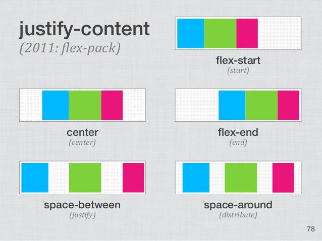
使用jusify-content指定水平方向上如何布局子元素外的空白部分
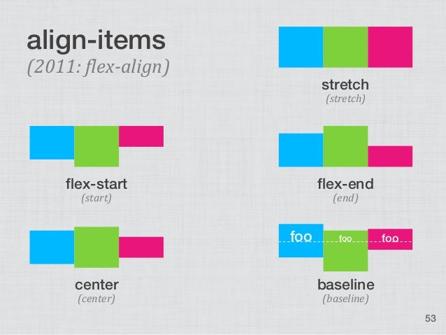
使用align-items指定垂直方向上如何布局子元素以外的空白部分
align-self与align-items类似,区别在于align-items指定所有子元素的对齐方式,而align-self单独指定某个子元素的对齐方式
align-content

使用该方法来自动计算元素的宽度等数值类型的样式属性值
#foo {
width: calc(50% - 100px);
background-color: green;
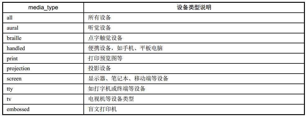
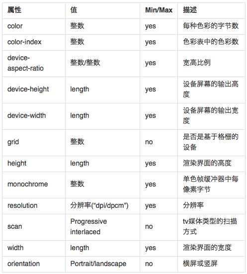
}@media 设备类型 and ( 设备特性 ) { 样式代码 }
initial
filter
标签:复杂 display 符号 result eve 颜色 图片 gradient text
原文地址:https://www.cnblogs.com/zmj97/p/10161675.html