标签:form image color note after 分享 lock bind ati
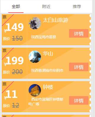
先看效果:
wxml:
<van-tab title="全部">
          <view class="coupon-list">
            <block wx:for="{{getmerchantsList}}" wx:key="{{item.id}}" data-id="{{item.id}}">
              <view class="item stamp stamp01 " data-id="{{item.id}}" bindtap="GetCoupon">
                <!-- 左侧 -->
                <view class="float-li t1">
                  <view class="coupon-left">
                    <view class="t5">票</view>
                    <view class="t t1">¥</view>
                    <view class="t t2">{{item.sell_price}}</view>
                    <view class="t t11">原价</view>
                    <view class="t t21">{{item.origin_price}}</view>
                  </view>
                </view>
                <!-- 右侧 -->
                <view class="float-li-rig">
                  <view class="coupon-rig">
                    <view class="">
                      <image src=‘{{item.picurl}}‘ class=‘img‘></image>
                    </view>
                    <view class="title"> {{item.name}}</view>
                    <view class="address">{{item.address}}</view>
                    <view class="t3">
                      <text>详情</text>
                    </view>
                  </view>
                </view>
                <i></i>
              </view>
            </block>
          </view>

        </van-tab>
wxss:
/* 修改卡片样式 */

.coupon-list {
  width: 710rpx;
  margin: 10rpx auto;
}

.coupon-list .item {
  width: 710rpx;
  height: 250rpx;
  margin-bottom: 20rpx;
  /* border: 1px dashed #666; */
  box-sizing: border-box;
  background: linear-gradient(135deg, #ffb543 10%, deeppink 10%, deeppink 10.5%, #ffb543 10.5%);


  /* 画圆点 */
    position: relative;
}


 /* 画卡片右边圆点开始 */
.item:after {   /*.item:before,item:after{}  这是卡片两边都是锯齿形,我这里只要右边是锯齿形*/
    content: ‘ ‘;
    width: 0;
    height: 100%;
    /* 绝对定位进行偏移 */
    position: absolute;
    top: 0;
}

.item:before {
    /* 圆点型的border */
    border-right: 10px dotted white;
    /* 偏移一个半径,让圆点的一半覆盖div */
    left: -5px;
}

.item:after {
    /* 圆点型的border */
    border-left: 10px dotted white;
    /* 偏移一个半径,让圆点的一半覆盖div */
    right: -5px;
}

 /* 画卡片右边圆点结束 */

.coupon-list .item .float-li {
  width: 200rpx;
  height: 100%;
  border-right: 2rpx dashed rgba(255, 255, 255, 0.3);
  float: left;
}

.coupon-list .item .float-li-rig {
  width: 420rpx;
  padding-right: 20rpx;
  height: 100%;
  color: #fff;
  float: right;
}

.coupon-left {
  position: relative;
}

.coupon-left .t {
  position: absolute;
  color: #fff;
}

.coupon-left .t1 {
  left: 10rpx;
  top: 110rpx;
}

.coupon-left .t2 {
  left: 30rpx;
  top: 50rpx;
  font-size: 80rpx;
  font-weight: bold;
}

.coupon-left .t3 {
  left: 220rpx;
  top: 50rpx;
  width: 200rpx;
  font-size: 30rpx;
}

.coupon-left .t4 {
  left: 10rpx;
  top: 180rpx;
}

.coupon-left .t5 {
  margin-left: 5rpx;
  font-size: 35rpx;
  opacity: 0.6;
}

.coupon-left .t11 {
  left: 10rpx;
  top: 176rpx;
  font-size: 30rpx;
}

.coupon-left .t21 {
  left: 80rpx;
  top: 160rpx;
  font-size: 50rpx;
  text-decoration: line-through;
  color: gray;
}

.coupon-rig .t1 {
  font-size: 40rpx;
  padding: 30rpx 0 10rpx 0;
}

.coupon-rig .t3 {
  float: right;
  margin-top: 60rpx;
}

.coupon-rig .t3 text {
  /* background: #fff; color: #333; border-radius: 7rpx; padding: 5rpx 40rpx */
  background-color: rgb(252, 126, 67);
  color: white;
  border-radius: 7rpx;
  background: bg_red;
  padding: 10rpx 40rpx;
}

.coupon-rig .img {
  width: 100rpx;
  height: 100rpx;
  border-radius: 98rpx;
  margin-top: 5rpx;
  position: absolute;
  left: 30%;
}

.coupon-rig .title {
  margin-top: 20rpx;
  margin-left: 60rpx;
  font-size: 40rpx;
}

.note {
  background: #faeab7;
}

.coupon-rig .address {
  font-size: 30rpx;
  text-indent: 25rpx;
  text-align: left;
  position: absolute;
  left: 30%;
  bottom: 50rpx;
  width: 300rpx;
}

.note {
  background: #faeab7;
}

.stamp {
  width: 700rpx;
  height: 250rpx;
  margin-bottom: 50rpx;
  position: relative;
  overflow: hidden;
}

.stamp i {
  position: absolute;
  left: 20%;
  top: 90rpx;
  height: 500rpx;
  width: 700rpx;
  background-color: rgba(255, 255, 255, 0.15);
  transform: rotate(-30deg);
}

.stamp01 {
  background: radial-gradient(rgba(0, 0, 0, 0) 0, rgba(0, 0, 0, 0) 30rpx, #ffb543 30rpx);
  background-size: 10rpx 10rpx;
  background-position: 9rpx 3rpx;
  background: #ffb543;
}

.stamp02 {
  background: radial-gradient(rgba(0, 0, 0, 0) 0, rgba(0, 0, 0, 0) 30rpx, #d24161 30rpx);
  background-size: 10rpx 10rpx;
  background-position: 9rpx 3rpx;
  background: #d24161;
}

.stamp03 {
  background: radial-gradient(rgba(0, 0, 0, 0) 0, rgba(0, 0, 0, 0) 30rpx, #d24161 30rpx);
  background-size: 10rpx 10rpx;
  background-position: 9rpx 3rpx;
  background: #7eab1e;
}

.stamp04 {
  background: radial-gradient(rgba(0, 0, 0, 0) 0, rgba(0, 0, 0, 0) 30rpx, #d24161 30rpx);
  background-size: 10rpx 10rpx;
  background-position: 9rpx 3rpx;
  background: #50add3;
}

.stamp05 {
  background: radial-gradient(rgba(0, 0, 0, 0) 0, rgba(0, 0, 0, 0) 30rpx, #d24161 30rpx);
  background-size: 10rpx 10rpx;
  background-position: 9rpx 3rpx;
  background: #f0229b;
}

.stamp05 {
  background: radial-gradient(rgba(0, 0, 0, 0) 0, rgba(0, 0, 0, 0) 30rpx, #d24161 30rpx);
  background-size: 10rpx 10rpx;
  background-position: 9rpx 3rpx;
  background: #f0229b;
}
标签:form image color note after 分享 lock bind ati
原文地址:https://www.cnblogs.com/bin521/p/10195689.html