标签:gre style .com command rap 功能 help cells 不用
原理是利用边框实现,好处是不用加载图片,节省流量;坏处就是会有很长一段css样式
基本:1.设置width,height为0 ,然后设置一个border-width
利用border可以画很多有趣的图
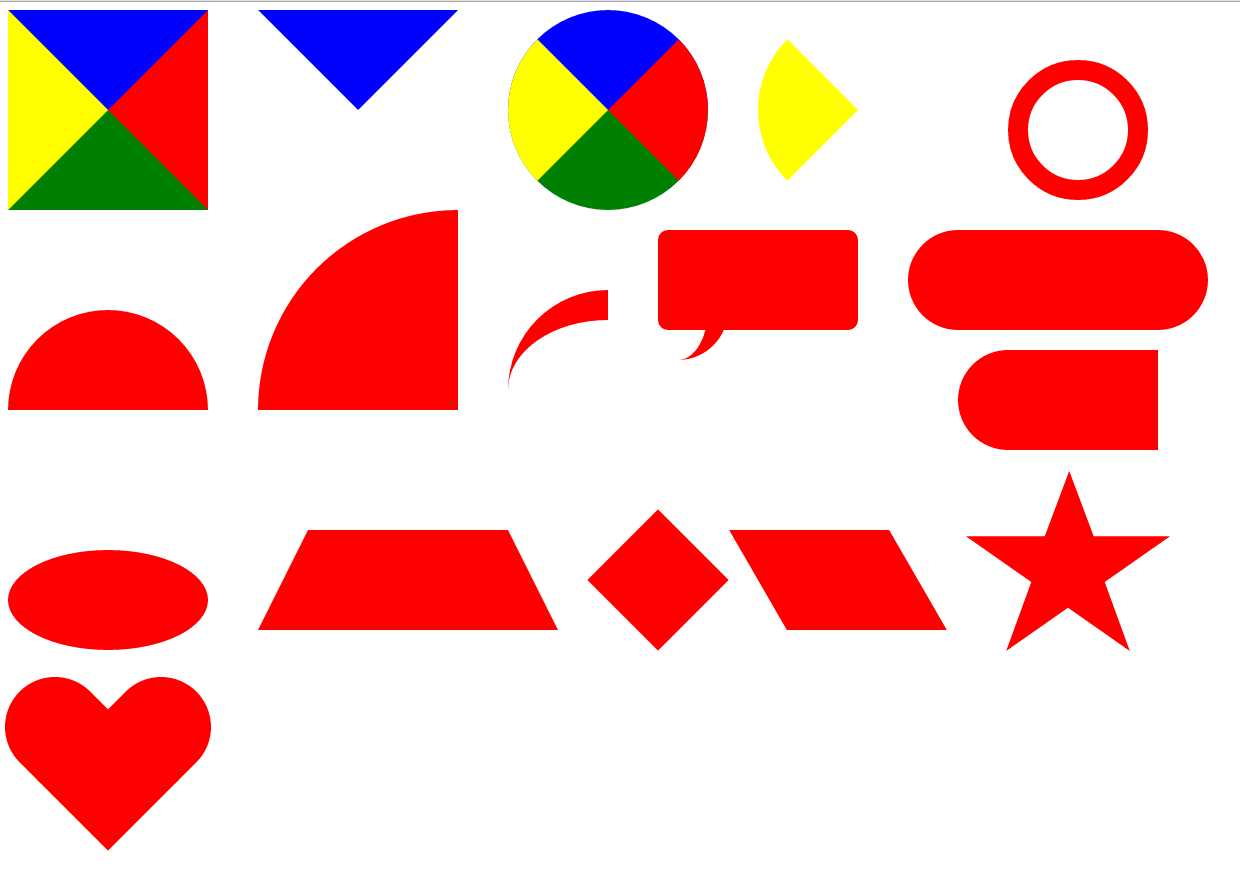
1.正方形
|
1
2
3
4
5
6
7
|
#square{ width:0px; height:0px; border-width: 100px; border-style: solid; border-color: blue red green yellow;} |
2.三角形:设置其他边颜色为透明值transparent
|
1
2
3
4
5
6
7
|
#triangle{ width: 0px; height: 0px; border-width: 100px; border-style: solid; border-color: blue transparent transparent transparent;} |
3.圆形:设置圆角属性border-radius
|
1
2
3
4
5
6
7
8
|
#circle{ width:0px; height:0px; border-width: 100px; border-style: solid; border-color: blue red green yellow; border-radius: 100px;} |
4.扇形:同理设置透明色
|
1
2
3
4
5
6
7
8
|
#fan{ width: 0px; height: 0px; border-width: 100px; border-style: solid; border-color: transparent transparent transparent yellow; border-radius: 100px;} |
5.同心圆:在圆的基础上添加width/height值
|
1
2
3
4
5
6
|
#circle-circle{ width: 200px; height: 200px; border: 50px solid red; border-radius: 200px;} |
5.半圆:利用border-radius分别设置左上角,右上角,右下角,左下角的值
|
1
2
3
4
5
6
7
8
|
#circle-half{ width: 200px; height: 100px; background-color: red; /*border-color: red;*/ /*border-style: solid;*/ border-radius: 100px 100px 0 0;} |
6.四分之一圆:同半圆原理
|
1
2
3
4
5
6
|
#circle-double-half{ width: 200px; height: 200px; background-color: red; border-radius: 200px 0 0 0;} |
7.小尾巴 :主要是在半圆的基础上添加某一侧的Border,border-top,border-right,border-left,border-bottom,大家阔以动手试一试
|
1
2
3
4
5
6
7
8
|
#tail{ width: 100px; height: 100px; border-radius: 100px 0 0 0; border-top:30px solid red; /*border-radius: 0 100px 0 0; border-top: 30px solid red;*/} |
8.提示框:用到了:after伪类去实现小尾巴的功能
|
1
2
3
4
5
6
7
8
9
10
11
12
13
14
15
16
17
|
#pop{ margin-top: 20px; width: 400px; height: 200px; border-radius: 20px; background-color: red; position: relative;}#pop:after{ content: ""; height: 100px; width:100px; border-radius: 0 0 200px 0; border-right: 50px solid red; position: absolute; top:180px;} |
9.椭圆:这里用到border-radius: 100px / 50px,其中"/"前面的表示水平半径(其值为width/2),后面的表示垂直半径(其值为height/2).
|
1
2
3
4
5
6
7
|
#ellipse{ margin-top: 20px; width: 200px; height: 100px; border-radius: 100px/50px; background-color: red;} |
10.梯形:主要是理解Border属性,也就是第一幅图,梯形就比较容易画了
|
1
2
3
4
5
6
7
8
|
#trapezium { height: 0; width: 200px; border-bottom: 100px solid red; border-left: 50px solid transparent; border-right: 50px solid transparent;} |
11.菱形:主要是用到旋转transform,不过要考虑到浏览器内核不同,要实现兼容,我这里就省略了
|
1
2
3
4
5
6
|
#diamond { width: 100px; height: 100px; background-color: red; transform:rotate(-45deg);} |
12.平行四边形:也是主要用到transform,但菱形用的是skew,倾斜
|
1
2
3
4
5
6
|
#parallelogram { width:160px; height: 100px; background-color: red; transform:skew(30deg);} |
13.五角星:主要是画三个三角形,通过旋转,然后拼接成一个五角星,各种画法自己去体会.....(可以通过不同的三角形去拼接,但原理是一样的)
|
1
2
3
4
5
6
7
8
9
10
11
12
13
14
15
16
17
18
19
20
21
22
23
24
25
26
27
28
29
30
31
32
33
|
#star{ width: 0; height: 0; color: red; position: relative; border-left: 100px solid transparent; border-right: 100px solid transparent; border-bottom: 70px solid red; transform:rotate(35deg);}#star:before{ content: ‘‘; width: 0; height: 0; position: absolute; border-bottom: 80px solid red; border-left: 30px solid transparent; border-right: 30px solid transparent; top:-50px; left:-60px; transform:rotate(-35deg);}#star:after{ content: ""; width: 0px; height: 0px; position: absolute; border-top: 70px solid red; border-left: 100px solid transparent; border-right: 100px solid transparent; left:-100px; transform:rotate(110deg);} |
14:爱心:用菱形和胶囊拼接一个爱心形
|
1
2
3
4
5
6
7
8
9
10
11
12
13
14
15
16
17
18
19
20
21
22
23
24
25
26
27
|
#love{ position: relative; width: 100px; height: 100px; background-color: red; transform:rotate(45deg);}#love:before{ position: absolute; left: -75px; content: ""; width: 80px; height: 100px; background: red; border-radius: 50px 0 0 50px;}#love:after{ position: absolute; left: 10px; top:-85px; content: ""; width: 80px; height: 100px; background: red; border-radius:0 50px 50px 0; transform:rotate(-90deg);} |
标签:gre style .com command rap 功能 help cells 不用
原文地址:https://www.cnblogs.com/7qin/p/10226883.html