标签:index color css 代码 1.0 height no-repeat style width
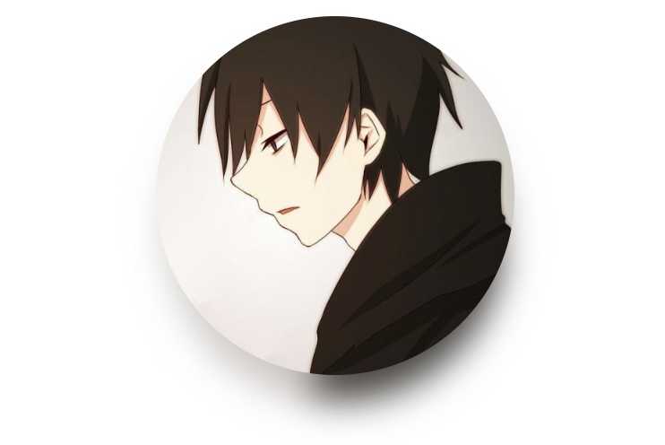
通常用css生成单色或者同色系的的阴影(box-shadow),其实可以通过巧妙的利用 filter: blur 模糊滤镜,可以生成渐变色或者说是颜色丰富的阴影效果,如图:
原理:
利用伪元素,生成一个与原图一样大小的新图叠加在原图之下,然后利用滤镜模糊 filter: blur() 配合其他的亮度/对比度,透明度等滤镜,制作出一个虚幻的影子,伪装成原图的阴影效果。
filter: blur(10px) brightness(80%) opacity(.8)
<!DOCTYPE html>
<html lang="en">
  <head>
    <meta charset="UTF-8" />
    <meta name="viewport" content="width=device-width, initial-scale=1.0" />
    <meta http-equiv="X-UA-Compatible" content="ie=edge" />
    <title>Document</title>
    <style>
    .container {
        width: 200px;
        margin: 20px auto;
    }
    .avator {
        position: relative;
        width: 200px;
        height: 200px;
        border-radius: 50%;
        background: url(http://img0.imgtn.bdimg.com/it/u=3743150250,644096170&fm=26&gp=0.jpg) no-repeat center center;
        background-size: 100% 100%;
    }

    .avator::after {
        content: "";
        position: absolute;
        top: 10%;
        left: 0%;
        width: 100%;
        height: 100%;
        background: inherit;
        background-size: 100% 100%;
        border-radius: 50%;
        transform: scale(.95);
        filter: blur(10px) brightness(80%) opacity(.8);
        z-index: -1;
    }
    </style>
  </head>
  <body>
    <div class="container">
        <div class="avator"></div>
    </div>
  </body>
</html>
标签:index color css 代码 1.0 height no-repeat style width
原文地址:https://www.cnblogs.com/pjl43/p/10264390.html