标签:document 方法 cti 注意 query text ima 效果 asc
在移动端如何实现一个正方形,我们知道margin和padding的百分比值是相对父元素的宽度,利用这一特性我们可以实现正方形
使用javascript/jquery
<style>
     .wrap {
     width: 100%;
     background: thistle;
   }
     .child {
     background: teal;
     width: 20%;
   }
</style>
<body>
     <div class="wrap">
           <div class="child">111</div>
     </div>
</body>
<script src="wjs/lib/jquery/jquery.min.js"></script>
<script type="text/javascript">
    $(document).ready(function(){
        $(window).on(‘resize‘, function () {
            $(‘child‘).css(‘height‘,$(‘li‘).css(‘width‘));
        }).trigger(‘resize‘);
    })
</script>
效果图:
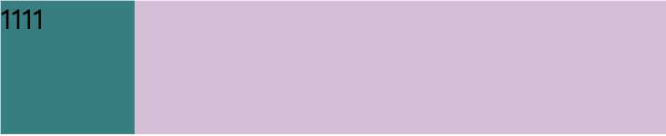
将元素垂直方向的一个padding,也就是padding-bottom或者padding-top设置为和宽度相同的百分比,将盒子撑起来,
但是padding是不包含盒子内容的,所以我们把盒子高度设置为0。
<style>
     .wrap {
     width: 100%;
     background: thistle;
   }
     .child {
     background: teal;
     width: 20%;
     padding-bottom: 20%;
     height: 0;
   }
</style>
<div class="wrap">
     <div class="child">
          1111
     </div>
</div>
效果图:
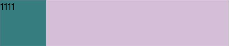
使用 vw/vh 单位,但是需要注意的是vw/vh单位是将当前视口的宽度/高度平均分成100份的长度,并非父级盒子,1vw = 1% viewport width。
<style>
        html,body {
            width: 100%;
            height: 100%;
        }
        .wrap {
            width: 80%;
            background: thistle;
        }
        .child {
            background: teal;
            width: 16vw;
            height: 16vw;
        }
</style>
<body>
    <div class="wrap">
        <div class="child">
            1111
        </div>
    </div>
</body>
效果图:
标签:document 方法 cti 注意 query text ima 效果 asc
原文地址:https://www.cnblogs.com/kunmomo/p/10838458.html