标签:black 多个 last cal height 分割线 上下左右 can 之间
| 名称 | 说明 |
|---|---|
| Canvas | 使用固定坐标绝对定位元素 |
| StackPanel | 在水平或竖直方向放置元素 |
| DockPanel | 根据外部容器边界,自动调整元素 |
| WrapPanel | 在可换行的行中放置元素 |
| Grid | 根据不可见的表格在行和列中排列元素,最常用 |
| UniformGid | 在不可见的相同尺寸的表格中放置元素 |
1、Canvas布局
<Canvas>
<Rectangle Canvas.Left="50" Canvas.Top="50" Width="50" Height="50" Fill="Red" />
<Rectangle Canvas.Left="120" Canvas.Top="50" Width="50" Height="50" Fill="Yellow" />
<Rectangle Canvas.Left="190" Canvas.Top="50" Width="50" Height="50" Fill="Green" />

<Rectangle Canvas.Left="50" Canvas.Top="150" Width="50" Height="50" Fill="Red" Panel.ZIndex="2"/>
<Rectangle Canvas.Left="75" Canvas.Top="170" Width="50" Height="50" Fill="Yellow" Panel.ZIndex="1" />
<Rectangle Canvas.Left="100" Canvas.Top="190" Width="50" Height="50" Fill="Green" Panel.ZIndex="1"/>
</Canvas>
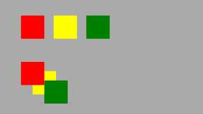
通过 Canvas.Left、Canvas.Top、Canvas.Right、Canvas.Bottom设置控件显示位置,通过Panel.ZIndex设置显示优先层级。
Canvas的强大之处,当然不仅仅只是简单显示。
<Canvas>
    <Canvas.Resources>
        <PathGeometry x:Key="path" Figures="M 10,100 C 35,0 135,0 160,100 180,190 285,200 310,100" />
        <Storyboard x:Key="pathStoryboard">
            <MatrixAnimationUsingPath
                DoesRotateWithTangent="True"
                PathGeometry="{StaticResource path}"
                RepeatBehavior="Forever"
                Storyboard.TargetName="ButtonMatrixTransform"
                Storyboard.TargetProperty="Matrix"
                Duration="0:0:5" />
        </Storyboard>
    </Canvas.Resources>

    <Canvas.Triggers>
        <EventTrigger RoutedEvent="Control.Loaded">
            <BeginStoryboard Storyboard="{StaticResource pathStoryboard}" />
        </EventTrigger>
    </Canvas.Triggers>

    <Path
        Data="{StaticResource path}"
        Stroke="Black"
        StrokeThickness="1" />

    <Ellipse
        Width="20"
        Height="20"
        Fill="Red">
        <Ellipse.RenderTransform>
            <MatrixTransform x:Name="ButtonMatrixTransform" />
        </Ellipse.RenderTransform>
    </Ellipse>
</Canvas>
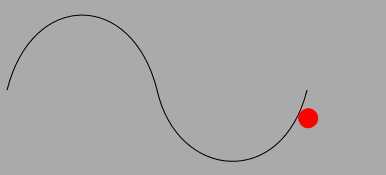
使用Canvas可以让小球沿着path路径运行,若使用其他布局控件,则会出现定位问题。在对显示位置有精确要求的地方,可以考虑使用Canvas布局。比如这种显示报表。
2、StackPanel布局
<StackPanel Orientation="Vertical"> <Rectangle Margin="5" Width="50" Height="50" Fill="Red" /> <Rectangle Margin="5" Width="50" Height="50" Fill="Yellow" /> <Rectangle Margin="5" Width="50" Height="50" Fill="Green" /> <TextBlock Margin="5" Text="Orientation="Vertical"" HorizontalAlignment="Center"></TextBlock> </StackPanel>
<StackPanel Orientation="Horizontal"> <Rectangle Margin="5" Width="50" Height="50" Fill="Red" /> <Rectangle Margin="5" Width="50" Height="50" Fill="Yellow" /> <Rectangle Margin="5" Width="50" Height="50" Fill="Green" /> <TextBlock Margin="5" Text="Orientation="Vertical"" VerticalAlignment="Center"></TextBlock> </StackPanel>
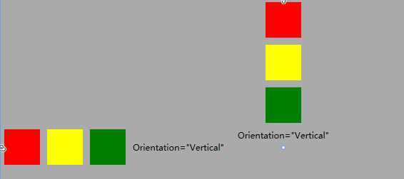
StackPanel面板控件有定义附加属性,通过Orientation可以控制布局是左右还是上下分布,FlowDirection属性可以调整显示左右,即从左至右,或从右至左。
StackPanel内部控件,可以通过VerticalAlignment、HorizontalAlignment、Margin来控制显示位置。
一般使用在布局几个关联性较强的控件之间(个人使用习惯,欢迎指正),如页面顶部导航条中多个图标按钮分布、文本输入时TextBlock(标题)+TextBox(内容)的组合等等。
3、DockPanel布局
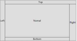
<DockPanel>
    <Button Content="Left" DockPanel.Dock="Left" />
    <Button Content="Top" DockPanel.Dock="Top" />
    <Button Content="Right" DockPanel.Dock="Right" />
    <Button Content="Bottom" DockPanel.Dock="Bottom" />
    <Button Content="Nomal" />
</DockPanel>
<DockPanel LastChildFill="False">
    <Button Content="Left" DockPanel.Dock="Left" />
    <Button Content="Top" DockPanel.Dock="Top" />
    <Button Content="Right" DockPanel.Dock="Right" />
    <Button Content="Bottom" DockPanel.Dock="Bottom" />
    <Button Content="不填充" />
</DockPanel>
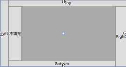
DockPanel通过附加属性DockPanel.Dock控制内容停靠上下左右方向上,最后一个通过LastChildFill控制是否填充剩余空间(默认填充)。
DockPanel在生产用软件中有这个不错的使用场景,类似VS的停靠。对于工业生产软件多个流程模块的调用和隐藏比较适用。
4、WrapPanel布局
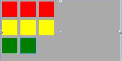
<WrapPanel Orientation="Vertical">
    <Rectangle Margin="5" Width="50" Height="50" Fill="Red" />
    <Rectangle Margin="5" Width="50" Height="50" Fill="Yellow" />
    <Rectangle Margin="5" Width="50" Height="50" Fill="Green" />
    <Rectangle Margin="5" Width="50" Height="50" Fill="Red" />
    <Rectangle Margin="5" Width="50" Height="50" Fill="Yellow" />
    <Rectangle Margin="5" Width="50" Height="50" Fill="Green" />
    <Rectangle Margin="5" Width="50" Height="50" Fill="Red" />
    <Rectangle Margin="5" Width="50" Height="50" Fill="Yellow" />
</WrapPanel>
<WrapPanel>
    <Rectangle Margin="5" Width="50" Height="50" Fill="Red" />
    <Rectangle Margin="5" Width="50" Height="50" Fill="Yellow" />
    <Rectangle Margin="5" Width="50" Height="50" Fill="Green" />
    <Rectangle Margin="5" Width="50" Height="50" Fill="Red" />
    <Rectangle Margin="5" Width="50" Height="50" Fill="Yellow" />
    <Rectangle Margin="5" Width="50" Height="50" Fill="Green" />
    <Rectangle Margin="5" Width="50" Height="50" Fill="Red" />
    <Rectangle Margin="5" Width="50" Height="50" Fill="Yellow" />
</WrapPanel>
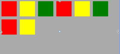
WrapPanel可以根据所在容器大小,自动换行显示,类似windows 文件管理平铺时的效果。
WrapPanel是最常用作Items控件的项目面板。在ListBox显示方式不满足需求的情况下,可以定义如下样式:
<ListBox>
    <ListBox.ItemsPanel>
        <ItemsPanelTemplate>
            <WrapPanel />
        </ItemsPanelTemplate>
    </ListBox.ItemsPanel>
</ListBox>
5、Grid布局
<Grid>
    <Grid.RowDefinitions>
        <RowDefinition Height="60"></RowDefinition>
        <RowDefinition></RowDefinition>
    </Grid.RowDefinitions>
    <Grid.ColumnDefinitions>
        <ColumnDefinition MaxWidth="60"></ColumnDefinition>
        <ColumnDefinition></ColumnDefinition>
        <ColumnDefinition></ColumnDefinition>
    </Grid.ColumnDefinitions>
    <Border Grid.Row="0" Grid.Column="0" Background="Red"/>
    <Border Grid.Row="0" Grid.Column="1" Background="Yellow"/>
    <Border Grid.Row="0" Grid.Column="2" Background="Green"/>
    <Border Grid.Row="1" Grid.ColumnSpan="2" Grid.Column="0" Background="Beige"/>
</Grid>
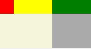
Grid是最常用的一种布局面板,通过Grid.RowDefinitions设置行数量,通过Grid.ColumnDefinitions设置列数量。元素通过Grid.Row和Grid.Column列定位到指定行列单元格中,也可以通过Grid.RowSpan和Grid.ColumnSpan显示在多个单元格中。
Grid的行列宽高是可以随意设置的,可以直接设置数值Width="100"、设置自适应Width="Auto"、设置比例Width="1*",再通过MinWidth,MaxWidth等控制行列高度宽度灵活显示。
第一种,固定长度——宽度不够,会裁剪,不好用。单位pixel。
第二种,自动长度——自动匹配列中最长元素的宽度。
第三种,比例长度——*表示占用剩余的全部宽度;两行都是*,将平分剩余宽度;像上面的一个2*,一个*,表示前者2/3宽度
Grid可以通过ShowGridLines属性显示分割线。
6、UniformGrid布局
<UniformGrid Columns="2" Rows="2">
    <Border Background="Red"/>
    <Border Background="Yellow"/>
    <Border Background="Green"/>
    <Border Background="Beige"/>
</UniformGrid>
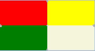
UniformGrid可以通过Columns和Rows来设置列行数,每个单元格的大小是固定的,也无法指定直接显示到某个单元格。在不设置行列数时,会根据其中元素的数量,自动分配行列显示。
一般在设计UI显示比较明确时,可以通过UniformGrid快速布局。
标签:black 多个 last cal height 分割线 上下左右 can 之间
原文地址:https://www.cnblogs.com/kuangxiangnice/p/11043354.html