标签:style blog http color io os ar 使用 for
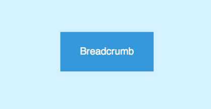
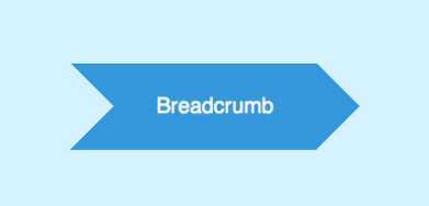
参照着教程做了一个面包屑式的导航。在这里分享一下实现方式,自己也在温习一下。首先效果如图:
HTML代码如下:
<div id="crumbs">
	<ul>
		<li><a href="#">Breadcrumb</a></li>
	</ul>
</div>

我们用一个无序列表来填充面包屑导航。每一个导航连接都相当于一个内嵌了<a>元素的<li>元素。
首先将每一个a元素渲染为蓝色的矩形框。文本居中放置,两边加上适当的内边距。设置<a>元素为相对定位。这样它的绝对定位的子元素可以相对于它来进行定位。
#crumbs ul li a {
	display: block;
	float: left;
	height: 50px;
	background: #3498db;
	text-align: center;
	padding: 30px 40px 0 40px;
	position: relative;
	margin: 0 10px 0 0;

	font-size: 20px;
	text-decoration: none;
	color: #fff;
}
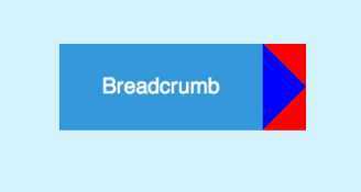
使用:after选择器创建一个元素。使用css边框来生成一个三角形。给使用:after选择器生成的元素应用上下边框,左边框,然后把上下边框的颜色设置成透明的。在将该元素放置到合适的地方(通过position:absolute),注意设置z-index
#crumbs ul li a:after {
	content: "";
	border-top: 40px solid red;
	border-bottom: 40px solid red;
	border-left: 40px solid blue;
	position: absolute; right: -40px; top: 0;
        z-index:5;
}
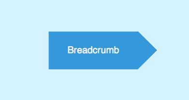
设置上下边框为透明,重新设置左边框的颜色后
border-top: 40px solid transparent;
border-bottom: 40px solid transparent;
border-left: 40px solid #3498db;
使用同样的方法,在矩形框的左边渲染一个三角形样式。这一次还是设置:before元素的上下边框为透明,设置左边框的颜色和页面的背景色一致,伪装成页面的一部分
#crumbs ul li a:before {
	content: "";
	border-top: 40px solid transparent;
	border-bottom: 40px solid transparent;
	border-left: 40px solid #d4f2ff;
	position: absolute; left: 0; top: 0;
}
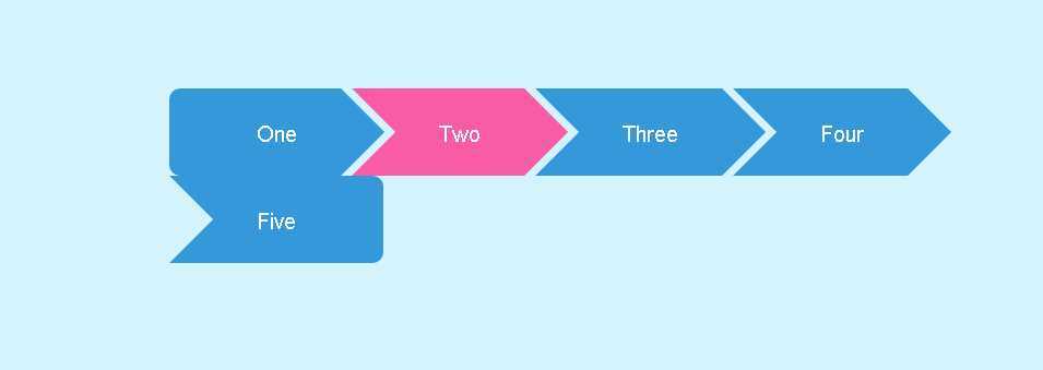
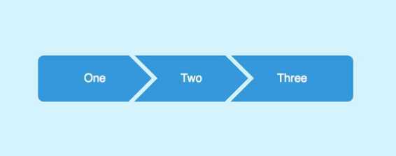
<div id="crumbs">
	<ul>
		<li><a href="#1">One</a></li>
		<li><a href="#2">Two</a></li>
		<li><a href="#3">Three</a></li>
		<li><a href="#4">Four</a></li>
		<li><a href="#5">Five</a></li>
	</ul>
</div>
#crumbs ul li:first-child a {
	border-top-left-radius: 10px; border-bottom-left-radius: 10px;
}
#crumbs ul li:first-child a:before {
	display: none;
}

#crumbs ul li:last-child a {
	padding-right: 80px;
	border-top-right-radius: 10px; border-bottom-right-radius: 10px;
}
#crumbs ul li:last-child a:after {
	display: none;
}
#crumbs ul li a:hover {
	background: #fa5ba5;
}
	#crumbs ul li a:hover:after {
		border-left-color: #fa5ba5;
	}
此次一个完整的面包屑导航就完成了。翻译水平还是有待提升。。。
附上原文地址:http://line25.com/tutorials/how-to-create-flat-style-breadcrumb-links-with-css
标签:style blog http color io os ar 使用 for
原文地址:http://www.cnblogs.com/submerge/p/4044341.html