标签:str 之间 tle inf 元素 htm orm idt pre
一、CSS3转换
通过转换实现对对元素进行旋转、缩放、移动、拉伸的效果;这种原来必须要通过JS或者图片处理才可以实现的效果,现在都可以通过CSS3来完成。 2D转换采用transform属性来实现效果。
二、transform属性的取值
三、函数的用法
transform:rotate( deg);旋转
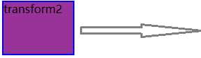
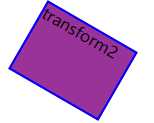
实例一:
构建一个div盒子,实现鼠标悬停时盒子顺时针旋转30deg的效果。(如果我们将角度设置为负值,则会向左侧倾斜)
 1 <!DOCTYPE html>
 2 <html lang="en">
 3 <head>
 4     <meta charset="UTF-8">
 5     <title>2D转换</title>
 6     <style>
 7     body{
 8         position: relative;
 9         width: 400px;
10         height: 400px;
11         /*top: 100px;*/
12         /*left: 100px;*/
13         /*border:2px solid red;*/
14
15            }
16     div{
17         width: 100px;
18         height: 75px;
19         background-color: #939;
20         border:2px solid blue;
21         position: absolute;
22     }
23     #rotateDiv{
24         top:300px;
25         left:100px;
26     }
27     #rotateDiv:hover{
28         transform:rotate(30deg);
29         ;}
30     </style>
31 </head>
32 <body>
33     <div id="rotateDiv">transform2</div>
34 </body>
35 </html>
表现效果:
transform:scale(x,y); 缩放
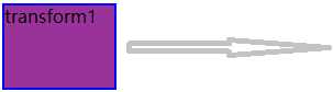
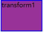
实例二:
实现盒子鼠标悬停上时,盒子放大1.3倍的效果。
 1 <!DOCTYPE html>
 2 <html lang="en">
 3 <head>
 4     <meta charset="UTF-8">
 5     <title>2D转换</title>
 6     <style>
 7     body{
 8         position: relative;
 9         width: 400px;
10         height: 400px;
11         /*top: 100px;*/
12         /*left: 100px;*/
13         /*border:2px solid red;*/
14            }
15     div{
16         width: 100px;
17         height: 75px;
18         background-color: #939;
19         border:2px solid blue;
20         position: absolute;
21     }
22     #box1:hover{transform:scale(1.3)}
23     </style>
24 </head>
25 <body>
26     <div id="box1">transform1</div>
27 </body>
28 </html>
表现效果:
标签:str 之间 tle inf 元素 htm orm idt pre
原文地址:https://www.cnblogs.com/nyw1983/p/11356917.html