标签:不兼容 relative 完成 run direction 进入 可见 iter none
animation属性设置动画效果
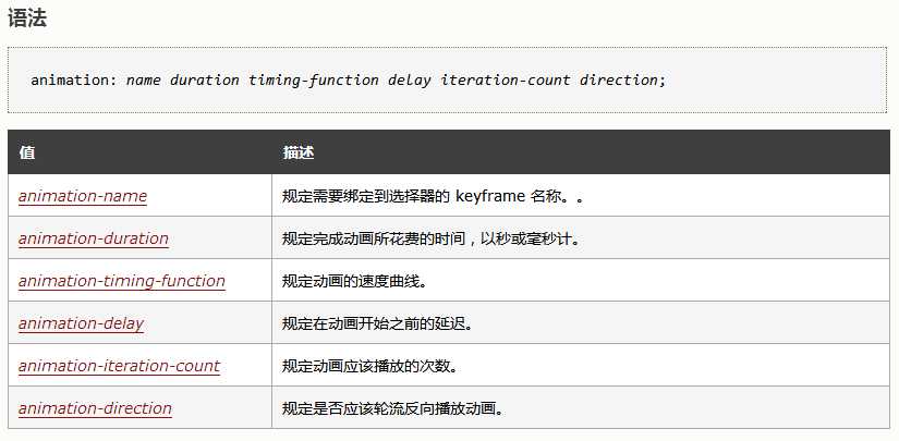
animation属性取值
animation-timing-function 属性取值
示例效果
div
{width:40px;
height:40px;
border-radius: 50%;
background:radial-gradient(red,green,blue);
position:relative;
animation-name:donghua;
/*规定要绑定选择器的名称*/
animation-duration:5s;
/*规定动画播放多长时间*/
animation-timing-function:ease;
/*规定动画的曲线*/
animation-delay:2s;
/*规定动画何时开始*/
animation-iteration-count:2;
/*规定动画播放次数infinite规定动画应该无限次播放。*/
animation-direcyion:normal;
/* 定义是否反向播放normal默认值动画应该正常播放  alternate动画应该轮流反向播放。*/
animation-play-state:running;
/*running播放paused/暂停规定动画是否正在运行或暂停*/
animation-fill-mode:forwards;
/*animation-fill-mode属性规定动画在播放之前或之后,其动画效果是否可见。none不改变默认行为。forwards当动画完成后,保持最后一个属性值(在最后一个关键帧中定义)。backwards在animation-delay所指定的一段时间内,在动画显示之前,应用开始属性值(在第一个关键帧中定义)。both向前和向后填充模式都被应用。*/
}
@keyframes donghua{
                0%   {background:red;left:0px; top:0px;width:50px;
height:50px; }
                25%  {background:yellow; left:200px;top:0px;width:600px;
height:600px;}
                50%  {background:blue;left:200px; top:200pxwidth:700px;
height:70px;}
                75%  {background:green;left:0px; top:200px;width:80px;
height:800px;}
    }
</style>
</head>
<body>
<div></div>
</body>
</html>
除了可以这样每个属性单独设置,也可以使用animation 的简写属性:
标签:不兼容 relative 完成 run direction 进入 可见 iter none
原文地址:https://www.cnblogs.com/niuyaomin/p/11420935.html