标签:nsf class alt 结束 font 效果 text http 大小
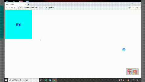
1、我们先设置两个盒子大小,颜色等等,然后定位重叠在一起,最后再进行动画设置
例子如下:
<style>
        .box {
            height: 300px;
            width: 300px;
            position: relative;
        }

        .zh,
        .fan {
            height: 300px;
            width: 300px;
            line-height: 300px;
            font-size: 30px;
            text-align: center;
            color: blue;
            transition: all 2s;
            backface-visibility: hidden;
            /* 背面不可见 */
            position: absolute;
            top: 0;
            left: 0;
        }

        .zh {
            background-color: aqua;
        }

        .fan {
            background-color: aquamarine;
            transform: rotateY(-180deg) rotateZ(-180deg);
        }

        .box:hover .zh {
            transform: rotateY(180deg) rotateZ(180deg)
        }

        .box:hover .fan {
            transform: rotateY(0) rotateZ(0);
        }
    </style>
</head>

<body>
    <div class="box">
        <div class="zh">正面</div>
        <div class="fan">反面</div>

    </div>
</body>
2、效果如下:
---恢复内容结束---
标签:nsf class alt 结束 font 效果 text http 大小
原文地址:https://www.cnblogs.com/qxz17760485467/p/11636683.html