标签:corners otto rop challenge from you 锐化 代码 selector
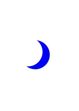
By manipulating different selectors and properties, you can make interesting shapes. One of the easier ones to try is a crescent moon shape.
For this challenge you need to work with the box-shadow property that sets the shadow of an element, along with the border-radius property that controls the roundness of the element‘s corners.
You will create a round, transparent object with a crisp shadow that is slightly offset to the side - the shadow is actually going to be the moon shape you see.
In order to create a round object, the border-radius property should be set to a value of 50%.
You may recall from an earlier challenge that the box-shadow property takes values for offset-x, offset-y, blur-radius, spread-radius and a color value in that order. The blur-radius and spread-radius values are optional.
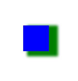
原始代码下的图形如下:

练习题:
Manipulate the square element in the editor to create the moon shape.
First, change the background-color to transparent, then set the border-radius property to 50% to make the circular shape.
Finally, change the box-shadow property to set the offset-x to 25px, the offset-y to 10px, blur-radius to 0, spread-radius to 0, and color to blue.
练习代码:
<style>
  .center {
    position: absolute;
    margin: auto;
    top: 0;
    right: 0;
    bottom: 0;
    left: 0;
    width: 100px;
    height: 100px;
    background-color: transparent;
    border-radius: 50%;
    box-shadow: 25px 10px 0 0 blue;
  }

</style>
<div class="center"></div>
效果:

Create a Graphic Using CSS---新月图形
标签:corners otto rop challenge from you 锐化 代码 selector
原文地址:https://www.cnblogs.com/jane-panyiyun/p/11722818.html