标签:div com top center 核心 info osi bottom eee
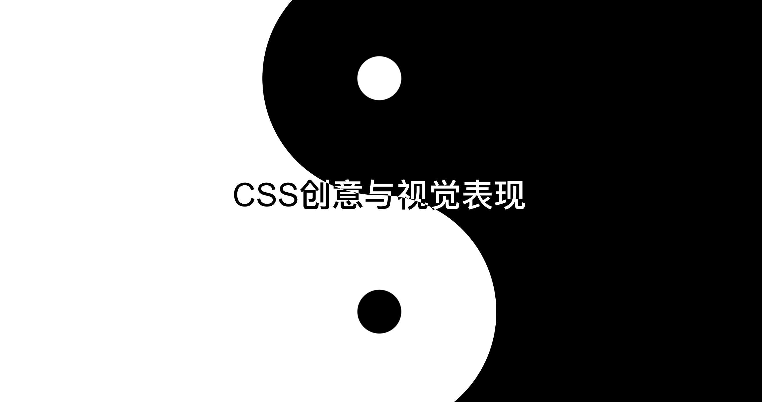
.cover {
    padding: 36% 50%;
    background: linear-gradient(to right, white 50%, black calc(50% + 1px));
    position: relative;
    font-size: 200%;
}
.cover::before,
.cover::after {
    content: ‘‘;
    position: absolute;
    width: 36%; height: 50%;
    border-radius: 50%;
    left: 50%;
    transform: translateX(-50%);
}
.cover::before {
    top: 0;
    background: radial-gradient(circle, white 13%, black calc(13% + 1px));
}
.cover::after {
    bottom: 0;
    background: radial-gradient(circle, black 13%, white calc(13% + 1px));
}
.cover-h,
.cover-p {
    position: absolute;
    mix-blend-mode: difference;
    left: 0; right: 0;
    text-align: center;
    color: #fff;
    z-index: 1;
}
<div class="cover">
    <h2 class="cover-h">CSS创意与视觉表现</h2>
</div>
.shape-left {
    float: left;
    width: 200px; height: 500px;
    shape-outside: polygon(0 0, 100% 0, 0% 100%);
}
.shape-right {
    float: right;
    width: 200px; height: 500px;
    shape-outside: polygon(100% 0, 100% 100%, 0 100%);
}
.content {
    display: block;
    padding: 1px;
    position: relative;
    z-index: 0;
}
.content::before {
    content: ‘‘;
    position: absolute;
    background-color: #fff;
    transform: skewX(-22deg);
    left: 50px; right: 50px; top: 0; bottom: 0;
    border: 1px solid #ddd;
    z-index: -1;
}
<div class="shape-left"></div>
<div class="shape-right"></div>
<content class="content">
   ...内容...
</content>
.square {
    display: inline-block;
    padding: 300px;
    background-color: #fff;
    background-image: linear-gradient(45deg, #eee 25%, transparent 25%, transparent 75%, #eee 75%), linear-gradient(45deg, #eee 25%, transparent 25%, transparent 75%, #eee 75%);
    background-size: 16px 16px;
    background-position: 0 0, 8px 8px;
}
<div class="square"></div>
标签:div com top center 核心 info osi bottom eee
原文地址:https://www.cnblogs.com/binHome/p/11825329.html