标签:image container div ima tps class lib color doc
<!doctype html>
<html>
<head>
<meta charset="utf-8">
<title>无标题文档</title>
<style>
.container {
display: grid;
grid-template-columns: 100px 100px 100px;// 三个100px分别是第一列、第二列、第三列div的宽度
grid-template-rows: 50px 50px;// 第一个50px是第一行的高度,第二个50px是第二行的高度
}
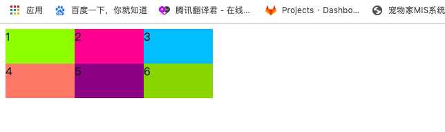
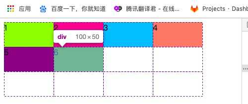
.container>div:nth-of-type(1){background-color: greenyellow;}
.container>div:nth-of-type(2){background-color: deeppink;}
.container>div:nth-of-type(3){background-color: deepskyblue;}
.container>div:nth-of-type(4){background-color: salmon;}
.container>div:nth-of-type(5){background-color: purple;}
.container>div:nth-of-type(6){background-color: yellowgreen;}
</style>
</head>
<body>
<div class="container">
<div>1</div>
<div>2</div>
<div>3</div>
<div>4</div>
<div>5</div>
<div>6</div>
</div>
<script src="https://libs.baidu.com/jquery/2.1.4/jquery.min.js"></script>
<script>
</script>
</body>
</html>
效果是这样的:
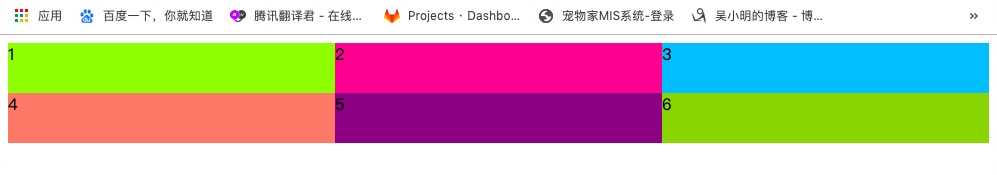
现在开始修改css语句:
grid-template-columns: 1fr 1fr 1fr;
只改了这一行,效果如下,直接就是响应式了:
再稍作修改:
grid-template-columns: 1fr 2fr 1fr;
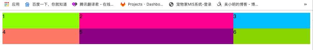
也就是说,fr控制宽度的比例。
repeat()函数grid-template-columns: repeat(3,100px);
grid-template-rows: repeat(2,50px);
效果如下:
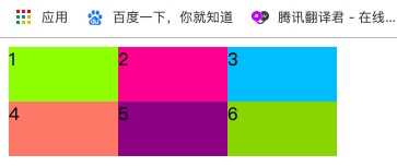
和grid-template-columns: 100px 100px 100px;grid-template-rows: 50px 50px;效果一样。
auto-fitgrid-template-columns: repeat(auto-fit,100px);
grid-template-rows: repeat(3,50px);
效果如下:
现在布局成了自适应数量,这里将宽度设置成了100px,则很大概率右边会有留白。
标签:image container div ima tps class lib color doc
原文地址:https://www.cnblogs.com/wuqilang/p/11881240.html