标签:NPU src ali orm san put use component from
。。。啥也不说了,难受啊
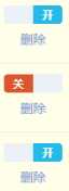
<template>
  <label role="checkbox" :class="[‘switch‘, { toggled }]">
    <input type="checkbox"
           class="switch-input"
           @change="toggle"/>
    <div class="switch-core"
         :style="{backgroundColor: toggled ? colorChecked  : colorUnchecked}">
      <div class="switch-button"
           :style="{transition: `transform ${speed}ms`,
           transform: toggled ? null: `translate3d(32px, 0px, 0px)`}">
      </div>
    </div>
    <span class="switch-label label-right"
          v-if="toggled"
          v-html="labelChecked">
     </span>
    <span class="switch-label label-left"
          v-html="labelUnchecked" v-else>
    </span>
  </label>

</template>

<script>
  export default {
    name: ‘ToggleSwitch‘,
    data () {
      return {
        toggled: this.value,
        colorChecked: ‘#25b9e9‘,
        colorUnchecked: ‘#db572e‘,
        labelChecked: ‘开‘,
        labelUnchecked: ‘关‘
      }
    },
    props: {
      value: {
        type: Boolean,
        default: true
      },
      speed: {
        type: Number,
        default: 100
      }
    },
    methods: {
      toggle (event) {
        this.toggled = !this.toggled
        this.$emit(‘change‘, event)
      }
    }
  }
</script>

<style lang="scss" scoped>

  .switch {
    display: inline-block;
    position: relative;
    overflow: hidden;
    vertical-align: middle;
    user-select: none;
    font-size: 10px;
    cursor: pointer;

    .switch-input {
      display: none;
    }

    .switch-label {
      position: absolute;
      top: 0;
      font-weight: 600;
      color: white;

      z-index: 2;

      &.label-left {
        left: 10px;
        line-height: 20px;
        border-top-left-radius: 2px;
        border-bottom-left-radius:2px;
      }

      &.label-right {
        right: 10px;
        line-height: 20px;
        border-top-right-radius: 2px;
        border-bottom-right-radius:2px;
      }
    }

    .switch-core {
      display: block;
      position: relative;
      box-sizing: border-box;
      outline: 0;
      margin: 0;
      transition: border-color .3s, background-color .3s;
      user-select: none;
      width: 64px;
      height: 20px;
      border-radius: 4px;
      line-height: 20px;

      .switch-button {
        width: 32px;
        height: 20px;
        display: block;
        position: absolute;
        overflow: hidden;
        top: 0;
        left: 0;
        z-index: 3;
        transform: translate3d(0, 0, 0);
        background-color: #ecf0f5;
      }
    }
  }
</style>
<template>
  <div id="app">
    <div class="left">
      <toggle-switch></toggle-switch>
    </div>
    <div class="main">
      <router-view></router-view>
    </div>
  </div>
</template>

<script>
  import ToggleSwitch from ‘@/components/toggle-switch‘
  export default {
    name: ‘app‘,
    components: {
      ToggleSwitch
    }
  }
</script>

<style>
  #app {
    font-family: ‘Microsoft YaHei‘,‘Avenir‘, Helvetica, Arial, sans-serif;
    -webkit-font-smoothing: antialiased;
    -moz-osx-font-smoothing: grayscale;
    text-align: left;
    color: #2c3e50;
    height:100%;
  }

  .left {
    margin: 50px 200px;
  }
  .main{
    float:left;
    width:95%;
    background-color: #EFF2F7;
    height:100%;
    overflow: auto;

  }
</style>
标签:NPU src ali orm san put use component from
原文地址:https://www.cnblogs.com/home-/p/11917008.html