Introduction
This is a simple example of validation in XAML for WPF controls and displaying error messages.
Background
I was looking for something out-of-the-box from WPF where no extra coding of style or template is needed for displaying validation errors, where we just need to code the validation logic for each control and it should automatically display an error icon or message next to the control. However, I did not find anything straightforward like that in WPF. But it can be achieved in two simple steps.
Using the Code
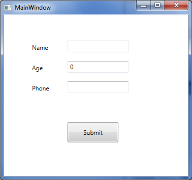
Here is a very simple form in XAML that is created which has three textbox controls:
Let us add code so that when values are entered in the above text boxes, they automatically run validation and if there are validation errors, they will be displayed next to the corresponding control. In order to do this, the following two steps are needed:
- Create a
ControlTemplatewithAdornedElementPlaceHolder - Implement a validation class inheriting the abstract class called
ValidationRule
Here is the sample validation control template. Let us start with a very simple validation control template where all we have is a TextBlock which will display a red exclamatory sign next to the control that has an error.
 Collapse | Copy Code
<ControlTemplate x:Key="validationErrorTemplate">
    <DockPanel>
        <TextBlock Foreground="Red"
            DockPanel.Dock="Top">!</TextBlock>
        <AdornedElementPlaceholder
           x:Name="ErrorAdorner"
        ></AdornedElementPlaceholder>
    </DockPanel>
</ControlTemplate>
Now, let us also create a validator class by inheriting from the ValidationRule class and implementing its abstract method as below:
Collapse | Copy Codepublic class NameValidator : ValidationRule
{
public override ValidationResult Validate
(object value, System.Globalization.CultureInfo cultureInfo)
{
if (value == null)
return new ValidationResult(false, "value cannot be empty.");
else
{
if (value.ToString().Length > 3)
return new ValidationResult
(false, "Name cannot be more than 3 characters long.");
}
return ValidationResult.ValidResult;
}
}
Let‘s plug this validation control template and the validation rule with control that we want to validate.
Collapse | Copy Code<TextBox Height="23" HorizontalAlignment="Left"
Grid.Column="1" Grid.Row="0" Name="textBox1"
VerticalAlignment="Top" Width="120"
Validation.ErrorTemplate="{StaticResource validationErrorTemplate}"
>
<TextBox.Text>
<Binding Path="Name" Mode="TwoWay"
UpdateSourceTrigger="LostFocus">
<Binding.ValidationRules>
<local:NameValidator></local:NameValidator>
</Binding.ValidationRules>
</Binding>
</TextBox.Text>
</TextBox>
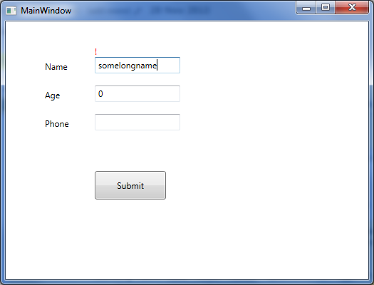
When we run this now and enter a name longer than three characters long, it displays the red exclamatory sign indicating validation error.
Now let us just replace the TextBlock in the above validation control template code (the line that is in bold) with the StackPanel containing an ellipse and a TextBlock to display the same validation error, as below:
Collapse | Copy Code<ControlTemplate x:Key="validationErrorTemplate">
<DockPanel>
<StackPanel Orientation="Horizontal" DockPanel.Dock="Top">
<Grid Width="12" Height="12">
<Ellipse Width="12" Height="12"
Fill="Red" HorizontalAlignment="Center"
VerticalAlignment="Center"
></Ellipse>
<TextBlock Foreground="White" FontWeight="Heavy"
FontSize="8" HorizontalAlignment="Center"
VerticalAlignment="Center" TextAlignment="Center"
ToolTip="{Binding ElementName=ErrorAdorner,
Path=AdornedElement.(Validation.Errors)[0].ErrorContent}"
>X</TextBlock>
</Grid>
<TextBlock Foreground="Red" FontWeight="12" Margin="2,0,0,0"
Text="{Binding ElementName=ErrorAdorner,
Path=AdornedElement.(Validation.Errors)[0].ErrorContent}"
></TextBlock>
</StackPanel>
<AdornedElementPlaceholder
x:Name="ErrorAdorner" ></AdornedElementPlaceholder>
</DockPanel>
</ControlTemplate>
Now when we run the code and validation fails, a validation error will be displayedas shown in the screenshot below (coded validator class for age and phone number as well).
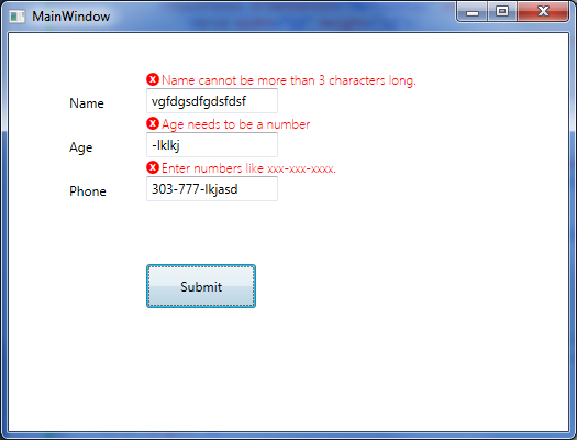
That is all that is needed for the simplest validation error to show up next to the control. Notice in the validation control template, we are using a DockPanel as the layout control, therefore we can easily change where the error icon and error message will be displayed. We can display them on top of the control that is failing validation (as the above picture), or on the left, right, or bottom.