标签:des style blog http io ar os 使用 sp
微软的WPF DataGrid中有很多的属性和样式,你可以调整,以寻找合适的(如果你是一名设计师)。
下面,找到我的小抄造型的网格。它不是100%全面,但它可以让你走得很远,有一些非常有用的技巧和陷阱。
在DataGrid中的最高水平,你可以改变的外观和感觉,通过设置一些:
|
Property |
Type |
Values |
Default |
|
AlternatingRowBackground |
Brush |
Any Brush |
Null |
|
Background |
Brush |
Any Brush |
Theme default |
|
ColumnHeaderHeight |
Double |
0 to any positive double |
NaN |
|
ColumnHeaderStyle |
Style |
Any Style |
Null |
|
ColumnWidth |
DataGridLength |
0 to any positive double, Auto, *, SizeToCells, SizeToHeader |
SizeToHeader |
|
HeadersVisibility |
DataGridHeadersVisibility |
All, Row, Column, None |
All |
|
MaxColumnWidth |
Double |
0 to any positive double |
Positive Infinity |
|
MaxRowHeight |
Double |
0 to any positive double |
Positive Infinity |
|
MinColumnWidth |
Double |
0 to any positive double |
20 |
|
MinRowHeight |
Double |
0 to any positive double |
0 |
|
RowBackground |
Brush |
Any Brush |
Theme default |
|
RowDetailsVisibilityMode |
DataGridRowDetailsVisibilityMode |
Visible, VisibleWhenSelected, Collapsed |
VisibleWhenSelected |
|
RowHeadersWidth |
Double |
0 to any positive double |
NaN |
|
RowHeight |
Double |
0 to any positive double |
NaN |
|
AlternationCount |
int |
2+ |
coerced to 2 |
|
GridLinesVisibility |
DataGridGridLinesVisibility |
All, Horizontal, Vertical, None |
All |
|
HorizontalGridLinesBrush |
Brush |
Any Brush |
Black(via metadata) |
|
VerticalGridLinesBrush |
Brush |
Any Brush |
Black(via metadata) |
|
ItemTemplate |
DataTemplate |
Any DataTemplate |
Null |
|
RowDetailsTemplate |
DataTemplate |
Any DataTemplate |
Null |
|
CellStyle |
Style |
Any Style |
Null |
|
ItemContainerStyle |
Style |
Any Style |
Null |
|
RowHeaderStyle |
Style |
Any Style |
Null |
|
RowStyle |
Style |
Any Style |
Null |
|
Style |
Style |
Any Style |
Null |
|
Template |
ControlTemplate |
ControlTemplate TargetType=Datagrid |
Null |
在这里,你可以看到的一些属性(在视觉上是不是全部)的可视化表示,这将让你知道这是什么文章将涵盖。
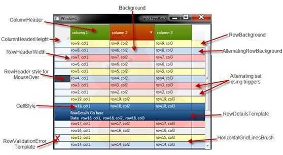
背景:
有趣的部分是背景之间的关系:
•背景 - 将整个数据网格的背景。请注意,它可以是任何刷,固体和梯度很明显,但为什么没有一个DrawingBrush像上述(你可以看到,如果你眯着眼睛努力,不透明度=0.1)
•RowBackground和AlternatingRowBackground设置一排交替行的背景。
这些都具有较高的Z顺序比DataGrid的背景,当然,这意味着你可以得到视觉组合物W/网格的背景。
请注意,,默认颜色RowBackground主题(默认值是不透明的); DataGrid的背景将是不可见的,除非你重写这些行的背景是部分透明。
•AlternationCount是将用于行的样式或颜色的总数。这个数字是一个指标为基础(,意义开始计数为1,而不是0)。 ?如果你设置AlternationCount的> 2,您的行从第三排AlternationCount的将被指定为默认的背景刷值(主题)。
?的方式来设置不同的背景或样式的每一行的基础上AlternationCount是压倒一切的样式DataGridRow触发的基础上AlternationIndex,这实际上是零指数。
?,如果设置AlternatingRowBackground刷,将被分配到行,其中(rownumber%AlternationIdex)== 1
压倒一切的的RowStyle调整背景下基于AlternationIndex下面是一个例子:

<Style x:Key="DataGridDemoRowStyle"
TargetType="{x:Type Custom:DataGridRow}">
<Style.Triggers>
<Trigger Property="AlternationIndex" Value="2" >
 <Setter Property="Background" Value="{StaticResource RowBackgroundAlternationIndex2Brush}" />
</Trigger>
<Trigger Property="AlternationIndex" Value="3">
<Setter Property="Background" Value="{StaticResource RowBackgroundAlternationIndex3Brush}" />
</Trigger>
</Style.Triggers>
</Style>
请注意,有目的的,我只覆盖AlternationIndex= 2,3。对于AlternationIndex= 0时,它使用RowBackground。
对于AlternationIndex= 1,它使用从DataGrid中AlternatingRowBackground的。
<Style x:Key="DataGridColumnHeaderStyle" TargetType="{x:Type Custom:DataGridColumnHeader}"  >
<Setter Property="Background" Value="#88800080" />
<Setter Property="Foreground" Value="White" />
<Style.Triggers>
<Trigger Property="SortDirection" Value="{x:Null}">
<Setter Property="Background" Value="{DynamicResource DataGridHeaderBackgroundBrush}" />
<Setter Property="BorderBrush"  Value="Transparent" />
</Trigger>
<MultiTrigger>
<MultiTrigger.Conditions>
<Condition Property="IsMouseOver" Value="True" />
<Condition Property="SortDirection" Value="{x:Null}" />
</MultiTrigger.Conditions>
<Setter Property="Background" Value="{StaticResource DataGridHeaderMouseOverBackgroundBrush}" />
<Setter Property="BorderBrush" Value="{StaticResource DataGridHeaderBorderBrush}" />
</MultiTrigger>
<MultiTrigger>
<MultiTrigger.Conditions>
<Condition Property="IsMouseOver" Value="true" />
<Condition Property="SortDirection" Value="{x:Null}" />
</MultiTrigger.Conditions>
 <Setter Property="Background" Value="{StaticResource DataGridHeaderMouseOverBackgroundBrush}" />
<Setter Property="BorderBrush" Value="{StaticResource DataGridHeaderBorderBrush}" />
</MultiTrigger>
<Trigger Property="SortDirection" Value="Ascending">
 <Setter Property="Background" Value="{StaticResource DataGridHeaderSortedBackgroundBrush}" />
</Trigger>
<Trigger Property="SortDirection" Value="Descending">
<Setter Property="Background" Value="{StaticResource DataGridHeaderSortedBackgroundBrush}" />
</Trigger>
</Style.Triggers>
</Style>
DataGrid列头
我通常自定义标题上一个数据网格,来完成两个任务:
•TWEAK的背景的标头,包括触发器悬停,选择等
•调整控制模板的头,主要是因为默认的样式显示排序是顶部ColumnHeader中,我喜欢它的侧面。
我的直觉是,自定义标题的背景将是一个简单的样式覆盖。这是我的尝试:
如果您运行的示例代码对这种风格,你会发现,排序的DataGrid中显示的默认样式消失的方向箭头“的原因,因为这是,DataGridColumnHeader使用DataGridHeaderBorder在其模板; DataGridHeaderBorder是一种智能边境检查,如果你设置了背景,如果你做了,它就像一个边界,如果你没有设定一个背景,它的行为巧妙,并呈现三角形指标排序的代码。
如果你想排序方向箭头,和不同的背景,你应该覆盖的模板,并使用常规的边界,什么都想要的背景。覆盖的模板是不是太辛苦了,这里是一个例子:
<Style x:Key="DatagridColumnHeaderCustomTemplateStyle"
TargetType="{x:Type Custom:DataGridColumnHeader}">
<Setter Property="SnapsToDevicePixels" Value="True" />
<Setter Property="MinWidth" Value="0" />
<Setter Property="MinHeight" Value="28" />
<Setter Property="Foreground" Value="White" />
<Setter Property="Cursor" Value="Hand" />
<Setter Property="Template">
 <Setter.Value>
<ControlTemplate TargetType="{x:Type Custom:DataGridColumnHeader}">
<Grid>
<Grid.ColumnDefinitions>
<ColumnDefinition Width="*" />
<ColumnDefinition Width="Auto" />
</Grid.ColumnDefinitions>
<Border x:Name="BackgroundBorder" BorderThickness="0,1,0,1"
Background="{StaticResource DataGridHeaderSortedBackgroundBrush}"
BorderBrush="{StaticResource DataGridHeaderSortedBorderBrush}"
Grid.ColumnSpan="2" />
<ContentPresenter Margin="6,3,6,3" VerticalAlignment="Center" />
<Path x:Name="SortArrow" Visibility="Collapsed" Data="M0,0 L1,0 0.5,1 z" Stretch="Fill"
 Grid.Column="1" Width="8" Height="6" Fill="White" Margin="0,0,8,0"
VerticalAlignment="Center" RenderTransformOrigin="0.5,0.4" />
<Rectangle Width="1" Fill="#AAC377" HorizontalAlignment="Right" Grid.ColumnSpan="2" />
<Rectangle Width="1" Margin="0,0,1,0" Fill="#425B10"
HorizontalAlignment="Right" Grid.ColumnSpan="2" />
<Thumb x:Name="PART_LeftHeaderGripper" HorizontalAlignment="Left"
Style="{StaticResource ColumnHeaderGripperStyle}"/>
<Thumb x:Name="PART_RightHeaderGripper" HorizontalAlignment="Right"
Style="{StaticResource ColumnHeaderGripperStyle}"/>
</Grid>
<ControlTemplate.Triggers>
<Trigger Property="SortDirection" Value="{x:Null}">
<Setter TargetName="BackgroundBorder" Property="Background"
Value="{DynamicResource DataGridHeaderBackgroundBrush}" />
<Setter TargetName="BackgroundBorder" Property="BorderBrush"
Value="Transparent" />
</Trigger>
<MultiTrigger>
<MultiTrigger.Conditions>
<Condition Property="IsMouseOver" Value="True" />
<Condition Property="SortDirection" Value="{x:Null}" />
</MultiTrigger.Conditions>
<Setter Property="Background" TargetName="BackgroundBorder"
Value="{StaticResource DataGridHeaderMouseOverBackgroundBrush}" />
<Setter Property="BorderBrush" TargetName="BackgroundBorder"
Value="{StaticResource DataGridHeaderBorderBrush}" />
</MultiTrigger>
<MultiTrigger>
<MultiTrigger.Conditions>
<Condition Property="IsMouseOver" Value="true" />
<Condition Property="SortDirection" Value="{x:Null}" />
</MultiTrigger.Conditions>
<Setter TargetName="BackgroundBorder" Property="Background"
Value="{StaticResource DataGridHeaderMouseOverBackgroundBrush}" />
<Setter TargetName="BackgroundBorder" Property="BorderBrush"
Value="{StaticResource DataGridHeaderBorderBrush}" />
</MultiTrigger>
<Trigger Property="SortDirection" Value="Ascending">
<Setter TargetName="SortArrow" Property="Visibility" Value="Visible" />
<Setter TargetName="SortArrow" Property="RenderTransform">
<Setter.Value>
<RotateTransform Angle="180" />
</Setter.Value>
</Setter>
</Trigger>
<Trigger Property="SortDirection" Value="Descending">
<Setter TargetName="SortArrow" Property="Visibility" Value="Visible" />
</Trigger>
<Trigger Property="DisplayIndex" Value="0">
<Setter Property="Visibility" Value="Collapsed"
TargetName="PART_LeftHeaderGripper"></Setter>
</Trigger>
</ControlTemplate.Triggers>
</ControlTemplate>
</Setter.Value>
</Setter>
</Style>
注意上面有几件事情:我取代DataGridHeaderBorder正常的边界,我增加了一个小的“三角”排序方向,并把它转换(或翻转)的基础上SortDirection。
DataGrid行头
对我来说,这是最常见的“调整”RowHeader。 调整的宽度(默认是太小) •调整的背景,以配合我的主题。 •实施行选择点击的行头,此功能不出来的方块。 •错误处理发生在RowHeader 我的第一个尝试的API时,是通过样式设置行头的宽度。后来,我认识到DataGrid中暴露的RowHeaderWidth的直接,所以我现在用的,而不是。这是一个简单的属性setter。 对于调整的背景下,我第一次尝试在DataGrid中设定一个的RowHeader的样式属性。基本的风格,我想是这样的:
<Style x:Key="DataGridRowHeaderBackgroundStyle" TargetType="{x:Type Custom:DataGridRowHeader}">
<Setter Property="Background" Value="Gray" />
</Style>
它的工作原理,但类似的ColumnHeaders我失去了功能。在运行时,它看起来像这样:

正如你会发现,它失去了分隔每一行的的行DataGridLines,有没有徘徊,等等。
然后我就开始覆盖模板。的变化,实际上是微不足道的,我注意到DataGridHeaderBorder默认回到它的基类(境)的渲染,这主要是隐含设定一个BorderThickness就可以了假网格的行分隔符,和具有约束力的颜色DataGrid的HorizontalGridLinesBrush..
这里是,我创建的DataGridRowHeader,模板.. (和下面的解释上的一些额外的陷阱)。
<Stylex:Key="{x:TypeCustom:DataGridRowHeader}"TargetType="{x:TypeCustom:DataGridRowHeader}">
<SetterProperty="Background"Value="{StaticResource RowHeaderBackgroundBrush}" />
<SetterProperty="Template">
<Setter.Value>
<ControlTemplate TargetType="{x:TypeCustom:DataGridRowHeader}">
<Grid>
<Custom:DataGridHeaderBorder IsSelected="{TemplateBinding IsRowSelected}"
IsHovered ="{TemplateBinding IsMouseOver}"
IsPressed="{TemplateBinding IsPressed}"
BorderBrush="{Binding RelativeSource={RelativeSource AncestorType={x:Type Custom:DataGrid}},
Path=HorizontalGridLinesBrush}"
 Background="{TemplateBinding Background}"
BorderThickness="0,1,0,0"
Padding ="{TemplateBinding Padding}"
Orientation="Horizontal"
SeparatorVisibility="{TemplateBinding SeparatorVisibility}"
SeparatorBrush="{TemplateBinding SeparatorBrush}" Margin="0,-1,0,0">

<StackPanel Orientation="Horizontal">
<ContentPresenter SnapsToDevicePixels="{TemplateBinding SnapsToDevicePixels}"
VerticalAlignment="Center"/>
<Control SnapsToDevicePixels="false"
Visibility="{Binding RelativeSource={RelativeSource AncestorType={x:Type Custom:DataGridRow}},
Path=(Validation.HasError),
Converter={StaticResource bool2VisibilityConverter}}"
Template="{Binding RelativeSource={RelativeSource AncestorType={x:Type Custom:DataGridRow}},
Path=ValidationErrorTemplate}" />
</StackPanel>
</Custom:DataGridHeaderBorder>
<Thumb x:Name="PART_TopHeaderGripper"
VerticalAlignment="Top" Height="3"
Style="{StaticResource RowHeaderGripperStyle}"/>
<Thumb x:Name="PART_BottomHeaderGripper"
VerticalAlignment="Bottom" Height="3"
Style="{StaticResource RowHeaderGripperStyle}"/>
</Grid>

<ControlTemplate.Triggers>
<Trigger Property="IsMouseOver" Value="True">
<Setter Property="Background" Value="{StaticResource RowHeaderIsMouseOverBrush}" />
</Trigger>
<Trigger Property="IsRowSelected" Value="True">
<Setter Property="Background" Value="{StaticResource RowBackgroundSelectedBrush}" />
</Trigger>
</ControlTemplate.Triggers>
</ControlTemplate>
</Setter.Value>
</Setter>
</Style>
有趣的变化是:
•我不得不使用一个隐式的风格。虽然DataGrid中确实有有RowHeaderStyle财产,一些没有工作对我来说,这是奇怪的,因为的RowHeaderStyle工作正常,当我用的风格,没有覆盖的模板。
•被设置为0,1,0,0的BorderThickness DataGridHeaderBorder.. ,这使得它的网格线绘制相当于中,我offseted的保证金为0,-1,0,0,以确保这与DataGridRow网格线对齐。
•在DataGridHeaderBorder BorderBrush时,势必到DataGrid的HorizontalGridLinesBrush。
•我继续绑定到本地刷在字典中的IsRowSelected,增加了一个触发器。所以,现在的RowHeader会显示选中状态的可视化。
•我添加了一个触发器IsMouseOver,它仅仅是预期的行为“。
•我设置了拇指的夹持器用于调整行高度尺寸3。我之所以这样做,是因为我喜欢可以双击头,选择整个行;在DataGrid中实现此功能,但大拇指都这么大了,他们得到的方式,试图点击在的RowHeader。大小为2或3的大拇指,似乎做精拖留下了足够的空间,为,点击RowHeader选择行。
另一个有趣的功能,我玩RowHeader时了解到的是,如果你双击调整行拇指,它会返回到原来的大小。尼斯触摸(我不知道)。
•
的报告的RowHeader错误的任务,我没有调整的DataGridRowHeader,在所有相关的错误做任何的事情。我做的所有通过DataGrid的ErrorTemplate属性,指向ErrorTemplate2在我的资源字典。
<ControlTemplate x:Key="ErrorTemplate2">
<Grid MinWidth="20" MinHeight="20">
<Rectangle Fill="{StaticResource ErrorTemplateBrush}" />
</Grid>
</ControlTemplate>
<digression>
我不喜欢ErrorTemplate是一个ControlTemplate。在我看来,它应该是一个DataTemplate访问DatagridRow的背景和在DatagridRow的错误收集。作为一个“解决方法,你可以尝试通过控制自己的调整RowHeaderTemplate到这一点,并传递到控制,作为占位符ErrorTemplate的,这样的DataContext:
<Control SnapsToDevicePixels="false"
Visibility="{Binding RelativeSource={RelativeSource AncestorType={x:Type Custom:DataGridRow}},
Path=(Validation.HasError),
Converter={StaticResource bool2VisibilityConverter}}"
Template="{Binding RelativeSource={RelativeSource AncestorType={x:Type Custom:DataGridRow}},
Path=ValidationErrorTemplate}"
DataContext="{Binding
RelativeSource={RelativeSource AncestorType={x:Type Custom:DataGridRow}},
Path=(Validation.Errors)[0].ErrorContent }"
>
然后,您可以调整的ErrorTemplate的DataGrid的一个工具提示:
<ControlTemplate x:Key="ErrorTemplate2">
<Grid MinWidth="20" MinHeight="20" ToolTip="{Binding}">
<Rectangle Fill="{StaticResource ErrorTemplateBrush}" >
</Rectangle>
</Grid>
</ControlTemplate>
和得到的东西更有帮助的错误消息,如下所示: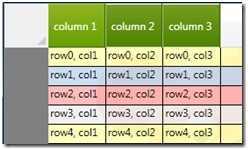
单元格样式
默认情况下,DataGrid的细胞时选择一个主题,蓝色背景(见下面的关闭想法),我不喜欢这样,所以我用DataGrid的CellStyle照顾。覆盖默认的模板,并删除选择的触发器:
<Style x:Key="DataGridCellStyle" TargetType="{x:Type Custom:DataGridCell}">
<Setter Property="Background" Value="Transparent" />
<Setter Property="BorderBrush" Value="Transparent" />
<Setter Property="BorderThickness" Value="1" />
<Setter Property="Template">
<Setter.Value>
<ControlTemplate TargetType="{x:Type Custom:DataGridCell}">
<Border Background="Transparent"
BorderBrush="{TemplateBinding BorderBrush}"
BorderThickness="0"
SnapsToDevicePixels="True">
<ContentPresenter SnapsToDevicePixels="{TemplateBinding SnapsToDevicePixels}"/>
</Border>
</ControlTemplate>
</Setter.Value>
</Setter>
</Style>
RowDetailsTemplate

RowDetails模板时,会显示一排。它是与上下文的行的DataTemplate。在本演示中,实现很简单,我所做的就是把一个TextBlock,但你可以做更复杂的RowDetails,一个真正的项目。
<DataTemplate x:Key="RowDetailsTemplate">
<Grid TextBlock.Foreground="White">
<Grid.RowDefinitions>
<RowDefinition />
<RowDefinition />
</Grid.RowDefinitions>
<TextBlock Text="RowDetails Go here" Grid.Row="0"/>
<TextBlock Text="{Binding }" Grid.Row="1"/>
</Grid>
</DataTemplate>
主要的原因提RowDetailsTemplate是强调的“同步”,需要做的选择一行时,RowDetailsTemplate,RowBackground,和RowHeader的背景都应该调整,以确保其背景颜色协调。在这种情况下,如果你看上面的模板,我并确保他们相匹配的选择,将背景设置为“深蓝色”梯度。
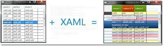
“WPF设计器友好”标记的调整,我们就从一个普通的网格(见左图)出写一行代码样式的网格(见右图)。
标签:des style blog http io ar os 使用 sp
原文地址:http://www.cnblogs.com/qq247039968/p/4085050.html