标签:需求 NPU 准备 媒体查询 无法 cli 一点 透明 ios8
在移动端web开发中,UI设计稿中设置边框为1像素,前端在开发过程中如果出现border:1px,测试会发现在retina屏机型中,1px会比较粗,即是较经典的移动端1px像素问题。
我们要对与视口、物理像素、逻辑像素、设备像素比、css像素等移动端基本概念要有一定的了解。
设备像素比:dpr=window.devicePixelRatio,也就是设备的物理像素与逻辑像素的比值。
在retina屏的手机上, dpr为2或3,css里写的1px宽度映射到物理像素上就有2px或3px宽度。
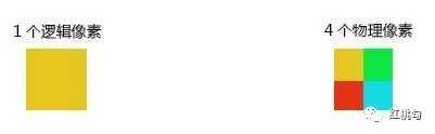
例如:iPhone6的dpr为2,物理像素是750(x轴),它的逻辑像素为375。也就是说,1个逻辑像素,在x轴和y轴方向,需要2个物理像素来显示,即:dpr=2时,表示1个CSS像素由4个物理像素点组成,如下图所示:
在IOS8+,苹果系列都已经支持0.5px了,可以借助媒体查询来处理。
/*这是css方式*/
.border { border: 1px solid #999 }
@media screen and (-webkit-min-device-pixel-ratio: 2) {
    .border { border: 0.5px solid #999 }
}
/*ios dpr=2和dpr=3情况下border相差无几,下面代码可以省略*/
@media screen and (-webkit-min-device-pixel-ratio: 3) {
    .border { border: 0.333333px solid #999 }
}
IOS7及以下和Android等其他系统里,0.5px将会被显示为0px。那么我们就需要想出办法解决,说实在一点就是找到Hack。
解决方案是通过JavaScript检测浏览器能否处理0.5px的边框,如果可以,给html标签元素添加个class。
if (window.devicePixelRatio && devicePixelRatio >= 2) {
  var testElem = document.createElement(‘div‘);
  testElem.style.border = ‘.5px solid transparent‘;
  document.body.appendChild(testElem);
}
if (testElem.offsetHeight == 1) {
  document.querySelector(‘html‘).classList.add(‘hairlines‘);
}
  document.body.removeChild(testElem);
}
// 脚本应该放在body内,如果在里面运行,需要包装 $(document).ready(function() {})
然后,极细的边框样式就容易了:
div {
  border: 1px solid #bbb;
}
.hairlines div {
  border-width: 0.5px;
}
优点:简单,不需要过多代码。
缺点:无法兼容安卓设备、 iOS 7及以下设备。
原理:把原先元素的border去掉,然后利用:before或者:after重做border,并 transform的scale缩小一半,原先的元素相对定位,新做的border绝对定位。
/*手机端实现真正的一像素边框*/
.border-1px, .border-bottom-1px, .border-top-1px, .border-left-1px, .border-right-1px {
    position: relative;
}

/*线条颜色 黑色*/
.border-1px::after, .border-bottom-1px::after, .border-top-1px::after, .border-left-1px::after, .border-right-1px::after {
    background-color: #000;
}

/*底边边框一像素*/
.border-bottom-1px::after {
    content: "";
    position: absolute;
    left: 0;
    bottom: 0;
    width: 100%;
    height: 1px;
    transform-origin: 0 0;
}

/*上边边框一像素*/
.border-top-1px::after {
    content: "";
    position: absolute;
    left: 0;
    top: 0;
    width: 100%;
    height: 1px;
    transform-origin: 0 0;
}

/*左边边框一像素*/
.border-left-1px::after {
    content: "";
    position: absolute;
    left: 0;
    top: 0;
    width: 1px;
    height: 100%;
    transform-origin: 0 0;
}

/*右边边框1像素*/
.border-right-1px::after {
    content: "";
    box-sizing: border-box;
    position: absolute;
    right: 0;
    top: 0;
    width: 1px;
    height: 100%;
    transform-origin: 0 0;
}

/*边框一像素*/
.border-1px::after {
    content: "";
    box-sizing: border-box;
    position: absolute;
    left: 0;
    top: 0;
    width: 100%;
    height: 100%;
    border: 1px solid gray;
}


/*设备像素比*/
/*显示屏最小dpr为2*/
@media (-webkit-min-device-pixel-ratio: 2) {
    .border-bottom-1px::after, .border-top-1px::after {
        transform: scaleY(0.5);
    }

    .border-left-1px::after, .border-right-1px::after {
        transform: scaleX(0.5);
    }

    .border-1px::after {
        width: 200%;
        height: 200%;
        transform: scale(0.5);
        transform-origin: 0 0;
    }
}

/*设备像素比*/
@media (-webkit-min-device-pixel-ratio: 3)  {
    .border-bottom-1px::after, .border-top-1px::after {
        transform: scaleY(0.333);
    }

    .border-left-1px::after, .border-right-1px::after {
        transform: scaleX(0.333);
    }

    .border-1px::after {
        width: 300%;
        height: 300%;
        transform: scale(0.333);
        transform-origin: 0 0;
    }
}
/*需要注意<input type="button">是没有:before, :after伪元素的*/
优点:所有场景都能满足,支持圆角(伪类和本体类都需要加border-radius)。
缺点:代码量也很大,对于已经使用伪类的元素(例如clearfix),可能需要多层嵌套。
同时通过设置对应viewport的rem基准值,这种方式就可以像以前一样轻松愉快的写1px了。
在devicePixelRatio=2 时,设置meta:
<meta name="viewport" content="width=device-width,initial-scale=0.5, maximum-scale=0.5, minimum-scale=0.5, user-scalable=no">
在devicePixelRatio=3 时,设置meta:
<meta name="viewport" content="width=device-width,initial-scale=0.3333333333333333, maximum-scale=0.3333333333333333, minimum-scale=0.3333333333333333, user-scalable=no">
实例验证:
<!DOCTYPE html>
<html lang="en">
<head>
    <title>移动端1px问题</title>
    <meta http-equiv="Content-Type" content="text/html;charset=UTF-8" />
    <meta name="viewport" id="WebViewport"
        content="width=device-width,initial-scale=1, maximum-scale=1, minimum-scale=1, user-scalable=no" />
    <style>
        html {
            font-size: 11px;
        }
        body {
            padding: 1rem;
        }
        * {
            padding: 0;
            margin: 0;
        }
        .item {
            padding: 1rem;
            border-bottom: 1px solid gray;
            font-size: 1.2rem;
        }
    </style>
    <script>
        var viewport = document.querySelector("meta[name=viewport]");
        var dpr = window.devicePixelRatio || 1;
        var scale = 1 / dpr;
        //下面是根据设备dpr设置viewport
        viewport.setAttribute(
            "content", +
            "width=device-width," +
            "initial-scale=" +
            scale +
            ", maximum-scale=" +
            scale +
            ", minimum-scale=" +
            scale +
            ", user-scalable=no"
        );

        var docEl = document.documentElement;
        var fontsize = 10 * (docEl.clientWidth / 320) + "px";
        docEl.style.fontSize = fontsize;
    </script>
</head>
<body>
    <div class="item">border-bottom: 1px solid gray;</div>
    <div class="item">border-bottom: 1px solid gray;</div>
</body>
</html>
优点:所有场景都能满足,一套代码,可以兼容基本所有布局。
缺点:老项目修改代价过大,只适用于新项目。
首先准备一张符合你要求的border-image
通常手机端的页面设计稿都是放大一倍的,如:为适应iphone retina,设计稿会设计成750*1334的分辨率,图片按照2倍大小切出来,在手机端看着就不会虚化,非常清晰。同样,在使用border-image时,将border设计为物理1px,如下:
样式设置:
.border-image-1px {
    border-width: 0 0 1px 0;
    border-image: url(linenew.png) 0 0 2 0 stretch;
}
上文是把border设置在边框的底部,所以使用的图片是2px高,上部的1px颜色为透明,下部的1px使用视觉规定的border的颜色。如果边框底部和顶部同时需要border。
样式设置:
.border-image-1px {
    border-width: 1px 0;
    border-image: url(linenew.png) 2 0 stretch;
}
到目前为止,我们已经能在iPhone上展现1px border的效果了。但是我们发现这样的方法在非视网膜屏上会出现border显示不出来的现象,于是使用Media Query做了一些兼容,样式设置如下:
.border-image-1px {
    border-bottom: 1px solid #666;
}

@media only screen and (-webkit-min-device-pixel-ratio: 2) {
    .border-image-1px {
        border-bottom: none;
        border-width: 0 0 1px 0;
        border-image: url(../img/linenew.png) 0 0 2 0 stretch;
    }
}
优点:可以设置单条,多条边框,没有性能瓶颈的问题
缺点:修改颜色麻烦, 需要替换图片;圆角需要特殊处理,并且边缘会模糊
background-image跟border-image的方法一样,你要先准备一张符合你要求的图片。
此例是准备将border设置在底部 样式设置:
.background-image-1px {
  background: url(../img/line.png) repeat-x left bottom;
  background-size: 100% 1px;
}
优点:可以设置单条,多条边框,没有性能瓶颈的问题。
缺点:修改颜色麻烦, 需要替换图片;圆角需要特殊处理,并且边缘会模糊。
使用border-image每次都要去调整图片,总是需要成本的。基于上述的原因,我们可以借助于PostCSS的插件postcss-write-svg来帮助我们。如果你的项目中已经有使用PostCSS,那么只需要在项目中安装这个插件。然后在你的代码中使用:
@svg 1px-border {
    height: 2px;
    @rect {
      fill: var(--color, black);
      width: 100%;
      height: 50%;
    }
}
.example {
    border: 1px solid transparent;
    border-image: svg(1px-border param(--color #00b1ff)) 2 2 stretch;
 }
这样PostCSS会自动帮你把CSS编译出来:
.example {
    border: 1px solid transparent;
    border-image: url("data:image/svg+xml;charset=utf-8,%3Csvg xmlns=‘http://www.w3.org/2000/svg‘ height=‘2px‘%3E%3Crect fill=‘%2300b1ff‘ width=‘100%25‘ height=‘50%25‘/%3E%3C/svg%3E")
          2 2 stretch;
  }
这个方案简单易用,是我所需要的。目前测试下来,基本能达到我所需要的需求,在最新的适配方案中,我也采用了这个插件来处理1px边框的问题。
0.5px,相信浏览器肯定是会慢慢支持的,目前而言,如果能用的话,可以hack一下。
对于老项目,建议采用transform+伪类。
新项目可以设置viewport的scale值,这个方法兼容性好。
postcss-write-svg简单易用,仅适合直线,圆角建议用transform+伪类实现。
本文分享到这里,给朋友们推荐一个前端公众号

标签:需求 NPU 准备 媒体查询 无法 cli 一点 透明 ios8
原文地址:https://www.cnblogs.com/cczlovexw/p/13232185.html