标签:定义 通过 动画效果 -- 基础 显示 image pos close
设页面中有<div class=” petal”></div>,若定义.shape的样式规则为:
.petal
{
width:100px;
height:100px;
background-color:#f00;
border-radius:0 100% 0 100%;
}
可在页面中显示如图1所示的花瓣图形。

图1 花瓣(1)
若修改.shape样式规则中border-radius属性的定义为:border-radius:100% 0 100% 0;,则在页面中显示如图2所示的花瓣图形。

图2 花瓣(2)
将图1和图2所示的花瓣各两片组合起来,可构成一个四叶花图案。定义关键帧使四叶花旋转起来。编写的HTML文件内容如下。

<!DOCTYPE html>
<html>
<title>旋转的花瓣</title>
<head>
<style>
  .container
  {
    position: relative;
    margin: 50px auto;
    width: 400px;
    height:300px;
    background:#d8d8d8;
    overflow:hidden;
    border: 4px solid rgba(255, 0, 0, 0.9);
    border-radius: 10%;
  }
  .flower
  {
     width:200px;
     height:200px;
     margin:50px auto;
     animation:rotate 2s linear infinite;
  }
  .petal
  {
     width:100px;
     height:100px;
     background-color:#f00;
     float:left;
   }
  .petal:nth-child(1)
  {
     border-radius:0 100% 0 100%;
  }
  .petal:nth-child(2)
  {
     border-radius:100% 0 100% 0;
  }
  .petal:nth-child(3)
  {
     border-radius:100% 0 100% 0;
  }
  .petal:nth-child(4)
  {
     border-radius:0 100% 0 100%;
  }
  @keyframes rotate
  {
      0%   { transform: rotate(0deg); }
      100% { transform:rotate(360deg); }
  }
</style>
</head>
<body>
<div class="container">
<div class="flower">
 <div class="petal"></div>
 <div class="petal"></div>
 <div class="petal"></div>
 <div class="petal"></div>
</div>
</div>
</body>
</html>
在浏览器中打开包含这段HTML代码的html文件,可以呈现出如图3所示的动画效果。
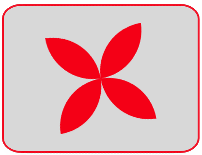
图3 旋转的四叶花(1)
编写如下的HTML文件。
<!DOCTYPE html>
<html>
<title>旋转的花瓣</title>
<head>
<style>
  .container
  {
    position: relative;
    margin: 50px auto;
    width: 400px;
    height:300px;
    background:#d8d8d8;
    overflow:hidden;
    border: 4px solid rgba(255, 0, 0, 0.9);
    border-radius: 10%;
  }
  .flower
  {
     width:204px;
     height:204px;
     margin:50px auto;
     animation:rotate 2s linear infinite;
  }
  .petal
  {
     width:100px;
     height:100px;
     float:left;
     background-color:#f00;
     border:2px solid yellow;
   }
  .petal:nth-child(1)
  {
     border-radius:100% 100% 0 100%;
     border-right:0;
     border-bottom:0;
  }
  .petal:nth-child(2)
  {
     border-radius:100% 100% 100% 0;
     border-left:0;
     border-bottom:0;
  }
  .petal:nth-child(3)
  {
     border-radius:100% 0 100% 100%;
     border-top:0;
     border-right:0;
  }
  .petal:nth-child(4)
  {
     border-radius:0 100% 100% 100%;
     border-left:0;
     border-top:0;
  }
  @keyframes rotate
  {
      0%   { transform: rotate(0deg); }
      100% { transform:rotate(360deg); }
  }
</style>
</head>
<body>
<div class="container">
<div class="flower">
 <div class="petal"></div>
 <div class="petal"></div>
 <div class="petal"></div>
 <div class="petal"></div>
</div>
</div>
</body>
</html>
在浏览器中打开包含这段HTML代码的html文件,可以呈现出如图4所示的动画效果。
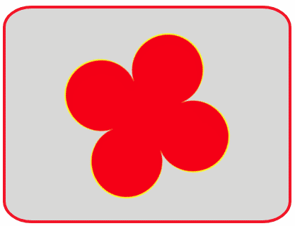
图4 旋转的四叶花(2)
编写如下的HTML文件。
<!DOCTYPE html>
<html>
<title>旋转的花瓣</title>
<head>
<style>
  .container
  {
    position: relative;
    margin: 50px auto;
    width: 400px;
    height:300px;
    background:#d8d8d8;
    overflow:hidden;
    border: 4px solid rgba(255, 0, 0, 0.9);
    border-radius: 10%;
  }
  .flower
  {
     width:200px;
     height:200px;
     margin:50px auto;
     position: relative;
     animation:rotate 2s linear infinite;
  }
  .petal
  {
     position: absolute;
     width:100px;
     height:100px;
     background-color:#f00;
     border-radius:0 100% 0 100%;
     transform-origin: right bottom;
   }
  .petal:nth-child(2)
  {
     transform: rotate(72deg);
  }
  .petal:nth-child(3)
  {
         transform: rotate(144deg);
  }
  .petal:nth-child(4)
  {
         transform: rotate(216deg);
  }
  .petal:nth-child(5)
  {
         transform: rotate(288deg);
  }
  @keyframes rotate
  {
      0%   { transform: rotate(0deg); }
      100% { transform:rotate(360deg); }
  }
</style>
</head>
<body>
<div class="container">
<div class="flower">
 <div class="petal"></div>
 <div class="petal"></div>
 <div class="petal"></div>
 <div class="petal"></div>
 <div class="petal"></div>
</div>
</div>
</body>
</html>
在浏览器中打开包含这段HTML代码的html文件,可以呈现出如图5所示的动画效果。动画中的五瓣花的5个花瓣是如图1所示花瓣每一个在前一个花瓣基础上旋转72deg得到。读者可修改HTML文件,自行演示旋转的三瓣花、六瓣花。
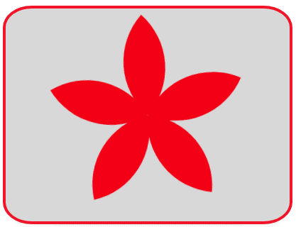
图5 旋转的五瓣花
设页面中有<div class=” petal”></div>,若定义.shape的样式规则为:
.petal
{
height: 80px;
width: 32px;
background-color:#fff;
border-radius: 0 160px 0 160px;
box-shadow: inset 0 0 0 2px #E645D0, 0 0 24px 0 #E645D0;
}
可在页面中显示如图6所示的花瓣图形,这个花瓣图形通过阴影的方式形成发光效果。
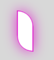
图6 花瓣(3)
将8片如图6所示的花瓣适当安排位置,使它们围成一个圆周。定义关键帧,使花瓣围成的圆周旋转起来。编写的HTML文件如下。
<!DOCTYPE html>
<html>
<title>发光旋转的花瓣</title>
<head>
<style>
  .container
  {
    position: relative;
    margin: 50px auto;
    width: 400px;
    height:300px;
    background:#d8d8d8;
    overflow:hidden;
    border: 4px solid rgba(255, 0, 0, 0.9);
    border-radius: 10%;
  }
  .flower
  {
     width:200px;
     height:200px;
     margin:50px auto;
     position: relative;
     animation:spin 2s linear infinite;
  }
  .petal
  {
    height: 80px;
    width: 32px;
    margin: auto;
    position: absolute;
    background-color:#fff;
    border-radius: 0 160px 0 160px;
    box-shadow: inset 0 0 0 2px #E645D0, 0 0 24px 0 #E645D0;
    left:var(--left);
    right:var(--right);
    top:var(--top);
    bottom:var(--bottom);
    transform: rotate(var(--degree));
    animation: shine 1s var(--delay) ease infinite;
  }
  @keyframes shine
  {
      0%,100% { }
      50%
      {
         box-shadow: inset 0 0 0 2px #17E1E6, 0 0 24px 0 #17E1E6;
      }
  }
  @keyframes spin
  {
      0% { transform: rotate(0deg); }
      100% { transform: rotate(-360deg); }
  }
</style>
</head>
<body>
<div class="container">
  <div class="flower">
     <div class="petal" style="--left: 0; --right: 0; --top: 0;--bottom:120px; --degree: 45deg;--delay:0;"></div>
     <div class="two petal" style="--left: 88px; --right: 0; --top: 0;--bottom:88px; --degree: 90deg;--delay:0.125s;"></div>
     <div class="three petal" style="--left: 120px; --right: 0; --top: 0;--bottom:0; --degree: 135deg;--delay:0.25s;"></div>
     <div class="four petal" style="--left: 88px; --right: 0; --top: 88px;--bottom:0; --degree: 180deg;--delay:0.375s;"></div>
     <div class="five petal" style="--left: 0; --right: 0; --top: 120px;--bottom:0; --degree: 225deg;--delay:0.5s;"></div>
     <div class="six petal" style="--left: 0; --right: 88px; --top: 88px;--bottom:0; --degree: 270deg;--delay:0.625s;"></div>
     <div class="seven petal" style="--left: 0; --right: 120px; --top: 0;--bottom:0; --degree: 315deg;--delay:0.75s;"></div>
     <div class="eight petal" style="--left: 0; --right: 88px; --top: 0;--bottom:88px; --degree: 360deg;--delay:0.875s;"></div>
  </div>
</div>
</body>
</html>
在浏览器中打开包含这段HTML代码的html文件,可以呈现出如图7所示的动画效果。
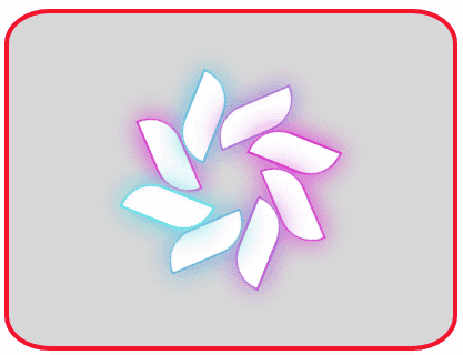
图7 发光旋转的花瓣
标签:定义 通过 动画效果 -- 基础 显示 image pos close
原文地址:https://www.cnblogs.com/cs-whut/p/13582888.html
