标签:style blog http io ar color os sp for
此练习作品是为学习HTML5+CSS3而设计的(如有不好请大家批评指教~~~)。
采用了CSS3的动画@keyframes规则设计div块的移动、伸缩、旋转和渐变:
动画定义:animation:animationName;
div块的移动:
@keyframes keyframeName{
from{divInitialLocation:value}
to{divEndLocation:value}
}
div块的伸缩:
@keyframes keyframeName{
from{transform:scale(multipleValue,multipleValue)}
to{transform:scale(multipleValue,multipleValue)}
}
div块的旋转:
@keyframes keyframeName{
from{transform:rotateY(angleValue)}
to{transform:rotateY(angleValue)}
}
div块的渐变(也是利用动画规则@keyframes和标签元素属性opacity来实现的):
@keyframes keyframeName{
from{opacity:InitialValue}
to{opacity:Endvalue}
}
具体代码实现如下:
body部分代码:

<body>
    <div id="one"></div>
    <div id="two"></div>
    <div id="three"></div>
    <div id="four"></div>
    <div id="five"></div>
</body>
script部分代码:
<script>
    window.onload=function(){
        var one=document.getElementById(‘one‘);
        var two=document.getElementById(‘two‘);
        var three=document.getElementById(‘three‘);
        var four=document.getElementById(‘four‘);
        var five=document.getElementById(‘five‘);

        var twotwo=document.getElementById(‘twotwo‘);


        one.onclick=function(){
            two.style.animation="two 5s";
            two.style.display="block";
            three.style.animation="three 5s";
            three.style.display="block";
            four.style.animation="four 5s";
            four.style.display="block";
            five.style.animation="five 5s";
            five.style.display="block";
        }
        two.onclick=function(){
            one.style.opacity="0";
            three.style.opacity="0";
            four.style.opacity="0";
            five.style.opacity="0";
            one.style.animation="opacity 5s";
            three.style.animation="opacity 5s";
            four.style.animation="opacity 5s";
            five.style.animation="opacity 5s";

            two.style.top="50%";
            two.style.transform="scale(2,2)";
            two.style.animation="twotwo 5s";
        }
        three.onclick=function(){
            one.style.opacity="0";
            two.style.opacity="0";
            four.style.opacity="0";
            five.style.opacity="0";
            one.style.animation="opacity 5s";
            two.style.animation="opacity 5s";
            four.style.animation="opacity 5s";
            five.style.animation="opacity 5s";

            three.style.left="50%";
            three.style.transform="scale(2,2)";
            three.style.animation="threethree 5s";
        }
        four.onclick=function(){
            one.style.opacity="0";
            two.style.opacity="0";
            three.style.opacity="0";
            five.style.opacity="0";
            one.style.animation="opacity 5s";
            two.style.animation="opacity 5s";
            three.style.animation="opacity 5s";
            five.style.animation="opacity 5s";

            four.style.left="50%";
            four.style.transform="scale(2,2)";
            four.style.animation="fourfour 5s";
        }
        five.onclick=function(){
            one.style.opacity="0";
            two.style.opacity="0";
            three.style.opacity="0";
            four.style.opacity="0";
            one.style.animation="opacity 5s";
            two.style.animation="opacity 5s";
            three.style.animation="opacity 5s";
            four.style.animation="opacity 5s";

            five.style.top="50%";
            five.style.transform="scale(2,2)";
            five.style.animation="fivefive 5s";
        }
    }
</script>
style部分代码:
<style>
    html,div,body,canvas{
        margin:0;
        padding:0;
    }
    div{
        //border:1px solid;
        border-radius:50px;
    }
    #one{
        position:absolute;
        height:100px;
        width:100px;
        top:50%;
        left:50%;
        margin:-50px 0 0 -50px;
        animation:one 5s;
        border-radius:50px;
        transform:scale(2,2);
        background:#1d953f;
    }
    #two{
        position:absolute;
        height:100px;
        width:100px;
        top:25%;
        left:50%;
        margin:-50px 0 0 -50px;
        //z-index:1;
        //animation:two 5s;
        display:none;
        background:#ea66a6;
    }
    #three{
        position:absolute;
        height:100px;
        width:100px;
        top:50%;
        left:25%;
        margin:-50px 0 0 -50px;
        //z-index:2;
        //animation:three 5s;
        display:none;
        background:#e0861a;
    }
    #four{
        position:absolute;
        height:100px;
        width:100px;
        top:50%;
        left:75%;
        margin:-50px 0 0 -50px;
        //z-index:3;
        //animation:four 5s;
        display:none;
        background:#00ae9d;
    }
    #five{
        position:absolute;
        height:100px;
        width:100px;
        top:75%;
        left:50%;
        margin:-50px 0 0 -50px;
        //z-index:4;
        //animation:five 5s;
        display:none;
        background:#ed1941;
    }
    @keyframes one{
        from{transform:scale(1,1);}
        to{transform:scale(2,2);}
    }
    @keyframes two{
        0%{top:50%}
        50%{top:25%;transform:rotateY(0deg);}
        100%{transform:rotateY(360deg);}
    }
    @keyframes twotwo{
        0%{top:25%;transform:scale(1,1);}
        50%{top:50%;transform:scale(1,1);}
        100%{transform:scale(2,2);}
    }
    @keyframes three{
        0%{left:50%}
        50%{left:25%;transform:rotateY(0deg);}
        100%{transform:rotateY(360deg);}
    }
    @keyframes threethree{
        0%{left:25%;transform:scale(1,1);}
        50%{left:50%;transform:scale(1,1);}
        100%{transform:scale(2,2);}
    }
    @keyframes four{
        0%{left:50%}
        50%{left:75%;transform:rotateY(0deg);}
        100%{transform:rotateY(360deg);}
    }
    @keyframes fourfour{
        0%{left:75%;transform:scale(1,1);}
        50%{left:50%;transform:scale(1,1);}
        100%{transform:scale(2,2);}
    }
    @keyframes five{
        0%{top:50%}
        50%{top:75%;transform:rotateY(0deg);}
        100%{transform:rotateY(360deg);}
    }
    @keyframes fivefive{
        0%{top:75%;transform:scale(1,1);}
        50%{top:50%;transform:scale(1,1);}
        100%{transform:scale(2,2);}
    }
    @keyframes opacity{
        from{opacity:1}
        to{opacity:0}
    }
</style>
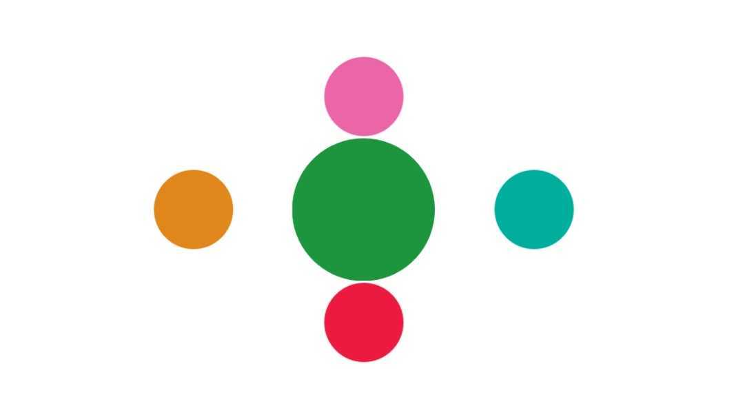
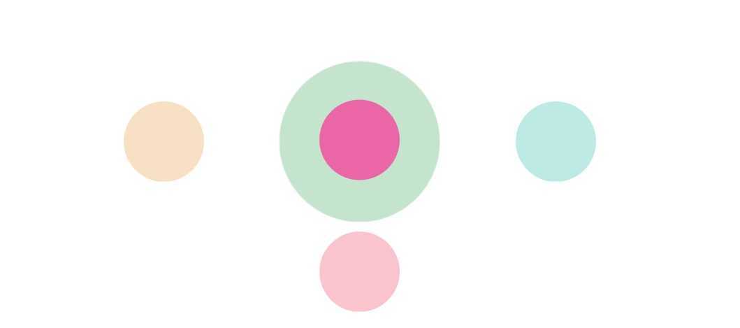
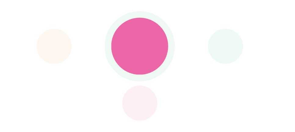
效果图如下:
第一幅图:
第二幅图:
第三幅图:
标签:style blog http io ar color os sp for
原文地址:http://www.cnblogs.com/xuyongsky1234/p/xuyongsky1234.html
