标签:style blog http io ar color os sp for
<!DOCTYPE html>
<html>
<head>
<meta charset="utf-8">
<title></title>
<style type="text/css">
html,body{
height: 100%;
width: 100%;
padding: 0;
margin: 0;
}
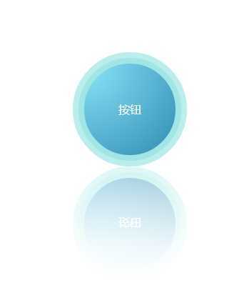
.circle{
width: 160px;
height: 160px;
cursor:pointer;
position: relative;
border-radius: 50%;
background-color: rgba(105,217,216,.1);
/*倒影*/
-webkit-box-reflect: below 0 -webkit-linear-gradient(top,rgba(250,250,250,0),rgba(250,250,250,.1) 30%,rgba(250,250,250,0.5));
box-reflect: below 0 -webkit-linear-gradient(top,rgba(250,250,250,0),rgba(250,250,250,.1) 30%,rgba(250,250,250,0.5));
}
.mybtn{
animation-name: mybtn;
animation-duration: 1s;
animation-timing-function: linear;
animation-iteration-count: infinite;
animation-direction: alternate;
animation-play-state: running;
/*Firefox: */
-moz-animation-name: mybtn;
-moz-animation-duration: 1s;
-moz-animation-timing-function: linear;
-moz-animation-iteration-count: infinite;
-moz-animation-direction: alternate;
-moz-animation-play-state: running;
/*ie: */
-ms-animation-name: mybtn;
-ms-animation-duration: 1s;
-ms-animation-timing-function: linear;
-ms-animation-iteration-count: infinite;
-ms-animation-direction: alternate;
-ms-animation-play-state: running;
/* Safari 和 Chrome: */
-webkit-animation-name: mybtn;
-webkit-animation-duration: 1s;
-webkit-animation-timing-function: linear;
-webkit-animation-iteration-count: infinite;
-webkit-animation-direction: alternate;
-webkit-animation-play-state: running;
/* Opera: */
-o-animation-name: mybtn;
-o-animation-duration: 1s;
-o-animation-timing-function: linear;
-o-animation-iteration-count: infinite;
-o-animation-direction: alternate;
-o-animation-play-state: running;
}
.circle:before,
.circle:after{
position: absolute;
border-radius: 50%;
}
.circle:before{
content: "";
width: 90%;
height: 90%;
margin:5%;
background-color: rgba(105,217,216,.3);
}
.circle:after{
width: 80%;
height: 80%;
margin:10%;
content: "按钮";
color: #fff;
font-family: ‘微软雅黑‘;
vertical-align: middle;
text-align: center;
/*镜相渐变背景*/
background-image: -webkit-radial-gradient(ellipse at left top, rgb(140,230,250),rgb(50,140,180));
background-image: -moz-radial-gradient(ellipse at left top, rgb(140,230,250),rgb(50,140,180));
background-image: -ms-radial-gradient(ellipse at left top, rgb(140,230,250),rgb(50,140,180));
background-image: -o-radial-gradient(ellipse at left top, rgb(140,230,250),rgb(50,140,180));
background-image: radial-gradient(ellipse at left top, rgb(140,230,250),rgb(50,140,180));
}
.circle:after,
.middle{
/*文字垂直居中*/
display: -webkit-box;
-webkit-box-orient: horizontal;
-webkit-box-pack: center;
-webkit-box-align: center;
display: -moz-box;
-moz-box-orient: horizontal;
-moz-box-pack: center;
-moz-box-align: center;
display: -o-box;
-o-box-orient: horizontal;
-o-box-pack: center;
-o-box-align: center;
display: -ms-box;
-ms-box-orient: horizontal;
-ms-box-pack: center;
-ms-box-align: center;
display: box;
box-orient: horizontal;
box-pack: center;
box-align: center;
}
@keyframes mybtn{
from {background-color: rgba(105,217,216,.1);}
to {background-color: rgba(105,217,216,.5);}
}
@-moz-keyframes mybtn{
from {background-color: rgba(105,217,216,.1);}
to {background-color: rgba(105,217,216,.5);}
}
@-webkit-keyframes mybtn{
from {background-color: rgba(105,217,216,.1);}
to {background-color: rgba(105,217,216,.5);}
}
@-o-keyframes mybtn{
from {background-color: rgba(105,217,216,.1);}
to {background-color: rgba(105,217,216,.5);}
}
</style>
</head>
<body class="middle">
<div class="circle mybtn"></div>
</body>
</html>
标签:style blog http io ar color os sp for
原文地址:http://www.cnblogs.com/frozen/p/4126527.html