标签:
知识点整理之css气泡框
1、气泡框构成——三角形箭头+容器
其中 三角形的实现:上下左右四个方向的三角形实现方式;
 1 <!DOCTYPE HTML>
 2 <html>
 3 <head>
 4 <meta http-equiv="Content-Type" content="text/html; charset=utf-8">
 5 <title>上下左右三角形</title>
 6 <style type="text/css">
 7 body{ background:#000; font-family:"微软雅黑"; color:#fff; font-weight:normal;}
 8 .top{
 9     width:0;
10     border-bottom:30px solid #abcdef;
11     border-left:30px solid transparent;
12     border-right:30px solid transparent;
13     }
14 .bottom{
15     width:0;
16     border-top:30px solid #abcdef;
17     border-left:30px solid transparent;
18     border-right:30px solid transparent;
19     }
20 .left{
21     width:0;
22     border-right:30px solid #abcdef;
23     border-top:30px solid transparent;
24     border-bottom:30px solid transparent;
25     }
26 .right{
27     width:0;
28     border-left:30px solid #abcdef;
29     border-top:30px solid transparent;
30     border-bottom:30px solid transparent;
31     }
32
33 </style>
34 </head>
35
36 <body>
37 <h3>朝上三角形:</h3>
38 <div class="top"></div>
39 <h3>朝下三角形:</h3>
40 <div class="bottom"></div>
41 <h3>朝左三角形:</h3>
42 <div class="left"></div>
43 <h3>朝右三角形:</h3>
44 <div class="right"></div>
45
46 </body>
47 </html>
2、容器的实现
1 <div class="content"></div>
容器的css样式:
1 .content{
2     position:relative;
3     width:300px;
4     height:80px;
5     line-height:60px;
6     background:#D6E29A;
7     border-radius:4px;
8     border:1px solid #AEBD30;
9     }
3、箭头+容器=气泡
在容器内绘制一个三角形
<div class="content">
    <div class="cac_top"></div>
</div>
容器内三角形.cac_top的样式为:
 1 .cac_top{
 2     width:0;
 3     border-top:20px solid #D6E29A;
 4     border-left:20px solid transparent;
 5     border-right:20px solid transparent;
 6     position:absolute;
 7     bottom:-20px;
 8     left:100px;
 9
10     }
此时气泡的样子为:
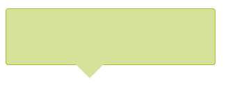
不难发现小三角并没有被边框,我们需要在div内再添加一个小三角,将其背景色设置成容器边框的颜色,充当三角的边框,具体代码如下:
1 <div class="content">
2     <div class="cac_bg"></div><!-- 背景三角 -->
3     <div class="cac_bder"></div><!-- 边框三角 -->
4 </div>
css为:
 1 .cac_bder{
 2     width:0;
 3     border-top:20px solid #AEBD30;
 4     border-left:20px solid transparent;
 5     border-right:20px solid transparent;
 6     position:absolute;
 7     bottom:-20px;
 8     left:100px;
 9     z-index:1;
10
11     }
12 .cac_bg{
13     width:0;
14     border-top:19px solid #D6E29A;
15     border-left:19px solid transparent;
16     border-right:19px solid transparent;
17     position:absolute;
18     bottom:-19px;
19     left:101px;
20     z-index:2;
21
22     }
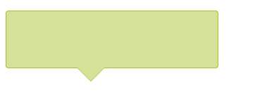
此时气泡的样子为:
完整代码如下:
 1 <!DOCTYPE HTML>
 2 <html>
 3 <head>
 4 <meta http-equiv="Content-Type" content="text/html; charset=utf-8">
 5 <title>上下左右三角形</title>
 6 <style type="text/css">
 7 body{ background:#fff; font-family:"微软雅黑"; color:#333; font-weight:normal;}
 8 .top{
 9     width:0;
10     border-bottom:30px solid #abcdef;
11     border-left:30px solid transparent;
12     border-right:30px solid transparent;
13     }
14 .bottom{
15     width:0;
16     border-top:30px solid #abcdef;
17     border-left:30px solid transparent;
18     border-right:30px solid transparent;
19     }
20 .left{
21     width:0;
22     border-right:30px solid #abcdef;
23     border-top:30px solid transparent;
24     border-bottom:30px solid transparent;
25     }
26 .right{
27     width:0;
28     border-left:30px solid #abcdef;
29     border-top:30px solid transparent;
30     border-bottom:30px solid transparent;
31     }
32 .content{
33     position:relative;
34     width:300px;
35     height:80px;
36     line-height:60px;
37     background:#D6E29A;
38     border-radius:4px;
39     border:1px solid #AEBD30;
40     }
41 .cac_bder{
42     width:0;
43     border-top:20px solid #AEBD30;
44     border-left:20px solid transparent;
45     border-right:20px solid transparent;
46     position:absolute;
47     bottom:-20px;
48     left:100px;
49     z-index:1;
50
51     }
52 .cac_bg{
53     width:0;
54     border-top:19px solid #D6E29A;
55     border-left:19px solid transparent;
56     border-right:19px solid transparent;
57     position:absolute;
58     bottom:-19px;
59     left:101px;
60     z-index:2;
61
62     }
63
64 </style>
65 </head>
66
67 <body>
68 <h3>朝上三角形:</h3>
69 <div class="top"></div>
70 <h3>朝下三角形:</h3>
71 <div class="bottom"></div>
72 <h3>朝左三角形:</h3>
73 <div class="left"></div>
74 <h3>朝右三角形:</h3>
75 <div class="right"></div>
76 <h3>div容器</h3>
77 <div class="content">
78     <div class="cac_bg"></div><!-- 背景三角 -->
79     <div class="cac_bder"></div><!-- 边框三角 -->
80 </div>
81 </body>
82 </html>
标签:
原文地址:http://www.cnblogs.com/cacti/p/4288238.html