标签:
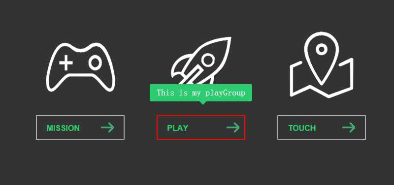
先预览效果
其中用到了CSS3的Transition属性:设置动画时间、效果;Transform属性:设置元素旋转、位移;box-sizing属性:以特定的方式定义某个区域的特定元素;
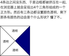
制作小三角方法:
1 width:0; height:0; overflow:hidden;
2 border:7px solid transparent;
3 border-top-color:#2dcb70; /*宽高都为零,先设置边框为透明,再在需要的地方给边框单独设置颜色即可*/
HTML代码
 1 <div class="box">
 2     <div class="link link-miss">
 3         <span class="icon"></span>
 4         <a href="#" class="button" data="My mission is clear">
 5             <span class="line line-top"></span>
 6             <span class="line line-right"></span>
 7             <span class="line line-bottom"></span>
 8             <span class="line line-left"></span>
 9             MISSION
10         </a>
11     </div>
12     <div class="link link-play">
13         <span class="icon"></span>
14         <a href="#" class="button" data="This is my playGroup">
15             <span class="line line-top"></span>
16             <span class="line line-right"></span>
17             <span class="line line-bottom"></span>
18             <span class="line line-left"></span>
19             PLAY
20         </a>
21     </div>
22     <div class="link link-touch">
23         <span class="icon"></span>
24         <a href="#" class="button" data="This is my Touch">
25             <span class="line line-top"></span>
26             <span class="line line-right"></span>
27             <span class="line line-bottom"></span>
28             <span class="line line-left"></span>
29             TOUCH
30         </a>
31     </div>
32     <div class="tip">
33         <em></em><span></span>
34     </div>
35 </div>
CSS代码
  1 *{margin:0;
  2   padding:0;}
  3
  4 body{background:#333;}
  5 .box {
  6   width:800px; height:280px; margin: 50px auto;
  7 }
  8 .box .link {
  9   width:205px; height:280px; float: left; margin:0 20px;
 10 }
 11 .link .icon {
 12   display:inline-block; width:100%; height:190px; cursor:pointer;
 13   transition:ease-out 0.2s;
 14 }
 15 .link-miss .icon {
 16   background:url(../images/mission.png) no-repeat center;
 17 }
 18 .link-play .icon {
 19   background:url(../images/play.png) no-repeat center;
 20 }
 21 .link-touch .icon {
 22   background:url(../images/touch.png) no-repeat center;
 23 }
 24 .link .icon:hover {
 25   transform:rotate(360deg) scale(1.2);
 26 }
 27 .button {
 28   display:block; width:180px; height:50px; line-height: 50px; text-decoration: none; color:#2dcb70;
 29   font-family: Arial; font-weight: bolder; border:2px solid rgba(255,255,255,0.6);
 30   padding-left: 20px; margin:0 auto; background: url(../images/allow.png) no-repeat 130px center;
 31   box-sizing:border-box;
 32   transition:0.4s ease;
 33   position: relative;
 34 }
 35 .button:hover {
 36   border:2px solid rgba(255,255,255,1);
 37   background-position: 140px center;
 38 }
 39 /*
 40 CSS3--Transition
 41   语法:transition:property duration timing-function delay;
 42   描述:
 43     transition-property:规定设置过渡效果的CSS属性的名称;
 44     transition-duration:规定完成过渡效果需要多少秒或毫秒;
 45     transition-timing-function:规定速度效果的速度曲线;
 46     transition-delay:定义过渡效果何时开始;
 47 CSS3--Transform
 48   transform属性向元素应用2D或3D转换;该属性允许我们对元素进行旋转/缩放/移动或倾斜;
 49 CSS3--box-sizing
 50   box-sizing属性允许以特定的方式定义匹配某个区域的特定元素;
 51   语法:box-sizing:content-box | border-box | inherit;
 52   描述:
 53     content-box:(默认值)宽度和高度分别应用到元素的内容框,在宽度和高度的基础上绘制元素的内边距和边框;
 54     border-box:为元素指定的任何内边距和边框都将在已设定的宽度和高度内进行绘制;
 55       通过已设定的宽度和高度分别减去边框和内边距才能得到内容的实际宽度和高度;
 56 */
 57 .button .line {
 58   position: absolute; background: none; transition:0.4s;
 59 }
 60 .button:hover .line {
 61   background: #f00;
 62 }
 63
 64 .button .line-top {
 65   width:0px; height:2px; top:-2px; left:-110%;
 66 }
 67 .button:hover .line-top {
 68   width:180px; left:-2px;
 69 }
 70
 71 .button .line-right {
 72   width:2px; height:0px; right:-2px; top:-110%;
 73 }
 74 .button:hover .line-right {
 75   height:50px; top:-2px;
 76 }
 77
 78 .button .line-bottom {
 79   width:0px; height:2px; bottom:-2px; right:-110%;
 80 }
 81 .button:hover .line-bottom {
 82   width:180px; right:-2px;
 83 }
 84
 85 .button .line-left {
 86   width:2px; height:0px; left:-2px; bottom:-110%;
 87 }
 88 .button:hover .line-left {
 89   height:50px; bottom:-2px;
 90 }
 91 .tip {
 92   position: absolute; padding: 0 14px; height:35px; line-height: 35px; background: #2dcb70;
 93   color:#fff; font-size: 18px; margin: 0 auto; border-radius: 3px; top:160px; opacity:0;
 94 }
 95 .tip em {
 96   font-style: normal; font-size: 18px; color:#fff;
 97 }
 98 .tip span {
 99   display: block; width:0; height:0; overflow: hidden; position: absolute; top:35px; left:50%;
100   border:7px solid transparent; border-top-color:#2dcb70; margin-left: -3px;
101 }
JQuery代码
 1 $(function(){
 2     $(‘.link .button‘).hover(function(){
 3         var title = $(this).attr(‘data‘);
 4         $(‘.tip em‘).text(title);
 5         var pos = $(this).offset().left;
 6         var dis = parseInt($(‘.tip‘).outerWidth()-$(this).outerWidth())/2;
 7         var l = pos - dis;
 8         $(‘.tip‘).css({‘left‘:l+‘px‘}).animate({‘top‘:180,‘opacity‘:1},300);
 9     },function(){
10         if(!$(‘.tip‘).is(‘:animated‘)){
11             $(‘.tip‘).animate({‘top‘:160,‘opacity‘:0},50);
12         }
13     })
14 });
学自慕课网http://www.imooc.com/learn/5
标签:
原文地址:http://www.cnblogs.com/yizihan/p/4312936.html