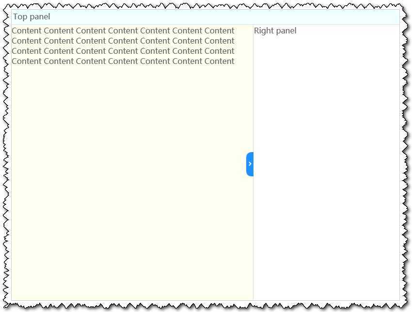
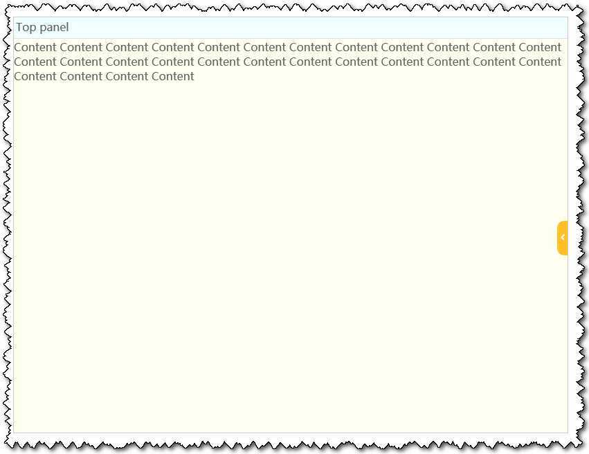
效果演示
实现原理
代码说明
css
|
1
2
3
4
5
6
7
8
9
10
11
12
13
14
15
16
17
18
19
20
21
22
23
24
25
26
27
28
29
30
31
32
33
34
35
36
37
38
39
40
41
42
43
44
45
46
47
48
49
50
51
52
53
54
55
56
57
58
59
60
61
62
63
64
65
66
67
68
69
70
71
72
73
74
75
76
77
78
79
80
81
82
83
84
85
86
87
88
89
90
91
92
93
94
95
96
97
98
99
100
101
102
103
104
105
106
107
108
109
110
111
112
113
114
115
116
117 |
<style>body { font-family:"Microsoft YaHei",arial,sans-serif; margin: 0px; padding: 0px; color: #666;}ul { margin:0; padding:0; list-style-type:none;}.topPanel{ position: fixed; top: 0px; left: 0px; height: 30px; width: 100%; border-top: 1px
solid #e0e0e0; border-bottom: 1px
solid #e0e0e0; background: #F0FFFF;}.topPanel div{ display: inline-block; padding: 3px
20px 0px 3px; height: 27px;}.splitPanel{ position: fixed; top: 49%; width: 15px; height: 50px; right: 301px; background: #1E90FF; cursor: pointer; border-top-left-radius: 10px; border-bottom-left-radius: 10px; z-index: 9999;}.showHideRightPanelChk { display: none;}.showHideRightPanelChk:checked ~ .rightPanel { display: none;}.showHideRightPanelChk:checked ~ .splitPanel { right: 0px; background: #FFC125;}.showHideRightPanelChk:checked ~ .splitPanel label{ right: 0px;}.showHideRightPanelChk:checked ~ .splitPanel label:nth-child(1){ margin: 20px
0px 0px 6px; transform: rotate(315deg); -webkit-transition:1s all
ease; transition:1s all
ease;}.showHideRightPanelChk:checked ~ .contentPanel { right: 0px;}.splitMark{ margin: 20px
0px 0px 3px; width: 5px; height: 5px; border-top: 2px
#fff solid; border-left: 2px
#fff solid; transform: rotate(135deg); display: inline-block; -webkit-transition:1s all
ease; transition:1s all
ease;}.splitBorder{ position: fixed; top: 49%; width: 15px; height: 50px; right: 301px;}.rightPanel{ position: fixed; top: 31px; right: 0px; width: 299px; bottom: 1px; border-left: 1px
solid #e0e0e0; padding: 1px
1px 1px 1px;}.rightPanel div{ display: inline-block; margin: 0px
0px 14px 0px;}.contentPanel{ position: fixed; top: 32px; left: 0px; right: 301px; bottom: 1px; width: auto; background: #FFFFF0;}</style> |
html
<div>
	<input id="showHideRightPanel" class="showHideRightPanelChk" type="checkbox">
	<div class="topPanel">
		<div>Top panel</div>
	</div>
	<div class="contentPanel">
		<div>Content
		Content Content Content Content Content Content Content Content Content Content Content Content Content Content Content Content Content Content Content Content Content Content Content Content Content Content Content </div>
	</div>
	<div class="splitPanel">
		<label for="showHideRightPanel" class="splitMark"></label>
		<label for="showHideRightPanel" class="splitBorder"></label>
	</div>
	<div class="rightPanel">
		<div>
			<ul>
				<li>Right panel</li>
			</ul>
		</div>
	</div>
</div>
运行后,就可以看见效果了。
CSS3+HTML5特效8 - 顶部和右侧固定,左侧随窗口变化的布局,布布扣,bubuko.com
CSS3+HTML5特效8 - 顶部和右侧固定,左侧随窗口变化的布局
原文地址:http://www.cnblogs.com/lonelyxmas/p/3768970.html