标签:
今天想做一个统计图表,像163博客的流量统计一样的,借助 flot 实现了,而且很简单。
| var options = { | |
| lines: { show: true }, | |
| points: { show: true }, | |
| xaxis: { tickDecimals: 0, tickSize: 1 } | |
| }; |
$.plot($("#placeholder"), [ { data: d1, lines: { show: true, fill: true } }, { data: d2, bars: { show: true } }, { data: d3, points: { show: true } }, { data: d4, lines: { show: true } }, { data: d5, lines: { show: true }, points: { show: true } }, { data: d6, lines: { show: true, steps: true } }]); |
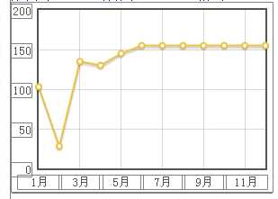
$.plot($("#placeholder"), [{ label: "", data: vData}],{ series: { lines: { show: true }, points: { show: true} }, xaxis: { ticks: [[1, "1月"], [3, "3月"], [5, "5月"], [7, "7月"], [9, "9月"], [11, "11月"]], min: 1, max: 12 }, //指定固定的显示内容 yaxis: { ticks: 5, min: 0 } //在y轴方向显示5个刻度,此时显示内容由 flot 根据所给的数据自动判断} ); |
<div id="flot-placeholder" style="width:300px;height:150px"></div>
标签:
原文地址:http://www.cnblogs.com/wicub/p/4383359.html