标签:
要想做出完美的树形结构和右键菜单必须要注意一下几个方面
一:TreeView的样式
二:数据的展示和数据绑定
三:数据的的组织和生成(递归)
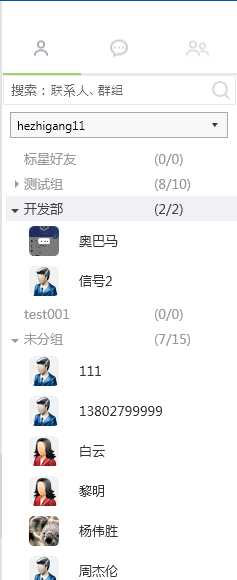
看下图效果:
首先来看TreeView的样式的实现:
<ResourceDictionary xmlns="http://schemas.microsoft.com/winfx/2006/xaml/presentation"
        xmlns:x="http://schemas.microsoft.com/winfx/2006/xaml"
        xmlns:i="http://schemas.microsoft.com/expression/2010/interactivity"
        xmlns:cw="clr-namespace:Wistron.Framerwork.FrameCommon.WPFExtension;assembly=Wistron.Framerwork.FrameCommon">

    <SolidColorBrush x:Key="NormalForegroundBrush" Color="#999999"/>
    <SolidColorBrush x:Key="HoverForegroundBrush" Color="#424242"/>
    <SolidColorBrush x:Key="SelectedForegroundBrush" Color="#000000"/>

    <!-- 悬停状态的画刷 -->
    <SolidColorBrush x:Key="HoverBackgroundBrushKey" Color="#f0f2f5" />
    <!-- 选中(激活)状态的画刷 -->
    <SolidColorBrush x:Key="SelectedActiveBackgroundBrushKey" Color="#e2e5eb" />
    <!-- 选中(悬停)状态的画刷 -->
    <SolidColorBrush x:Key="SelectedHoverBackgroundBrushKey" Color="#e2e5eb" />
    <!-- 选中(失效)状态的画刷 -->
    <SolidColorBrush x:Key="SelectedInactiveBackgroundBrushKey" Color="#e2e5eb" />
    <!--前面小三角样式-->
    <Style x:Key="ExpandCollapseToggleStyle"
           TargetType="{x:Type ToggleButton}">
        <Setter Property="Focusable"
                Value="False" />
        <Setter Property="Width"
                Value="13" />
        <Setter Property="Height"
                Value="13" />
        <Setter Property="Foreground" Value="{DynamicResource NormalForegroundBrush }"/>
        <Setter Property="Template">
            <Setter.Value>
            <ControlTemplate TargetType="ToggleButton">
            <Grid Width="13" Height="13"  Background="Transparent">
            <Path x:Name="ExpandPath"
              HorizontalAlignment="Left"
              VerticalAlignment="Center"
              Margin="0"
              Fill="{TemplateBinding Foreground}"
             Data="M 4 0 L 8 4 L 4 8 Z"/>
                    </Grid>
                    <ControlTemplate.Triggers>
                        <Trigger Property="IsChecked" Value="True">
                            <Setter Property="Data" TargetName="ExpandPath" Value="M 0 4 L 8 4 L 4 8 Z"/>
                        </Trigger>
                    </ControlTemplate.Triggers>
                </ControlTemplate>
            </Setter.Value>
        </Setter>
    </Style>

    <Style x:Key="MetroTreeViewItemStyle" TargetType="{x:Type TreeViewItem}">
        <Setter Property="BorderThickness" Value="0" />
        <Setter Property="Padding" Value="0" />
        <Setter Property="FontSize" Value="14"/>
        <Setter Property="Foreground" Value="{DynamicResource NormalForegroundBrush }"/>
        <Setter Property="Template">
            <Setter.Value>
                <ControlTemplate TargetType="{x:Type TreeViewItem}">
                    <ControlTemplate.Resources>
                        <!-- 计算节点缩进的转换器 -->
                        <cw:IndentConverter Indent="5" MarginLeft="5" x:Key="IndentConverter" />
                    </ControlTemplate.Resources>
                    <StackPanel>
                        <Border x:Name="Border"
                                BorderBrush="{TemplateBinding BorderBrush}"
                                BorderThickness="{TemplateBinding BorderThickness}"
                                Background="{TemplateBinding Background}"
                                Padding="{TemplateBinding Padding}"
                                SnapsToDevicePixels="True">
                            <Grid Margin="{Binding Converter={StaticResource IndentConverter}, RelativeSource={RelativeSource TemplatedParent}}">
                                <Grid.ColumnDefinitions>
                                    <ColumnDefinition MinWidth="12" Width="Auto" />
                                    <ColumnDefinition />
                                </Grid.ColumnDefinitions>
                                <ToggleButton x:Name="Expander"
                                              Style="{StaticResource ExpandCollapseToggleStyle}"
                                              IsChecked="{Binding Path=IsExpanded,RelativeSource={RelativeSource TemplatedParent}}"
                                              ClickMode="Press" Width="Auto" HorizontalAlignment="Left"   VerticalAlignment="Center"
                                              Height="Auto" Margin="0,0,0,0" />
                                <ContentPresenter x:Name="PART_Header"
                                                  Grid.Column="1"
                                                  ContentSource="Header"
                                                  VerticalAlignment="{TemplateBinding VerticalAlignment}"
                                                  HorizontalAlignment="{TemplateBinding HorizontalContentAlignment}"
                                                  SnapsToDevicePixels="{TemplateBinding SnapsToDevicePixels}" />
                            </Grid>
                        </Border>
                        <ItemsPresenter x:Name="ItemsHost">
                         </ItemsPresenter>
                    </StackPanel>
                    <ControlTemplate.Triggers>
                        <Trigger Property="IsExpanded" Value="False">
                            <Setter TargetName="ItemsHost" Property="Visibility" Value="Collapsed" />
                        </Trigger>
                        <Trigger Property="HasItems" Value="False">
                            <Setter TargetName="Expander" Property="Visibility" Value="Hidden" />
                        </Trigger>
                        <!-- 选中(激活)-->
                        <Trigger Property="IsSelected" Value="True">
                            <Setter TargetName="Border" Property="Background"
                                    Value="{StaticResource SelectedActiveBackgroundBrushKey}" />
                            <Setter  Property="Foreground"
                                    Value="{StaticResource  SelectedForegroundBrush}" />
                            <Setter TargetName="Expander"  Property="Foreground"
                                    Value="{StaticResource  SelectedForegroundBrush}" />
                        </Trigger>
                        <MultiTrigger>
                            <MultiTrigger.Conditions>
                                <Condition Property="IsSelected" Value="True" />
                                <Condition Property="Selector.IsSelectionActive" Value="False" />
                            </MultiTrigger.Conditions>
                            <Setter TargetName="Border" Property="Background"
                                    Value="{StaticResource SelectedInactiveBackgroundBrushKey}" />
                            <Setter  Property="Foreground"
                                    Value="{StaticResource SelectedForegroundBrush}" />
                            <Setter TargetName="Expander"  Property="Foreground"
                                    Value="{StaticResource  SelectedForegroundBrush}" />
                        </MultiTrigger>
                        <Trigger SourceName="Border" Property="IsMouseOver" Value="True">
                            <Setter TargetName="Border" Property="Background"
                                    Value="{StaticResource HoverBackgroundBrushKey}" />
                            <Setter  Property="Foreground"
                                    Value="{StaticResource  HoverForegroundBrush}" />
                             <Setter TargetName="Expander"  Property="Foreground"
                                    Value="{StaticResource  HoverForegroundBrush}" />
                        </Trigger>
                        <MultiTrigger>
                            <MultiTrigger.Conditions>
                                <Condition Property="IsSelected" Value="True" />
                                <Condition SourceName="Border" Property="IsMouseOver" Value="True" />
                            </MultiTrigger.Conditions>
                            <Setter TargetName="Border" Property="Background"
                                    Value="{StaticResource SelectedHoverBackgroundBrushKey}" />
                            <Setter  Property="Foreground"
                                    Value="{StaticResource  SelectedForegroundBrush}" />
                            <Setter TargetName="Expander"  Property="Foreground"
                                    Value="{StaticResource  SelectedForegroundBrush}" />
                        </MultiTrigger>
                        <Trigger Property="IsEnabled" Value="False">
                            <Setter Property="Foreground"
                                    Value="{DynamicResource {x:Static SystemColors.GrayTextBrushKey}}" />
                        </Trigger>
                    </ControlTemplate.Triggers>
                </ControlTemplate>
            </Setter.Value>
        </Setter>
    </Style>

    <Style x:Key="MetroTreeViewStyle"
           TargetType="{x:Type TreeView}">
        <Setter Property="BorderBrush"
                Value="{DynamicResource BlackBrush}" />
        <!-- default to 0 -->
        <Setter Property="BorderThickness"
                Value="0" />
        <Setter Property="SnapsToDevicePixels"
                Value="True" />
        <Setter Property="Template">
            <Setter.Value>
                <ControlTemplate TargetType="{x:Type TreeView}">
                    <Border Name="Border"
                            Background="{TemplateBinding Background}"
                            BorderBrush="{TemplateBinding BorderBrush}"
                            BorderThickness="{TemplateBinding BorderThickness}">
                        <ScrollViewer>
                            <ItemsPresenter />
                        </ScrollViewer>
                    </Border>
                    <ControlTemplate.Triggers>
                        <Trigger Property="IsEnabled"
                                 Value="False">
                            <Setter TargetName="Border"
                                    Property="BorderBrush"
                                    Value="{DynamicResource GrayBrush9}" />
                        </Trigger>
                    </ControlTemplate.Triggers>
                </ControlTemplate>
            </Setter.Value>
        </Setter>
        <Setter Property="ItemContainerStyle"
                Value="{StaticResource MetroTreeViewItemStyle}" />
    </Style>

</ResourceDictionary>
上面引用了的一个缩进方法 这个事非常重要的,第一关系到父节点和子节点的缩进长度,第二关系到选择 和鼠标放上去的样式是否是整列。引用的缩进代码如下
using System;
using System.Globalization;
using System.Windows;
using System.Windows.Controls;
using System.Windows.Data;

namespace Wistron.Framerwork.FrameCommon.WPFExtension
{
    /// <summary>
    /// 计算 <see cref="System.Windows.Controls.TreeViewItem"/> 的缩进的转换器。
    /// </summary>
    [ValueConversion(typeof(TreeViewItem), typeof(Thickness))]
    public sealed class IndentConverter : IValueConverter
    {
        /// <summary>
        /// 获取或设置缩进的像素个数。
        /// </summary>
        public double Indent { get; set; }
        /// <summary>
        /// 获取或设置初始的左边距。
        /// </summary>
        public double MarginLeft { get; set; }
        /// <summary>
        /// 转换值。
        /// </summary>
        /// <param name="value">绑定源生成的值。</param>
        /// <param name="targetType">绑定目标属性的类型。</param>
        /// <param name="parameter">要使用的转换器参数。</param>
        /// <param name="culture">要用在转换器中的区域性。</param>
        /// <returns>转换后的值。如果该方法返回 <c>null</c>,则使用有效的 <c>null</c> 值。</returns>
        public object Convert(object value, Type targetType, object parameter, CultureInfo culture)
        {
            TreeViewItem item = value as TreeViewItem;
            if (item == null)
            {
                return new Thickness(0);
            }
            return new Thickness(this.MarginLeft + this.Indent * item.GetDepth(), 0, 0, 0);
        }
        /// <summary>
        /// 转换值。
        /// </summary>
        /// <param name="value">绑定目标生成的值。</param>
        /// <param name="targetType">要转换到的类型。</param>
        /// <param name="parameter">要使用的转换器参数。</param>
        /// <param name="culture">要用在转换器中的区域性。</param>
        /// <returns>转换后的值。如果该方法返回 <c>null</c>,则使用有效的 <c>null</c> 值。</returns>
        public object ConvertBack(object value, Type targetType, object parameter, CultureInfo culture)
        {
            throw new NotImplementedException();
        }
    }
}
TreeView的样式几个重要方面就是选择颜色,鼠标放上去的颜色,还有选择鼠标放上去的颜色,在样式文件里表的一清二楚。
TreeView的样式就大功告成了。
标签:
原文地址:http://www.cnblogs.com/webb-ring/p/4440448.html