标签:
目前有越来越多的网站都使用animation,无论他们是用GIF,SVG,WebGL,视频背景或者其他形式展示。适当地使用动画会让网站更生动,互动性更好,为用户增加一个额外的反馈和体验层。
在本教程中我会向你介绍CSS动画;随着浏览器支持性的提高已经变得越来越流行了,css动画在做一些事情上有很高的性能。在涵盖了基础知识后,我们将建一个快速的例子:矩形变成圆形的动画。
@keyframes和动画 介绍
css动画的主要组件:@keyframes,创建动画的css规则。把@keyframes想象为动画步骤的时间轴。在@keyframes里,你可以定义这些步骤,每个都有不同的样式声明。
第二步,让css动画能运行,需要为@keyframes绑定一个选择符。基于这些步骤,@keyframes声明的所有代码都会变解析然后对新的样式进行初始化。
这里我们将会设置动画的步骤,@keyframes的属性如下:
例子:
@keyframes tutsFade {
0% { opacity: 1; } 100% { opacity: 0; }}@keyframes tutsFade {
from { opacity: 1; } to { opacity: 0; }}@keyframes tutsFade {
to { opacity: 0; }}animation的属性:
animation-name: @keyframes名称 (此例为 tutsFade).animation-duration:时间间隔,动画从开始到结束的总长.animation-timing-function: 设置动画速度 ( linear | ease | ease-in | ease-out | ease-in-out | cubic-bezier ).animation-delay:动画开始前的延迟.animation-iteration-count: 在动画期间它会遍历多少次.animation-direction: 改变循环的方向,从开始到结束,还是从结束到开始,或者两者都.animation-fill-mode: 指定动画结束时元素应用的样式 ( none | forwards | backwards | both ).例如:
.element {
animation-name: tutsFade; animation-duration: 4s; animation-delay: 1s; animation-iteration-count: infinite; animation-timing-function: linear; animation-direction: alternate;}.element {
animation: tutsFade 4s 1s infinite linear alternate;}在工作中,我们需要使用浏览器指定前缀确保最好的浏览器支持。标准前缀应用:
-webkit--moz--o--ms-动画属性使用了浏览器前缀的形式:
.element {
-webkit-animation: tutsFade 4s 1s infinite linear alternate; -moz-animation: tutsFade 4s 1s infinite linear alternate; -ms-animation: tutsFade 4s 1s infinite linear alternate; -o-animation: tutsFade 4s 1s infinite linear alternate; animation: tutsFade 4s 1s infinite linear alternate;}@-webkit-keyframes tutsFade { /* your style */ }
@-moz-keyframes tutsFade { /* your style */ }@-ms-keyframes tutsFade { /* your style */ }@-o-keyframes tutsFade { /* your style */ }@keyframes tutsFade { /* your style */ }多动画
使用逗号分割添加多动画。为tutsFade 元素添加回转,我们要声明一个额外的@keyframes然后绑定到元素上:
.element {
animation: tutsFade 4s 1s infinite linear alternate,tutsRotate 4s 1s infinite linear alternate;}@keyframes tutsFade { to { opacity: 0; }}@keyframes tutsRotate { to { transform: rotate(180deg); }}这个例子中总共有五个步骤,每个步骤将为元素定义一个圆角,一个回转和不同的背景色,下面是实现的步骤和代码。
首先创建一个标记,动画的元素。甚至不用class,仅仅只用一个div:
<div></div>
然后运用元素选择为div添加样式:
div {
width: 200px; height: 200px; background-color: coral; }定义一个 @keyframes,命名为square-to-circle,五个步骤如下:
@keyframes square-to-circle {
0%{} 25%{} 50%{} 75%{} 100%{}}@-webkit-keyframes square-to-circle {
0% { border-radius:0 0 0 0; } 25% { border-radius:50% 0 0 0; } 50% { border-radius:50% 50% 0 0; } 75% { border-radius:50% 50% 50% 0; } 100% { border-radius:50%; }}@keyframes square-to-circle {
0% { border-radius:0 0 0 0; background:coral; } 25% { border-radius:50% 0 0 0; background:darksalmon; } 50% { border-radius:50% 50% 0 0; background:indianred; } 75% { border-radius:50% 50% 50% 0; background:lightcoral; } 100% { border-radius:50%; background:darksalmon; }}@keyframes square-to-circle {
0% { border-radius:0 0 0 0; background:coral; transform:rotate(0deg); } 25% { border-radius:50% 0 0 0; background:darksalmon; transform:rotate(45deg); } 50% { border-radius:50% 50% 0 0; background:indianred; transform:rotate(90deg); } 75% { border-radius:50% 50% 50% 0; background:lightcoral; transform:rotate(135deg); } 100% { border-radius:50%; background:darksalmon; transform:rotate(180deg); }}定义了square-to-circle动画后,需要将它应用到div上:
div {
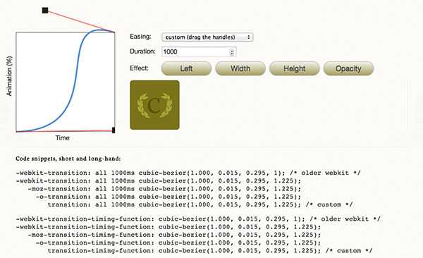
width: 200px; height: 200px; background-color: coral; animation: square-to-circle 2s 1s infinite alternate; }动画名:square-to-circle.2s.1s.可以为animation添加的最后一个属性是animation-timing-function.定义移动的速度,加速或者减速。这个函数可以是一个非常详细的值,尴尬的手动计算,但是有很多免费的网站为timing-function提供资源和在线定制。
例如:CSS Easing Animation Tool,现在来计算我们的定时功能。
运用立方贝塞尔函数为square-to-circle动画添加伸缩效果。
div {
width: 200px; height: 200px; background-color: coral; animation: square-to-circle 2s 1s infinite cubic-bezier(1,.015,.295,1.225) alternate; }-webkit- , -moz-, -ms-, -o- ) 的代码如下:div {
width: 200px; height: 200px; background-color: coral; animation: square-to-circle 2s .5s infinite cubic-bezier(1,.015,.295,1.225) alternate;}@keyframes square-to-circle { 0% { border-radius:0 0 0 0; background:coral; transform:rotate(0deg); } 25% { border-radius:50% 0 0 0; background:darksalmon; transform:rotate(45deg); } 50% { border-radius:50% 50% 0 0; background:indianred; transform:rotate(90deg); } 75% { border-radius:50% 50% 50% 0; background:lightcoral; transform:rotate(135deg); } 100% { border-radius:50%; background:darksalmon; transform:rotate(180deg); }}在现代浏览器中一切运行正常,但是在Firefox中渲染对象有点不足,边缘会出现锯齿:
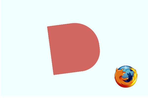
幸运的是,有一个解决方法。在div上添加透明的outline之后Firefox就会完美地渲染!
outline: 1px solid transparent;
原文来自:http://webdesign.tutsplus.com/tutorials/a-beginners-introduction-to-css-animation--cms-21068
标签:
原文地址:http://www.cnblogs.com/huangxi/p/4448278.html