标签:
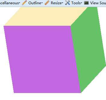
<div class="contain">
  <div class="box">
    <div class="face one"> </div>
    <div class="face two"> </div>
    <div class="face three"> </div>
    <div class="face four"> </div>
    <div class="face five"> </div>
    <div class="face six"> </div>
  </div>
</div>
<style>
        .contain {
    height: 550px;
    margin: 0 auto;
    position: relative;
    width: 250px;
}
.box {
    animation: 4s ease 0s normal none infinite running rotate;
    height: 240px;
    margin: 0 auto;
    position: relative;
    transform-style: preserve-3d;
    width: 240px;
}
.face {
    backface-visibility: hidden;
    background-color: #fae48c;
    height: 240px;
    opacity: 0.6;
    position: absolute;
    width: 240px;
}
.box .one {
    background-color: #fae48c;
    transform: rotateX(90deg) translateZ(120px);
}
.box .two {
    background-color:#9900CC ;
    transform: translateZ(120px);
}
.box .three {
    background-color:#009900;
    transform: rotateY(90deg) translateZ(120px);
}
.box .four {
    background-color:#66CCFF;
    transform: rotateY(180deg) translateZ(120px);
}
.box .five {
    background-color:#CC0000;
    transform: rotateY(-90deg) translateZ(120px);
}
.box .six {
    background: none repeat scroll 0 0 #fae48c;
    transform: rotateX(-90deg) translateZ(120px) rotate(180deg);
}
.box-demo {
    left: 40px;
    position: absolute;
    top: 40px;
}
.donut-text {
    left: 60px;
    top: 55px;
}
.enjoy {
    left: 50px;
    top: 90px;
}
input[type="checkbox"] {
    display: none;
}
label {
    background: none repeat scroll 0 0 #ff6970;
    border-radius: 5px;
    color: #b3e5d4;
    cursor: pointer;
    font-family: "Alegreya Sans",sans-serif;
    font-size: 18px;
    left: 60px;
    padding: 5px;
    position: absolute;
    text-align: center;
    top: 325px;
    width: 125px;
}
input:checked ~ .box .face {
    backface-visibility: visible;
}
@keyframes rotate {
100% {
    transform: rotateY(360deg) rotateX(360deg);
}
}
</style>
标签:
原文地址:http://www.cnblogs.com/LoveOrHate/p/4461325.html