标签:android style blog http java color
Google 公司为我们开发Android应用程序提供了丰富的UI组件,有时一个控件无法满足我们的需求,这就要求我们同时使用两个三个或者个更多的控件一起使用。有些常用的组合我就把他写成一个自定的的组件,这样就方便了以后自己的使用。本人新手,研究一天写出的组件虽然实现了自己想要的功能,但代码应该还有许多不足的地方,希望大家可以指点一下。写本帖的目的是防止自己忘记。
首先第一步,写一个布局文件my_title.xml里面放着我们要经常用到的几个控件。
<?xml version="1.0" encoding="utf-8"?>
<LinearLayout xmlns:android="http://schemas.android.com/apk/res/android"
    android:layout_width="fill_parent"
    android:layout_height="50dip"
    android:id="@+id/my_title_layout"
    android:orientation="horizontal" >

    <Button
        android:id="@+id/my_titlt_left_btn"
        android:layout_width="60dip"
        android:layout_height="fill_parent"
        android:background="#00000000"
        android:text="返回"
        />
    <TextView
        android:id="@+id/my_title_middle_text"
        android:layout_height="fill_parent"
        android:layout_width="wrap_content"
        android:layout_weight="1"
        android:gravity="center"
        android:textColor="#f00"
        android:textSize="20sp"
        android:text="我是标题栏"
        />
    <Button
        android:id="@+id/my_title_right_btn"
        android:layout_height="fill_parent"
        android:layout_width="60dip"
        android:background="#00ffffff"
        android:text="删除"
        />
</LinearLayout>
第二步,为了方便封装后设置某些属性,因此我们要为该组件添加一些自定义属性!在values文件夹下新建attrs.xml文件。
1 <?xml version="1.0" encoding="utf-8"?>
2 <resources>
3     <declare-styleable name="myTitle">
4         <attr name="background" format="reference|color"/>
5         <attr name="middlebackground" format="reference|color"/>
6         <attr name="btnleftbackground" format="reference|color"/>
7         <attr name="btnrightbackground" format="reference|color"/>
8     </declare-styleable>
9 </resources>
第三步,我们新建一个类并继承于LinearLayout在这个类里面引用上面的布局文件my_title.xml。并在里面定义一些我们要用到的方法,和初始化我们自定义的属性。
 1 package com.Jett.mytitle;
 2
 3 import android.content.Context;
 4 import android.content.res.TypedArray;
 5 import android.util.AttributeSet;
 6 import android.view.LayoutInflater;
 7 import android.widget.Button;
 8 import android.widget.LinearLayout;
 9 import android.widget.TextView;
10
11 public class MyTitleView extends LinearLayout {
12
13         private LinearLayout ll;
14         private Button btnleft,btnright;
15         private TextView middletext;
16
17         //构造函数
18         public MyTitleView(Context context) {
19                 this(context, null);
20                 // TODO Auto-generated constructor stub
21         }
22         public MyTitleView(Context context, AttributeSet attrs) {
23                 super(context, attrs);
24                 //初始化控件属性
25                 LayoutInflater.from(context).inflate(R.layout.my_title,this,true);
26
27                 ll = (LinearLayout)this.findViewById(R.id.my_title_layout);
28                 btnleft = (Button)this.findViewById(R.id.my_titlt_left_btn);
29                 btnright = (Button)this.findViewById(R.id.my_title_right_btn);
30                 middletext = (TextView)this.findViewById(R.id.my_title_middle_text);
31
32 //初始化
33                 TypedArray a = context.obtainStyledAttributes(attrs, R.styleable.myTitle);
34                 //设置标题栏颜色和中间颜色(默认没有颜色)
35                 setBackground(a.getColor(R.styleable.myTitle_background,0));
36                 setMiddleTextBackgroundColoe(a.getColor(R.styleable.myTitle_middlebackground,0));
37                 //设置左右按钮的背景图片(默认没有背景图片)
38                 setBtnLeftBackground(a.getResourceId(R.styleable.myTitle_btnleftbackground,0));
39                 setBtnRightBackground(a.getResourceId(R.styleable.myTitle_btnrightbackground,0));
40
41                 //同步一下属性
42                 a.recycle();
43         }
44         //设置显示的文字
45         public void setBtnLeftText(String text)
46         {
47                 btnleft.setText(text);
48         }
49         public void setBtnRightText(String text)
50         {
51                 btnright.setText(text);
52         }
53         public void setMiddleText(String text)
54         {
55                 middletext.setText(text);
56         }
57         //设置背景颜色
58         public void setBackground(int resId)
59         {
60                 ll.setBackgroundColor(resId);
61         }
62         public void setMiddleTextBackgroundColoe(int color)
63         {
64                 middletext.setBackgroundColor(color);
65         }
66         //设置左右按钮的背景图片
67         public void setBtnLeftBackground(int resId)
68         {
69                 btnleft.setBackgroundResource(resId);
70         }
71         public void setBtnRightBackground(int resId)
72         {
73                 btnright.setBackgroundResource(resId);
74         }
75
76         //设置左右按钮的点击事件
77         public void setLeftOnClick(OnClickListener clickListener)
78         {
79                 btnleft.setOnClickListener(clickListener);
80         }
81         public void setRightOnClick(OnClickListener clickListener)
82         {
83                 btnright.setOnClickListener(clickListener);
84         }
85 }
写到这我们自定义的组件其实已经写好了。下面就是如何使用了。
首先我们在布局文件里面引用。使用自定义属性需要加入xmlns:mytitle="http://schemas.android.com/apk/res/com.Jett.mytitle" 红色字体随便写,不过下面要用来调用自定义属性。蓝色字体是包名。
 1 <RelativeLayout xmlns:android="http://schemas.android.com/apk/res/android"
 2     xmlns:mytitle="http://schemas.android.com/apk/res/com.Jett.mytitle"
 3     xmlns:tools="http://schemas.android.com/tools"
 4     android:layout_width="fill_parent"
 5     android:layout_height="fill_parent"
 6     android:paddingBottom="@dimen/activity_vertical_margin"
 7     android:paddingLeft="0dip"
 8     android:paddingRight="0dip"
 9     android:paddingTop="0dip"
10     tools:context=".MainActivity" >
11
12     <com.Jett.mytitle.MyTitleView
13         android:id="@+id/Mian_mytitle"
14         android:layout_width="fill_parent"
15         android:layout_height="wrap_content"
16         mytitle:background="#2aa9f4"
17         mytitle:middlebackground="#2595ef"
18         mytitle:btnrightbackground="@drawable/mytitle_btn_style"
19         >
20     </com.Jett.mytitle.MyTitleView>
21
22 </RelativeLayout>
还有就是在Activity 里面设置一些组件方法
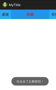
 1 package com.Jett.mytitle;
 2
 3 import android.os.Bundle;
 4 import android.view.View;
 5 import android.widget.Toast;
 6 import android.app.Activity;
 7 import android.graphics.Color;
 8
 9 public class MainActivity extends Activity {
10         private MyTitleView mytitle;
11         @Override
12         protected void onCreate(Bundle savedInstanceState) {
13                 super.onCreate(savedInstanceState);
14                 setContentView(R.layout.activity_main);
15
16                 mytitle = (MyTitleView)this.findViewById(R.id.Mian_mytitle);
17
18                 mytitle.setMiddleText("标题");
19                 mytitle.setBtnRightText("右侧");
20                 mytitle.setLeftOnClick(new View.OnClickListener() {
21                         @Override
22                         public void onClick(View v) {
23                                 // TODO Auto-generated method stub
24                                 Toast.makeText(MainActivity.this, "你点击了左侧按钮!", 1).show();
25                         }
26                 });
27         }
28 }
这样就好了,对了把按钮样式也贴出来一下吧。
在res文件夹下新建文件夹drawable在给文件夹下新建文件mytitle_btn_style.xml。
 1 <?xml version="1.0" encoding="utf-8"?>
 2 <selector xmlns:android="http://schemas.android.com/apk/res/android">
 3     <!-- 按钮按下 -->
 4     <item android:state_pressed="true">
 5         <shape>
 6             <!-- 填充颜色 -->
 7                     <solid
 8                         android:color="#1a6d99"/>
 9                     <!-- 间隔 -->
10                         <padding android:left="0dp" android:right="0dp"
11                                android:top="0dp" android:bottom="0dp"/>
12
13         </shape>
14     </item>
15
16     <item android:state_enabled="true">
17             <shape>
18                         <!-- 间隔 -->
19                         <padding android:left="0dp" android:right="0dp"
20                                android:top="0dp" android:bottom="0dp"/>
21                         <!-- 填充 -->
22                     <solid
23                         android:color="#2aa9f4"/><!-- 填充的颜色 -->
24                 </shape>
25         </item>
26 </selector>
到此我们自定义的组件就完成了。可以方便以后我们项目中的使用。
效果如下:
标签:android style blog http java color
原文地址:http://www.cnblogs.com/Jett/p/3786256.html