标签:
关键词:微信 摇一摇 DeviceOrientation DeviceMotion
本文介绍使用HTML5的DeviceOrientation特性在微信中实现摇一摇的功能。
在HTML5中,DeviceOrientation特性所提供的DeviceMotion事件封装了设备的运动传感器时间,通过改时间可以获取设备的运动状态、加速度等数据(另还有deviceOrientation事件提供了设备角度、朝向等信息)。
而通过DeviceMotion对设备运动状态的判断,则可以帮助我们在网页上就实现“摇一摇”的交互效果。
运动事件监听
    if (window.DeviceMotionEvent) {
        window.addEventListener(‘devicemotion‘, deviceMotionHandler, false);
    } else {
        alert(‘你的手机太差了,扔掉买个新的吧。__方倍工作室‘);
    }
获取加速度信息
“摇一摇”的动作既“一定时间内设备了一定距离”,因此通过监听上一步获取到的x, y, z 值在一定时间范围内的变化率,即可进行设备是否有进行晃动的判断。而为了防止正常移动的误判,需要给该变化率设置一个合适的临界值。
运行代码编辑代码查看源代码资源添加向导
    function deviceMotionHandler(eventData) {
        var acceleration = eventData.accelerationIncludingGravity;
        var curTime = new Date().getTime();

        if ((curTime - last_update) > 100) {
            var diffTime = curTime - last_update;
            last_update = curTime;
            x = acceleration.x;
            y = acceleration.y;
            z = acceleration.z;
            var speed = Math.abs(x + y + z - last_x - last_y - last_z) / diffTime * 10000;
            var status = document.getElementById("status");

            if (speed > SHAKE_THRESHOLD) {
                doResult();
            }
            last_x = x;
            last_y = y;
            last_z = z;
        }
    }
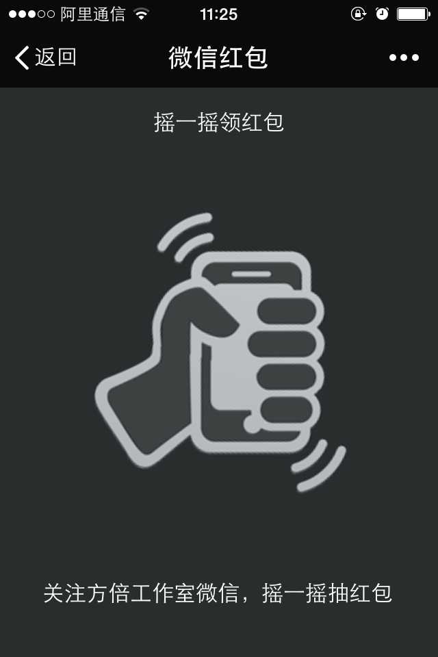
模拟微信摇一摇效果
  1 <!doctype html>
  2 <html>
  3 <head>
  4     <meta charset="UTF-8">
  5     <title>微信摇一摇红包</title>
  6     <meta name="viewport" content="width=device-width, initial-scale=1.0, minimum-scale=1.0, maximum-scale=1.0, user-scalable=no"/>
  7     <style>
  8     * { margin: 0; padding: 0; }
  9     body { background: #292D2E; }
 10     .hand { width: 190px; height: 300px; background: url(hand.png) no-repeat; position: absolute; top: 50px; left: 50%; margin-left: -95px; }
 11     .hand-animate { -webkit-animation: hand_move infinite 2s; }
 12     .result { background: #393B3C; border: #2C2C2C 1px solid; box-shadow: inset #4D4F50 0 0 0 1px; border-radius: 10px; color: #fff; padding: 10px; width: 300px; position: absolute; top: 300px; left: 50%; margin-left: -161px; opacity: 0;
 13         -webkit-transition: all 1s;
 14            -moz-transition: all 1s;
 15             -ms-transition: all 1s;
 16              -o-transition: all 1s;
 17                 transition: all 1s; }
 18     .result .pic { width: 50px; height: 50px; float: left; background: #fff; }
 19     .result .con { overflow: hidden; zoom: 1; padding-left: 10px; line-height: 24px; }
 20     .result-show { opacity: 1; margin-top: 50px; }
 21     .loading { position: absolute; top: 240px; left: 50%; margin-left: -50px; width: 100px; height: 100px; background: url(spinner.png) no-repeat; background-size: 100px 100px; opacity: 0;
 22         -webkit-animation: loading infinite linear .5s;
 23            -moz-animation: loading infinite linear .5s;
 24             -ms-animation: loading infinite linear .5s;
 25              -o-animation: loading infinite linear .5s;
 26                 animation: loading infinite linear .5s;
 27         -webkit-transition: all .5s;
 28            -moz-transition: all .5s;
 29             -ms-transition: all .5s;
 30              -o-transition: all .5s;
 31                 transition: all .5s; }
 32     .loading-show { opacity: 1; }
 33
 34     @-webkit-keyframes hand_move {
 35         0% {
 36             -webkit-transform: rotate(0);
 37                -moz-transform: rotate(0);
 38                 -ms-transform: rotate(0);
 39                  -o-transform: rotate(0);
 40                     transform: rotate(0); }
 41         50% {
 42             -webkit-transform: rotate(15deg);
 43                -moz-transform: rotate(15deg);
 44                 -ms-transform: rotate(15deg);
 45                  -o-transform: rotate(15deg);
 46                     transform: rotate(15deg); }
 47         100% {
 48             -webkit-transform: rotate(0);
 49                -moz-transform: rotate(0);
 50                 -ms-transform: rotate(0);
 51                  -o-transform: rotate(0);
 52                     transform: rotate(0); }
 53     }
 54     @-webkit-keyframes loading {
 55         0% {
 56             -webkit-transform: rotate(0);
 57                -moz-transform: rotate(0);
 58                 -ms-transform: rotate(0);
 59                  -o-transform: rotate(0);
 60                     transform: rotate(0); }
 61         100% {
 62             -webkit-transform: rotate(360deg);
 63                -moz-transform: rotate(360deg);
 64                 -ms-transform: rotate(360deg);
 65                  -o-transform: rotate(360deg);
 66                     transform: rotate(360deg); }
 67     }
 68     </style>
 69 </head>
 70 <body>
 71
 72     <div id="hand" class="hand hand-animate"></div>
 73     <div id="loading" class="loading"></div>
 74     <div id="result" class="result">
 75         <div class="con">你摇到了一个18元的红包</div>
 76     </div>
 77     <script>
 78     var SHAKE_THRESHOLD = 800;
 79     var last_update = 0;
 80     var x = y = z = last_x = last_y = last_z = 0;
 81
 82     if (window.DeviceMotionEvent) {
 83         window.addEventListener(‘devicemotion‘, deviceMotionHandler, false);
 84     } else {
 85         alert(‘你的手机太差了,扔掉买个新的吧。__方倍工作室‘);
 86     }
 87
 88     function deviceMotionHandler(eventData) {
 89         var acceleration = eventData.accelerationIncludingGravity;
 90         var curTime = new Date().getTime();
 91
 92         if ((curTime - last_update) > 100) {
 93             var diffTime = curTime - last_update;
 94             last_update = curTime;
 95             x = acceleration.x;
 96             y = acceleration.y;
 97             z = acceleration.z;
 98             var speed = Math.abs(x + y + z - last_x - last_y - last_z) / diffTime * 10000;
 99             var status = document.getElementById("status");
100
101             if (speed > SHAKE_THRESHOLD) {
102                 doResult();
103             }
104             last_x = x;
105             last_y = y;
106             last_z = z;
107         }
108     }
109
110     function doResult() {
111         document.getElementById("result").className = "result";
112         document.getElementById("loading").className = "loading loading-show";
113         setTimeout(function(){
114             //document.getElementById("hand").className = "hand";
115             document.getElementById("result").className = "result result-show";
116             document.getElementById("loading").className = "loading";
117         }, 1000);
118     }
119     </script>
120 </body>
121 </html>
效果图
标签:
原文地址:http://www.cnblogs.com/txw1958/p/weixin-shake-h5.html