标签:
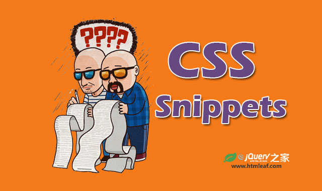
这里收集了30个非常有用的CSS代码片段,非常值得大家去收藏,以备不时之需。
如何将图片制作为灰度图片,而且在所有的浏览器中都表现一致呢?答案是结合使用svg和filter过滤器。
<svg xmlns="http://www.w3.org/2000/svg"> <filter id="grayscale"> <feColorMatrix type="matrix" values="0.3333 0.3333 0.3333 0 0 0.3333 0.3333 0.3333 0 0 0.3333 0.3333 0.3333 0 0 0 0 0 1 0"/> </filter></svg> |
img { filter: url(filters.svg#grayscale); /* Firefox 3.5+ */ filter: gray; /* IE6-9 */ -webkit-filter: grayscale(1); /* Google Chrome, Safari 6+ & Opera 15+ */} |
要使一个元素相对于它的父元素垂直居中需要使用一些小技巧。
.ele{ position: relative; top: 50%; -webkit-transform: translateY(-50%); -o-transform: translateY(-50%); transform: translateY(-50%);} |
更多关于元素垂直居中的资料可以参考:《使用3行CSS代码使任何元素垂直居中》
通常情况下,元素的渐变背景是不能制作动画效果的,你可以使用下面的代码来实现这个动画效果。实际上它是使用修改背景图片位置的方法来实现这个效果的。
button { background-image: linear-gradient(#5187c4, #1c2f45); background-size: auto 200%; background-position: 0 100%; transition: background-position 0.5s;} button:hover { background-position: 0 0;} |
查看下面的效果演示:
有时候我们需要为不同的超链接设置不同的样式,使用户能够一眼就看出这个超链接的作用。下面的CSS代码将不同的超链接设置为不同的颜色,并为每个超链接设置不同的小图标。
a[href^="http://"]{ padding-right: 20px; background: url(external.gif) no-repeat center right;}/* emails */a[href^="mailto:"]{ padding-right: 20px; background: url(email.png) no-repeat center right;}/* pdfs */a[href$=".pdf"]{ padding-right: 20px; background: url(pdf.png) no-repeat center right;} |
效果如下面所示:
Hello, Here i will share Google Material Design eBook.
You can going to my website or drop me Email for more info.
要调整一个的表格的列宽是一件非常头疼的事情。你可以为td元素设置white-space: nowrap;,让文本在表格中自适应。
td { white-space: nowrap;} |
查看下面表格的前后比较效果。
非主动列宽的表格
| 1 | Mr. John Doe | United States of America | 2014 |
| 2 | Mr. Paul Jones | New Zealand | 2013 |
自动列宽的表格
| 1 | Mr. John Doe | United States of America | 2014 |
| 2 | Mr. Paul Jones | New Zealand | 2013 |
.clearfix:after { content: "."; display: block; clear: both; visibility: hidden; line-height: 0; height: 0; }.clearfix { display: inline-block; }html[xmlns] .clearfix { display: block; }* html .clearfix { height: 1%; } |
.clearfix:before, .container:after { content: ""; display: table; }.clearfix:after { clear: both; }/* IE 6/7 */.clearfix { zoom: 1; } |
.transparent { filter: alpha(opacity=50); /* internet explorer */ -khtml-opacity: 0.5; /* khtml, old safari */ -moz-opacity: 0.5; /* mozilla, netscape */ opacity: 0.5; /* fx, safari, opera */} |
具体效果如下:
.blurry-text { color: transparent; text-shadow: 0 0 5px rgba(0,0,0,0.5);} |
效果如下:
这是一些模糊文本。
更多关于模糊文字的资料请参考:《使用CSS制作跨浏览器的模糊文字效果》。
这段CSS代码使用CSS3的帧动画来模拟loading文字后面的3个小省略号的动画效果。
.loading:after { overflow: hidden; display: inline-block; vertical-align: bottom; animation: ellipsis 2s infinite; content: "\2026"; /* ascii code for the ellipsis character */}@keyframes ellipsis { from { width: 2px; } to { width: 15px; }} |
看一看下面loading文字后面的小省略号的动画效果。
#container { -webkit-border-radius: 4px 3px 6px 10px; -moz-border-radius: 4px 3px 6px 10px; -o-border-radius: 4px 3px 6px 10px; border-radius: 4px 3px 6px 10px;}/* 下面的代码是上面代码的分解代码 */#container { -webkit-border-top-left-radius: 4px; -webkit-border-top-right-radius: 3px; -webkit-border-bottom-right-radius: 6px; -webkit-border-bottom-left-radius: 10px; -moz-border-radius-topleft: 4px; -moz-border-radius-topright: 3px; -moz-border-radius-bottomright: 6px; -moz-border-radius-bottomleft: 10px;} |
/* Smartphones (portrait and landscape) ----------- */@media only screenand (min-device-width : 320px) and (max-device-width : 480px) { /* Styles */}/* Smartphones (landscape) ----------- */@media only screen and (min-width : 321px) { /* Styles */}/* Smartphones (portrait) ----------- */@media only screen and (max-width : 320px) { /* Styles */}/* iPads (portrait and landscape) ----------- */@media only screen and (min-device-width : 768px) and (max-device-width : 1024px) { /* Styles */}/* iPads (landscape) ----------- */@media only screen and (min-device-width : 768px) and (max-device-width : 1024px) and (orientation : landscape) { /* Styles */}/* iPads (portrait) ----------- */@media only screen and (min-device-width : 768px) and (max-device-width : 1024px) and (orientation : portrait) { /* Styles */}/* Desktops and laptops ----------- */@media only screen and (min-width : 1224px) { /* Styles */}/* Large screens ----------- */@media only screen and (min-width : 1824px) { /* Styles */}/* iPhone 4 ----------- */@media only screen and (-webkit-min-device-pixel-ratio:1.5), only screen and (min-device-pixel-ratio:1.5) { /* Styles */} |
正常情况下用鼠标选择一段文本是呈现蓝底白字的效果,使用下面的代码可以改变它们。
::selection { background: #e2eae2; }::-moz-selection { background: #e2eae2; }::-webkit-selection { background: #e2eae2; } |
DEMO:用鼠标选择这里的文字看看效果。
下面的代码可以为你的图片添加漂亮的带阴影的边框效果。
img.polaroid { background:#000; /*Change this to a background image or remove*/ border:solid #fff; border-width:6px 6px 20px 6px; box-shadow:1px 1px 5px #333; /* Standard blur at 5px. Increase for more depth */ -webkit-box-shadow:1px 1px 5px #333; -moz-box-shadow:1px 1px 5px #333; height:200px; /*Set to height of your image or desired div*/ width:200px; /*Set to width of your image or desired div*/} |
全屏图片主要使用的是CSS的background-size属性。关于该属性的详细介绍可以参考:《使用一行CSS代码生成全屏背景图像》。
html { background: url(‘images/bg.jpg‘) no-repeat center center fixed; -webkit-background-size: cover; -moz-background-size: cover; -o-background-size: cover; background-size: cover;} |
#colorbox { background: #629721; background-image: -webkit-gradient(linear, left top, left bottom, from(#83b842), to(#629721)); background-image: -webkit-linear-gradient(top, #83b842, #629721); background-image: -moz-linear-gradient(top, #83b842, #629721); background-image: -ms-linear-gradient(top, #83b842, #629721); background-image: -o-linear-gradient(top, #83b842, #629721); background-image: linear-gradient(top, #83b842, #629721);} |
@font-face { font-family: ‘MyWebFont‘; src: url(‘webfont.eot‘); /* IE9 Compat Modes */ src: url(‘webfont.eot?#iefix‘) format(‘embedded-opentype‘), /* IE6-IE8 */ url(‘webfont.woff‘) format(‘woff‘), /* Modern Browsers */ url(‘webfont.ttf‘) format(‘truetype‘), /* Safari, Android, iOS */ url(‘webfont.svg#svgFontName‘) format(‘svg‘); /* Legacy iOS */}body { font-family: ‘MyWebFont‘, Arial, sans-serif;} |
tbody tr:nth-child(odd) { background-color: #ccc;} |
#mydiv { -moz-box-shadow: inset 2px 0 4px #000; -webkit-box-shadow: inset 2px 0 4px #000; box-shadow: inset 2px 0 4px #000;} |
#mydiv { -webkit-box-shadow: 0 2px 2px -2px rgba(0, 0, 0, 0.52); -moz-box-shadow: 0 2px 2px -2px rgba(0, 0, 0, 0.52); box-shadow: 0 2px 2px -2px rgba(0, 0, 0, 0.52);} |
#columns-3 { text-align: justify; -moz-column-count: 3; -moz-column-gap: 12px; -moz-column-rule: 1px solid #c4c8cc; -webkit-column-count: 3; -webkit-column-gap: 12px; -webkit-column-rule: 1px solid #c4c8cc;} |
你是否曾经想将页面的脚部固定在网页的底部呢?下面的代码可以帮你实现,并且添加了对IE6的支持。
#footer { position: fixed; left: 0px; bottom: 0px; height: 30px; width: 100%; background: #444;}/* IE 6 */* html #footer { position: absolute; top: expression((0-(footer.offsetHeight)+(document.documentElement.clientHeight ? document.documentElement.clientHeight : document.body.clientHeight)+(ignoreMe = document.documentElement.scrollTop ? document.documentElement.scrollTop : document.body.scrollTop))+‘px‘);} |
在IE6中,PNG图片无法显示透明像素。使用下面的代码可以修复这个BUG。
.bg { width:200px; height:100px; background: url(/folder/yourimage.png) no-repeat; _background:none; _filter:progid:DXImageTransform.Microsoft.AlphaImageLoader(src=‘/folder/yourimage.png‘,sizingMethod=‘crop‘);}/* 1px gif method */img, .png { position: relative; behavior: expression((this.runtimeStyle.behavior="none")&&(this.pngSet?this.pngSet=true:(this.nodeName == "IMG" && this.src.toLowerCase().indexOf(‘.png‘)>-1?(this.runtimeStyle.backgroundImage = "none", this.runtimeStyle.filter = "progid:DXImageTransform.Microsoft.AlphaImageLoader(src=‘" + this.src + "‘, sizingMethod=‘image‘)", this.src = "images/transparent.gif"):(this.origBg = this.origBg? this.origBg :this.currentStyle.backgroundImage.toString().replace(‘url("‘,‘‘).replace(‘")‘,‘‘), this.runtimeStyle.filter = "progid:DXImageTransform.Microsoft.AlphaImageLoader(src=‘" + this.origBg + "‘, sizingMethod=‘crop‘)", this.runtimeStyle.backgroundImage = "none")),this.pngSet=true));} |
#container { min-height: 550px; height: auto !important; height: 550px;} |
input[type=text], textarea { -webkit-transition: all 0.30s ease-in-out; -moz-transition: all 0.30s ease-in-out; -ms-transition: all 0.30s ease-in-out; -o-transition: all 0.30s ease-in-out; outline: none; padding: 3px 0px 3px 3px; margin: 5px 1px 3px 0px; border: 1px solid #ddd;}input[type=text]:focus, textarea:focus { box-shadow: 0 0 5px rgba(81, 203, 238, 1); padding: 3px 0px 3px 3px; margin: 5px 1px 3px 0px; border: 1px solid rgba(81, 203, 238, 1);} |
查看下面的例子,鼠标选中输入框看看边框效果。
没有修改样式的输入框:
修改样式的输入框:
pre { white-space: pre-wrap; /* css-3 */ white-space: -moz-pre-wrap; /* Mozilla, since 1999 */ white-space: -pre-wrap; /* Opera 4-6 */ white-space: -o-pre-wrap; /* Opera 7 */ word-wrap: break-word; /* Internet Explorer 5.5+ */} |
a[href], input[type=‘submit‘], input[type=‘image‘], label[for], select, button, .pointer { cursor: pointer;} |
@media print { a:after { content: " [" attr(href) "] "; } } |
body { -webkit-touch-callout: none; -webkit-user-select: none; -khtml-user-select: none; -moz-user-select: none; -ms-user-select: none; user-select: none;} |
body { background-color: white; background-image: linear-gradient(45deg, black 25%, transparent 25%, transparent 75%, black 75%, black), linear-gradient(45deg, black 25%, transparent 25%, transparent 75%, black 75%, black); background-size: 100px 100px; background-position: 0 0, 50px 50px;} |
ul.box { position: relative; z-index: 1; /* prevent shadows falling behind containers with backgrounds */ overflow: hidden; list-style: none; margin: 0; padding: 0; }ul.box li { position: relative; float: left; width: 250px; height: 150px; padding: 0; border: 1px solid #efefef; margin: 0 30px 30px 0; background: #fff; -webkit-box-shadow: 0 1px 4px rgba(0, 0, 0, 0.27), 0 0 40px rgba(0, 0, 0, 0.06) inset; -moz-box-shadow: 0 1px 4px rgba(0, 0, 0, 0.27), 0 0 40px rgba(0, 0, 0, 0.06) inset; box-shadow: 0 1px 4px rgba(0, 0, 0, 0.27), 0 0 40px rgba(0, 0, 0, 0.06) inset; }ul.box li:before,ul.box li:after { content: ‘‘; z-index: -1; position: absolute; left: 10px; bottom: 10px; width: 70%; max-width: 300px; /* avoid rotation causing ugly appearance at large container widths */ max-height: 100px; height: 55%; -webkit-box-shadow: 0 8px 16px rgba(0, 0, 0, 0.3); -moz-box-shadow: 0 8px 16px rgba(0, 0, 0, 0.3); box-shadow: 0 8px 16px rgba(0, 0, 0, 0.3); -webkit-transform: skew(-15deg) rotate(-6deg); -moz-transform: skew(-15deg) rotate(-6deg); -ms-transform: skew(-15deg) rotate(-6deg); -o-transform: skew(-15deg) rotate(-6deg); transform: skew(-15deg) rotate(-6deg); }ul.box li:after { left: auto; right: 10px; -webkit-transform: skew(15deg) rotate(6deg); -moz-transform: skew(15deg) rotate(6deg); -ms-transform: skew(15deg) rotate(6deg); -o-transform: skew(15deg) rotate(6deg); transform: skew(15deg) rotate(6deg); } |
标签:
原文地址:http://www.cnblogs.com/wzzl/p/4668091.html