标签:
1、简单的写一个外部样式表的例子,了解CSS的基本结构以及优点。
<--html部分代码,这是引入外部样式表的例子-->
<html>
<head>
<meta charset="UTF-8" />
 <link rel="stylesheet" href="bgcolor.css" />
</head>
<body>
<h1>这是标题 1</h1>
<h2>这是标题 2</h2>
<p>这是段落</p>
<p class="no2">这个段落设置了内边距。</p>
</body>
</html>
<--CSS部分的代码,一个简单的引入外部式样表的例子-->
body {
    background-image:
    url(/f:/pic.gif);
    background-repeat: no-repeat;
    background-attachment:fixed;
    background-position:left-side;
    width: 50%;
    height: 100%;
}
h1 {
background-color: red;
}
h2 {
background-color: transparent;
}
p {
background-color: rgb(11,0,11);
}
p.no2 {
background-color: gray; padding: 20px;
}
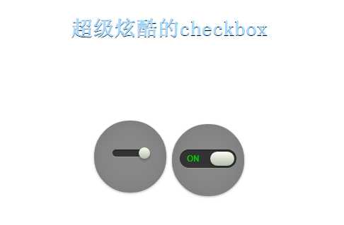
2、了解了CSS基本结构和概念之后,就练习了一个开关的例子,实际上就是checkbox,了解了很多的属性,一会儿我就具体的属性进行解释说明。
<--内部样式表例子-->
<!DOCTYPE html>
<html>
    <head>
        <title>checkbox CSS</title>
        <meta charset="UTF-8">
        <style>
        .slideOne{
        width: 50px;
        height: 10px;
        background: #333;
        margin: 40px auto;
        position: relative;
        -moz-border-radius: 50px;
        -webkit-border-radius: 50px;
        border-radius: 50px;
        -moz-box-shadow: inset 0px 1px 1px rgba(0, 0, 0, 0.5), 0px 1px 0px rgba(255, 255, 255, 0.2);
        -webkit-box-shadow: inset 0px 1px 1px rgba(0, 0, 0, 0.5), 0px 1px 0px rgba(255, 255, 255, 0.2);
        box-shadow: inset 0px 1px 1px rgba(0, 0, 0, 0.5), 0px 1px 0px rgba(255, 255, 255, 0.2);
        }
        .slideOne label{
        display: block;
        width: 16px;
        height: 16px;
        position: absolute;
        top: -3px;
        left: -3px;
        cursor: pointer;
        background: #fcfff4;
        background: -moz-linear-gradient(top, #fcfff4 0%, #dfe5d7 40%, #b3bead 100%);
        background: -webkit-linear-gradient(top, #fcfff4 0%, #dfe5d7 40%, #b3bead 100%);
        background: linear-gradient(to bottom, #fcfff4 0%, #dfe5d7 40%, #b3bead 100%);
        -moz-border-radius: 50px;
        -webkit-border-radius: 50px;
        border-radius: 50px;
        -moz-box-shadow: 0px 2px 5px 0px rgba(0, 0, 0, 0.3);
        -webkit-box-shadow: 0px 2px 5px 0px rgba(0, 0, 0, 0.3);
        box-shadow: 0px 2px 5px 0px rgba(0, 0, 0, 0.3);
        -moz-transition: all 0.4s ease;
        -o-transition: all 0.4s ease;
        -webkit-transition: all 0.4s ease;
        transition: all 0.4s ease;
        }
        .slideOne input[type=checkbox] {
        visibility: hidden;
        }
        .slideOne input[type=checkbox]:checked + label {
        left: 37px;
        }

        .slideThree {
          width: 80px;
          height: 26px;
          background: #333;
          margin: 35px auto;
          position: relative;
          -moz-border-radius: 50px;
          -webkit-border-radius: 50px;
          border-radius: 50px;
          -moz-box-shadow: inset 0px 1px 1px rgba(0, 0, 0, 0.5), 0px 1px 0px rgba(255, 255, 255, 0.2);
          -webkit-box-shadow: inset 0px 1px 1px rgba(0, 0, 0, 0.5), 0px 1px 0px rgba(255, 255, 255, 0.2);
          box-shadow: inset 0px 1px 1px rgba(0, 0, 0, 0.5), 0px 1px 0px rgba(255, 255, 255, 0.2);
        }
        .slideThree:after {
          content: ‘OFF‘;
          color: #000;
          position: absolute;
          right: 10px;
          z-index: 0;
          font: 12px/26px Arial, sans-serif;
          font-weight: bold;
          text-shadow: 1px 1px 0px rgba(255, 255, 255, 0.15);
        }
        .slideThree:before {
          content: ‘ON‘;
          color: #00bf00;
          position: absolute;
          left: 10px;
          z-index: 0;
          font: 12px/26px Arial, sans-serif;
          font-weight: bold;
        }
        .slideThree label {
          display: block;
          width: 34px;
          height: 20px;
          cursor: pointer;
          position: absolute;
          top: 3px;
          left: 3px;
          z-index: 1;
          background: #fcfff4;
          background: -moz-linear-gradient(top, #fcfff4 0%, #dfe5d7 40%, #b3bead 100%);
          background: -webkit-linear-gradient(top, #fcfff4 0%, #dfe5d7 40%, #b3bead 100%);
          background: linear-gradient(to bottom, #fcfff4 0%, #dfe5d7 40%, #b3bead 100%);
          -moz-border-radius: 50px;
          -webkit-border-radius: 50px;
          border-radius: 50px;
          -moz-transition: all 0.4s ease;
          -o-transition: all 0.4s ease;
          -webkit-transition: all 0.4s ease;
          transition: all 0.4s ease;
          -moz-box-shadow: 0px 2px 5px 0px rgba(0, 0, 0, 0.3);
          -webkit-box-shadow: 0px 2px 5px 0px rgba(0, 0, 0, 0.3);
          box-shadow: 0px 2px 5px 0px rgba(0, 0, 0, 0.3);
        }
        .slideThree input[type=checkbox] {
          visibility: hidden;
        }
        .slideThree input[type=checkbox]:checked + label {
          left: 43px;
        }


        body h1 {
          color: #adf;
          font-size: 30px;
          text-align: center;
          margin: 60px 0 50px 0;
          -webkit-font-smoothing: antialiased;
          text-shadow: 0px 1px black;
        }
        body .ondisplay {
          text-align: center;
          /*border-bottom: 1px solid gray;*/
          padding: 60px 0;
        }
        body .ondisplay section {
          width: 100px;
          height: 100px;
          background: #888;
          display: inline-block;
          position: relative;
          text-align: center;
          margin-top: 5px;
          border: 1px solid gray;
          -moz-border-radius: 50px;
          -webkit-border-radius: 50px;
          border-radius: 50px;
          -moz-box-shadow: 0 1px 4px rgba(0, 0, 0, 0.3), 0 0 40px rgba(0, 0, 0, 0.1) inset;
          -webkit-box-shadow: 0 1px 4px rgba(0, 0, 0, 0.3), 0 0 40px rgba(0, 0, 0, 0.1) inset;
          box-shadow: 0 1px 4px rgba(0, 0, 0, 0.3), 0 0 40px rgba(0, 0, 0, 0.1) inset;
        }
        body .ondisplay section:before {
          color: #adf;
          font-size: 12px;
          font-weight: 400;
          -webkit-font-smoothing: antialiased;
          text-shadow: 0px 1px black;
        }
        body .ondisplay section:after {
          content: attr(title);
          position: absolute;
          width: 100%;
          left: 0;
          bottom: 3px;
          color: #fff;
          font-size: 12px;
          font-weight: 400;
          -webkit-font-smoothing: antialiased;
          text-shadow: 0px 1px black;
        }


        </style>
        <script src="assets/prefixfree.min.js"></script>
    </head>
    <body>
        <h1>超级炫酷的checkbox</h1>
        <div class="ondisplay">
            <section>
                <div class="slideOne">
                    <input class="check" id="check"  type="checkbox" name="check" value="none" checked />
                    <label for="check"> </label>
                </div>

            </section>

            <section>
            <div class="slideThree">
              <input type="checkbox" value="None" id="slideThree" name="check" checked />
              <label for="slideThree"></label>
            </div>
          </section>
        </div>
        <div id="master" style="width:300px;margin:50px">
        </div>
    </body>
</html>
执行结果:
 3、认识学习CSS属性
(1)border-radius属性
 -moz-border-radius: 50px;
 -webkit-border-radius: 50px;前面这俩属性是为了浏览器的兼容性
 border-radius: 50px; 让边框有圆角
(2)position属性的属性值有:
· static(预设值):这代表元素会被放在预设的地方。如果position的值时被设定为static,那么top,left,bottom,right的值就没有意义了
· absolute:这表示元素会被放在浏览器的固定位置,不受其他元素的影响,不会因为有其他元素而改变位置,当我们把网页往下拉变化的时候,元素的位置也会改变。
· relative:这表示元素被放的地方将会和设想的地方不同。是相对距离。
·fixed:这表示元素会被放在浏览器的固定位置。元素也不会随着网页大小而改变。
(3)-webkit-font-smoothing: antialiased;这个属性值是为了让字体变得光滑,一般很少用,资料也比较少。
(4)transition 用于设置四个过渡属性:
transition-property: none--没有属性会获得过渡效果 all--所有属性都将获得过渡效果 property--定义应用过渡效果的 CSS 属性名称列表,列表以逗号分隔。
transition-duration: time--规定完成过度效果需要花费的时间,默认值为0,若是0,就没有什么效果。
选择器过滤明天写吧,我还没有归类,那个好多,用多了也就记住了。
标签:
原文地址:http://www.cnblogs.com/zhangyunuo/p/4687171.html