标签:
4 ? Visual Effects ? ?视觉效果 ? ? ?? 读书笔记
第四章
Well, circles and ovals are good, but how about drawing rectangles with rounded corners? Can we do that now, too?
Steve Jobs
?
We looked at the layer frame in Chapter 3, "Layer Geometry," and the layer backing image in Chapter 2, "The Backing Image." But layers are more than mere rectangular containers for colors or images; they also have a number of built-in features that make it possible to create impressive and elegant interface elements programmatically. In this chapter, we explore the various visual effects that can be achieved using?CALayer?properties.
我们在这一章将会探索各种不同的视觉效果
Rounded Corners 圆角
One of the signature features of the iOS aesthetic is the use of?rounded rectangles?(rectangles with rounded corners). These appear everywhere in iOS, from homescreen icons, to modal alerts, to text fields. Given their prevalence, you might guess that there would be an easy way to create them without resorting to Photoshop. You‘d be right.
?
CALayer?has a?cornerRadius?property that controls the curvature of the layer‘s corners.
CALayer有一个cornerRadius 属性控制着layer的corner的曲线
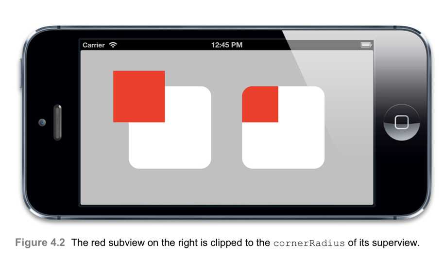
It is a floating point value that defaults to zero (sharp corners), but can be set to any value you like (specified in points). By default, this curvature affects only the background color of the layer and not the backing image or sublayers.
默认情况下,曲线仅仅是影响layer 的background color,而不是backing image 或sublayers.?
However, when the?masksToBounds?property is set to?YES?(see Chapter 2), everything inside the layer is clipped to this curve.
然而,当masksToBounds属性设置为YES 的时候,任何在这个layer的东西都限制在这里面了。
We can demonstrate this effect with a simple project. Let‘s arrange a couple of views in Interface Builder that have subviews that extend outside of their bounds (see Figure 4.1). You can‘t really see from the figure that the inner views extend beyond their containing
views because Interface Builder always clips views in the editing interface. You‘ll just have to trust that they do.
Figure 4.1?Two large white views, each containing small red views
Using code, we‘ll apply a 20-point radius to the corners and enable clipping on only the second view (see Listing 4.1). Technically, these properties can both be applied directly in Interface Builder by using User Defined Runtime Attributes and the Clip Subviews checkbox in the Inspector panel, respectively, but in the example this is implemented in code for clarity. Figure 4.2 shows the result.
Listing4.1?ApplyingcornerRadiusandmasksToBounds?@interface?ViewController ()
@property?(nonatomic,?weak)?IBOutlet?UIView?*layerView1;?@property?(nonatomic,?weak)?IBOutlet?UIView?*layerView2;
@end
@implementation?ViewController
?
- (void)viewDidLoad {
[super?viewDidLoad];
//set the corner radius on our layers
self.layerView1.layer.cornerRadius?=?20.0f;?self.layerView2.layer.cornerRadius?=?20.0f;
//enable clipping on the second layer
self.layerView2.layer.masksToBounds?=?YES; }
@end
It is not possible to control the curvature of each layer corner independently, so if you want to create a layer or view that has some sharp and some rounded corners, you‘ll need to find a different approach, such as using a?layer mask?(as covered later in the chapter) or?CAShapeLayer?(see Chapter 6, "Specialized Layers").
?
Layer Borders ?边界
?
Another useful pair of?CALayer?properties are?borderWidth?and?borderColor. Together these define a line that is drawn around the edge of the layer. This line (known as a?stroke) follows the?bounds?of the layer, including the corner curvature.
borderWidth and borderColor 定义了
?
The?borderWidth?is a floating-point number that defines the stroke thickness in points. This defaults to zero (no border). The?borderColor?defines the color of the stroke and defaults to black.
borderWidth 是一个浮点数 定义了绘制点的宽度。默认是0.
?
The type of?borderColor?is?CGColorRef, not?UIColor, so it‘s not a Cocoa object per-se.
borderColor的类型是CGColorRef,不是UIColor?
However, you should be aware that the layer retains the?borderColor, even though there‘s no indication of this from the property declaration.?CGColorRef?behaves like an?NSObject?in terms of retain/release, but the Objective-C syntax does not provide a way to indicate this, so even strongly retained?CGColorRef?properties must be declared using?assign.
CGColorRef 在retain/release 像NSObject,但是OC语法没有提供,所以即使retained CGColorRef属性也必须使用assign修饰。
The border is drawn?inside?the layer bounds, and in front of any other layer contents, including sublayers. If we modify the example to include a layer border (see Listing 4.2), you can see how this works (see Figure 4.3).
Listing 4.2?Applying a Border?@implementation?ViewController
- (void)viewDidLoad {
[super?viewDidLoad];
//set the corner radius on our layers
?
self.layerView1.layer.cornerRadius?=?20.0f;
self.layerView2.layer.cornerRadius?=?20.0f;
//add a border to our layers
?
self.layerView1.layer.borderWidth?=?5.0f;
self.layerView2.layer.borderWidth?=?5.0f;
//enable clipping on the second layer
self.layerView2.layer.masksToBounds?=?YES; }
@end

Figure 4.3?Adding a border around the layer
Note that the layer border does not take the shape of the layer backing image or sublayers into account. If the layer‘s sublayers overflow its?bounds, or if the backing image has an alpha mask containing transparent areas, the border will still always follow a (possibly rounded) rectangle around the layer (see Figure 4.4).
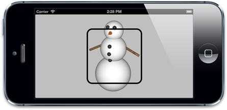
Figure 4.4?The border follows the?bounds?of the layer, not the shape of its contents.
Drop Shadows 阴影?
?
Another common feature in iOS is the?drop shadow.?Drop shadows are cast behind a view to imply depth. They are used to indicate layering and priority (such as when a modal alert is presented in front of another view), but they are also sometimes used for purely cosmetic purposes (to give controls a more solid appearance).
有时是为了显示层级,有时就是为了效果了
?
A drop shadow can be shown behind any layer by setting the?shadowOpacity?property to a value greater than zero (the default).
一个drop shadow 可以显示在任意layer的后面通过设置shadowOpacity属性给一个比0大的值。
The?shadowOpacity?is a floating-point value and should be set between 0.0 (invisible) and 1.0 (fully opaque).
是浮点数,设置在0.0和1.0之间。
Setting a value of 1.0 will show a black shadow with a slight blur and a position slightly above the layer. To tweak the appearance of the shadow, you can use a trio of additional?CALayer?properties:?shadowColor,?shadowOffset, and?shadowRadius.
为了设置shadow的外观,你可以使用三个额外的CALayer 属性:shadowColor,shadowOffset 和shadowRadius
?
The?shadowColor?property, as its name implies, controls the shadow color and is a?CGColorRef, just like the?borderColor?and?backgroundColor?properties. The default shadow color is black, which is probably what you want most of the time anyway (colored shadows occur rarely in real life, and can look a bit strange).
shadowColor属性控制着shadow color 是一个CGColorRef.
?
The?shadowOffset?property controls the direction and distance to which the shadow extends.
shadowOffset属性控制着阴影的方向和距离
The?shadowOffset?is a?CGSize?value, with the width controlling the shadow‘s horizontal offset and the height controlling its vertical offset. The default?shadowOffset?is {0, -3}, which results in a shadow positioned 3 points above the layer along the ? ? Y axis. {0,-3}意味着这个shadow position 3 points 在layer的上面。
?
Why does the default shadow point upward? Although Core Animation was adapted from Layer Kit (the private animation framework created for iOS), its first appearance as a public framework was on Mac OS, which uses an inverted coordinate system with respect to iOS (the Y axis points upward). On a Mac, the same default?shadowOffset?value results in a?downward-pointing shadow, so the default direction makes more sense in that context (see Figure 4.5).
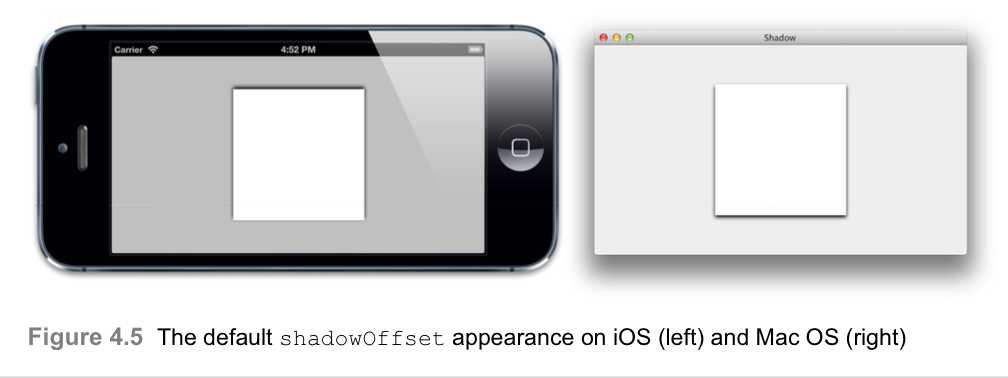
The Apple convention is that user interface shadows point vertically downward, so on iOS it‘s probably a good idea to use zero for the width and a positive value for the height in most cases.
?
?
The?shadowRadius?property controls the?blurriness?of the shadow. A value of zero creates a hard-edged shadow that exactly matches the shape of the view. A larger value creates a soft-edged shadow that looks more natural. Apple‘s own app designs tend to use soft shadows, so it‘s probably a good idea to stick with a nonzero value for this.
一个shadowRadius属性控制着shadow的blurriness .一个0值创建一个硬shadow,恰恰配好view。一个大的值可以创建更自然的软 边界的shadow .
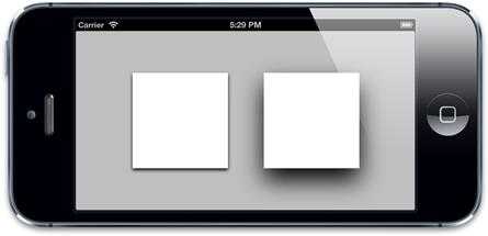
Generally, you should use a larger?shadowRadius?for something like a modal overlay than you would to make a control stand out from its background; the blurrier the shadow, the greater the illusion of depth (see Figure 4.6).
?
Figure 4.6?A larger shadow offset and radius increases the illusion of depth.
?
?
Shadow Clipping shadow ?裁剪
?
Unlike the layer border, the layer‘s shadow derives from the?exact?shape of its contents, not just the?bounds?and?cornerRadius. To calculate the shape of the shadow, Core Animation looks at the backing image (as well as the sublayers, if there are any) and uses these to create a shadow that perfectly matches the shape of the layer (see Figure 4.7).
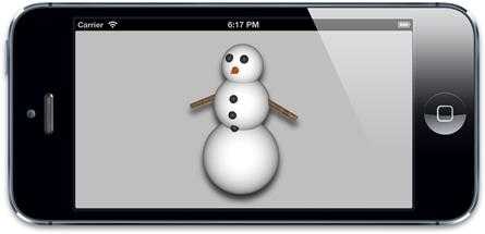
Figure 4.7?The layer shadow follows the exact outline of the layer backing image.
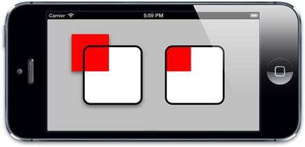
Layer shadows have an annoying limitation when combined with clipping: Because the shadow is usually drawn outside the layer bounds, if you enable the?masksToBounds?property, the shadow is clipped along with any other content that protrudes outside of the layer. If we add a layer shadow to our border example project, you can see the problem (see Figure 4.8).
Figure4.8?ThemasksToBoundspropertyclipsbothshadowandcontent.
?
This behavior is understandable from a technical perspective, but it is unlikely to be the effect that you wanted. If you want to clip the contents?and?cast a shadow, you need to use two layers: an empty outer layer that just draws the shadow, and an inner one that has?masksToBounds?enabled for clipping content.
如果你想clip content,并cast 一个shadow,你需要用两层 :一个空的outer layer 仅仅用来绘制shadwo ,和里面的一个有masksToBounds 使得clipping content.
?
If we update our project to use an additional view wrapped around the clipping view on the right, we can solve the problem (see Figure 4.9).
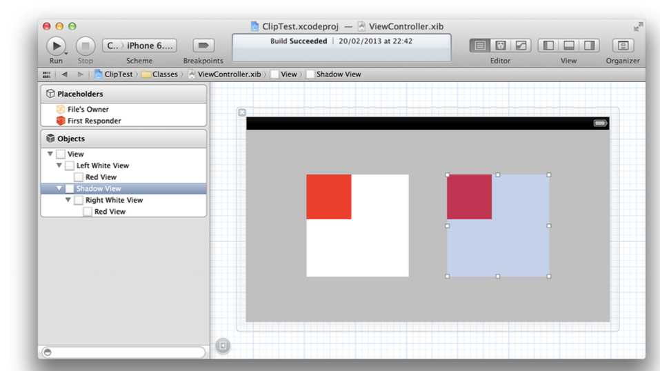
Figure 4.9?An additional shadow-casting view around the clipping view on the right
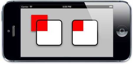
We attach the shadow only to the outermost view, and enable clipping only on the inner
view. Listing 4.3 shows the updated code, and Figure 4.10 shows the result.
?
Listing 4.3?Using an Additional View to Solve Shadow Clipping Problems
@interface?ViewController ()
?
@property?(nonatomic,?weak)?IBOutlet?UIView?*layerView1;
@property?(nonatomic,?weak)?IBOutlet?UIView?*layerView2;
@property?(nonatomic,?weak)?IBOutlet?UIView?*shadowView;
@end
@implementation?ViewController
- (void)viewDidLoad {
[super?viewDidLoad];
//set the corner radius on our layers
?
self.layerView1.layer.cornerRadius?=?20.0f;
self.layerView2.layer.cornerRadius?=?20.0f;
//add a border to our layers
?
self.layerView1.layer.borderWidth?=?5.0f;
self.layerView2.layer.borderWidth?=?5.0f;
//add a shadow to layerView1
?
self.layerView1.layer.shadowOpacity?=?0.5f;
self.layerView1.layer.shadowOffset?=?CGSizeMake(0.0f,?5.0f);?self.layerView1.layer.shadowRadius?=?5.0f;
//add same shadow to shadowView (not layerView2)
?
self.shadowView.layer.shadowOpacity?=?0.5f;
self.shadowView.layer.shadowOffset?=?CGSizeMake(0.0f,?5.0f);?self.shadowView.layer.shadowRadius?=?5.0f;
//enable clipping on the second layer
self.layerView2.layer.masksToBounds?=?YES; }
@end

?
Figure 4.10?The view on the right now has a shadow, despite clipping.
The?shadowPath?Property
We‘ve established that layer shadows are not always square, but instead derive from the shape of the contents. This looks great, but it‘s also very expensive to calculate in real time, especially if the layer contains multiple sublayers, each with alpha-masked backing images.
?
If you know in advance what the shape of your shadow needs to be, you can improve performance considerably by specifying a?shadowPath. The?shadowPath?is a?CGPathRef?(a pointer to a?CGPath?object).
shadowPath是一个CGPathRef对象
CGPath?is a Core Graphics object used to specify an arbitrary vector shape. We can use this to define the shape of our shadow independently of the layer‘s shape.
我们可以定义我们的shadow的形状独立于layer的形状
Figure 4.11 shows two different shadow shapes applied to the same layer image. In this case, the shapes we‘ve used are simple, but they can be absolutely any shape you want. See Listing 4.4 for the code.
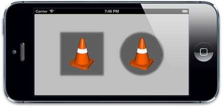
Figure4.11?UsingshadowPathtocastshadowswitharbitraryshapes
?
Listing 4.4?Creating Simple Shadow Paths
@interface?ViewController ()
?
@property?(nonatomic,?weak)?IBOutlet?UIView?*layerView1;
@property?(nonatomic,?weak)?IBOutlet?UIView?*layerView2;
@end
@implementation?ViewController
- (void)viewDidLoad {
[super?viewDidLoad];
//enable layer shadows
self.layerView1.layer.shadowOpacity?=?0.5f;
self.layerView2.layer.shadowOpacity?=?0.5f;
//create a square shadow
CGMutablePathRef?squarePath =?CGPathCreateMutable();
CGPathAddRect(squarePath,?NULL,?self.layerView1.bounds);
self.layerView1.layer.shadowPath?= squarePath;
CGPathRelease(squarePath);
//create a circular shadow
CGMutablePathRef??circlePath =?CGPathCreateMutable();
CGPathAddEllipseInRect(circlePath,?NULL,?self.layerView2.bounds);?self.layerView2.layer.shadowPath?= circlePath;
CGPathRelease(circlePath);
}
@end
For something like a rectangle or circle, creating a?CGPath?manually is fairly straight- forward. For a more complex shape like a rounded rectangle, you‘ll probably find it easier to use the?UIBezierPath?class, which is an Objective-C wrapper around?CGPath?provided by UIKit.
Layer Masking?
Using the?masksToBounds?property, we know that it is possible to clip a layer‘s contents to its?bounds, and using the?cornerRadius?property, we can even give it rounded corners. But sometimes you will want to represent content that is not rectangular or even rounded-rectangular in shape. For example, you might want to create a star-shaped photo frame around an image, or you might want the edges of some scrolling text to fade gracefully into the background instead of clipping to a sharp edge.
Using a 32-bit PNG image with an alpha component, you can specify a backing image that includes an arbitrary alpha mask, which is usually the simplest way to create a non- rectangular view. But that approach doesn‘t allow you to clip images dynamically using programmatically generated masks or to have sublayers or subviews that also clip to the same arbitrary shape.
?
CALayer?has a property called?mask?that can help with this problem. The?mask?property is itself a?CALayer?and has all the same drawing and layout properties of any other layer.
mask 属性自己也是个CALayer,有所有相同的drawing 和layout属性 ?
It is used in a similar way to a sublayer in that it is positioned relative to its parent (the layer that owns it), but it does not?appear?as a normal sublayer. Instead of being drawn inside the parent, the?mask?layer defines the part of the parent layer that is visible.
不是drawn在parent的里面,mask layer 定义了可以看见的父layer的一部分。
?
The?color?of the?mask?layer is irrelevant; all that matters is its?silhouette.
mask layer的color无关紧要,重要的是他的silhouette
The?mask?acts like a cookie cutter; the solid part of the?mask?layer will be "cut out" of its parent layer and kept; anything else is discarded (see Figure 4.12).
?
If the?mask?layer is smaller than the parent layer, only the parts of the parent (or its sub- layers) that intersect the?mask?will be visible. If you are using a?mask?layer, anything outside of that layer is implicitly hidden.
如果mask layer 比parent layer 小,仅仅与mask有交集的parent 才可见。
?

Figure 4.12?Combining separate image and mask layers to create a masked image
To demonstrate this, let‘s create a simple project that masks one image with another using the layer?mask?property. To simplify things, we‘ll create our image layer in Interface Builder using a?UIImageView, so that only the?mask?layer needs to be created and applied programmatically. Listing 4.5 shows the code to do this, and Figure 4.13 shows the result.
?
Listing 4.5?Applying a Layer Mask
@interface?ViewController ()
?
@property?(nonatomic,?weak)?IBOutlet?UIImageView?*imageView;
@end
@implementation?ViewController
- (void)viewDidLoad {
[super?viewDidLoad];
//create mask layer
?
CALayer?*maskLayer = [CALayer?layer];
maskLayer.frame?=?self.layerView.bounds;
UIImage?*maskImage = [UIImage?imageNamed:@"Cone.png"];
maskLayer.contents?= (__bridge id)maskImage.CGImage;
//apply mask to image layer
self.imageView.layer.mask?= maskLayer;
}
?
@end
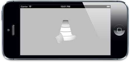
Figure4.13?Our ?UIImageView,after the?mask?layer has been applied
The?really?cool feature of?CALayer?masking is that you are not limited to using static images for your masks. Anything that can be composed out of layers can be used as the?mask?property, which means that your masks can be created dynamically using code, and even animated in real time.
?
Scaling Filters ?缩放过滤
?
The final topic we cover in this chapter is the effect of the?minificationFilter?and?magnificationFilter?properties.
缩小过滤 和放大过滤属性?
Generally on iOS, when you display images, you should try to display them at the correct size (that is, with a 1:1 correlation between the pixels in the image and the pixels onscreen). The reasons for this are as follows:
?
??It provides the best possible quality, because the pixels aren‘t stretched or resampled.
??It makes the best use of RAM, because you aren‘t storing more pixels than needed.
??It yields the best performance, because the GPU doesn‘t have to work as hard.
Sometimes, however, it‘s necessary to display an image at a larger-than-actual or smaller- than-actual size. Examples might include a thumbnail image of a person or avatar, or a very large image that the user can pan and zoom. In these cases, it might not be practical to store separate copies of the image for every size it might need to be displayed at.
?
When images are displayed at different sizes, an algorithm (known as a?scaling filter) is applied to the pixels of the original image to generate the new pixels that will be displayed onscreen.
当一个图片展示不同的尺寸,一个算法 scaling filter 应用到了原始图片的像素来展示一个新的pixel?
?
There is no universally ideal algorithm for resizing an image. The approach depends on the nature of the content being scaled, and whether you are scaling up or down.?CALayer?offers a choice of three scaling filters to use when resizing images. These are represented by the following string constants: 提供了三个缩放filters 来调整图片
kCAFilterLinear kCAFilterNearest kCAFilterTrilinear
The default filter for both?minification?(shrinking an image) and?magnification?(expanding an image) is?kCAFilterLinear. This filter uses the?bilinear?filtering algorithm, which yields good results under the majority of circumstances. Bilinear filtering works by sampling multiple pixels to create the final value. This results in nice, smooth scaling, but can make the image appear blurry if it scaled up by a large factor (see Figure 4.14).
The?kCAFilterTrilinear?option is very similar to?kCAFilterLinear. There is no visible difference between them in most cases, but?trilinear?filtering improves on the performance of bilinear filtering by storing the image at multiple sizes (known as?mip- mapping) and then sampling in three dimensions, combining pixels from the larger and smaller stored image representations to create the final result.
The advantage of this approach is that the algorithm can work from a pair of images that are already quite close to the final size. This means that it does not need to sample as many pixels simultaneously, which improves performance and avoids the sampling glitches that can occur at very small scale factors due to rounding errors.
Figure 4.14?For larger images, bilinear or trilinear filtering is usually better.
?
The?kCAFilterNearest?option is the crudest approach. As the name suggests, this algorithm (known as?nearest-neighbor?filtering) just samples the nearest single pixel and performs no color blending at all. This is very fast, and doesn‘t blur the image, but the quality is noticeably worse for shrunken images, and magnified images become blocky and pixelated.
?
In Figure 4.14, note how the bilinear image looks less distorted than the nearest-neighbor version when shrunk to a small size, but when enlarged it looks blurrier. Contrast this with Figure 4.15, where we‘ve started with a very small image. In this instance, nearest-neighbor does a better job of preserving the original pixels, whereas linear filtering turns them into a blurry mess regardless of whether the image is minified or magnified.
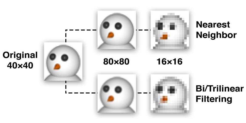
Figure 4.15?For small images without diagonals, nearest-neighbor filtering is better.
Generally speaking, for very small images or larger images with sharp contrast and few diagonal lines (for example, computer-generated images), nearest-neighbor scaling will preserve contrast and may yield better results. But for most images, especially photographs or images with diagonals or curves, nearest-neighbor will look appreciably worse than linear filtering. To put it another way, linear filtering preserves the?shape, and nearest- neighbor filtering preserves the?pixels.
Let‘s try a real-world example. We‘ll modify the clock project from Chapter 3 to display an LCD-style digital readout instead of an analog clock face. The digits will be created using a simple?pixel font?(a font where the characters are constructed from individual pixels rather than vector shapes), stored as a single image and displayed using the sprite sheet technique introduced in Chapter 2 (see Figure 4.16).
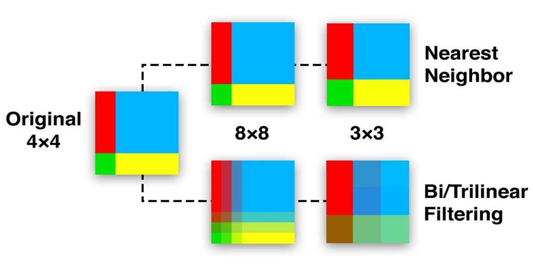
Figure 4.16?A simple "pixel font" sprite sheet for displaying LCD-style digits
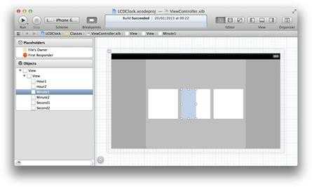
We‘ll arrange six views in Interface Builder, two each for the hours, minutes, and seconds digits. Figure 4.17 shows how the views are arranged in Interface Builder. That many views starts to get a bit unwieldy when using individual outlets, so we‘ll connect them to the controller using an?IBOutletCollection, which allows us to access the views as an array. Listing 4.6 shows the code for the clock.

Figure 4.17?The clock digit views arranged into hours, minutes, and seconds
?
Listing 4.6?Displaying an LCD-Style Clock
@interface?ViewController ()
@property?(nonatomic, strong)?IBOutletCollection(UIView)?NSArray?*digitViews;?@property?(nonatomic,?weak)?NSTimer?*timer;
 ?
?
@end
@implementation?ViewController
- (void)viewDidLoad {
[super?viewDidLoad];?//get spritesheet image
UIImage?*digits = [UIImage?imageNamed:@"Digits.png"];
//set up digit views
for?(UIView?*view?in self.digitViews) {
//set contents
view.layer.contents?= (__bridge id)digits.CGImage; view.layer.contentsRect?=?CGRectMake(0,?0,?0.1,?1.0); view.layer.contentsGravity?=?kCAGravityResizeAspect;
}
//start timer
self.timer = [NSTimer?scheduledTimerWithTimeInterval:1.0?target:self
//set initial clock time
[self?tick]; }
//adjust contentsRect to select correct digit
view.layer.contentsRect?=?CGRectMake(digit *?0.1,?0,?0.1,?1.0); }
//convert time to hours, minutes and seconds
NSCalendar?*calendar = [[NSCalendar?alloc]?initWithCalendarIdentifier:?NSGregorianCalendar];
NSUInteger?units =?NSHourCalendarUnit?|?NSMinuteCalendarUnit?|
NSSecondCalendarUnit;
selector:@selector(tick)?userInfo:nil
repeats:YES];
NSDateComponents?*components = [calendar?components:units?fromDate:[NSDate?date]];
//set hours
[self?setDigit:components.hour?/?10?forView:self.digitViews[0]]; [self?setDigit:components.hour?%?10?forView:self.digitViews[1]];
//set minutes
[self?setDigit:components.minute?/?10?forView:self.digitViews[2]]; [self?setDigit:components.minute?%?10?forView:self.digitViews[3]];
//set seconds
[self?setDigit:components.second?/?10?forView:self.digitViews[4]];
[self?setDigit:components.second?%?10?forView:self.digitViews[5]]; }
@end
?
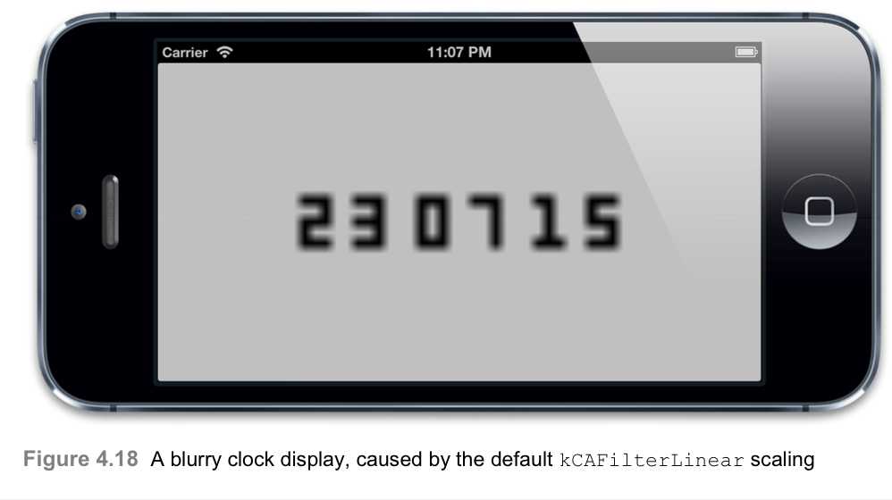
As you can see from Figure 4.18, it works, but the digits look blurry. It seems that the default?kCAFilterLinear?option has failed us.
?
?
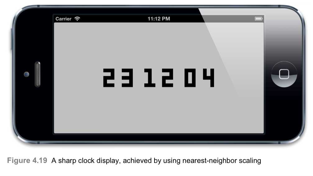
To get the crisp digits shown in Figure 4.19, we just need to add the following line to the
?
for...in?loop in our program:?view.layer.magnificationFilter?=?kCAFilterNearest;
?
Group Opacity 组合透明度
?
UIView?has a handy?alpha?property that can be used to vary its transparency.?CALayer?has an equivalent property called?opacity. Both properties work hierarchically, so if you set the?opacity?of a layer it will automatically affect all of its sublayers, as well.
UIView有一个alpha 属性可以用来改变它的透明度。CALayer也有一个相等的属性叫做opacity.两个属性都工作在层级上。
?
A common trick in iOS is to set a control‘s?alpha?to 0.5 (50%) to make it appear disabled.
一个常用的技巧是设置iOS的alpha 为0.5 来使它显示失效。
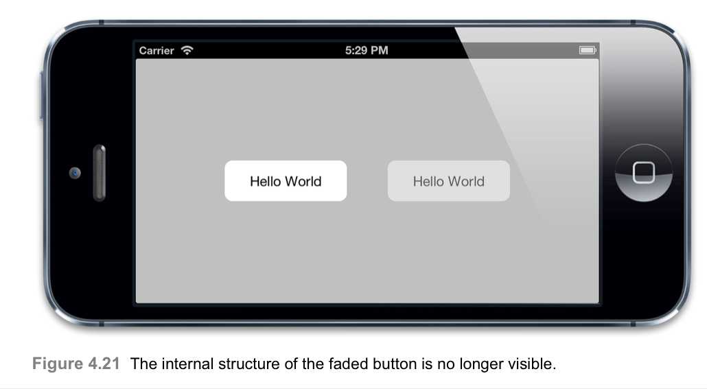
This works great for individual views, but when a control has subviews it can look a bit strange. Figure 4.20 shows a custom?UIButton?containing a nested?UILabel; on the left is an opaque button, and on the right is the same button shown with 50% alpha. Notice how we can see the outline of the internal label against the button background.
?

Figure 4.20?In the faded button on the right, the internal label‘s border is clearly visible.
This effect is due the way that alpha blending works. 混合的结果 ?When you display a layer with 50% opacity, each pixel of the layer displays 50% of its own color and 50% of the layer behind it. That results in the appearance of translucency. But if the layer contains sublayers that are also displayed at 50% transparency, then when you look through the sublayer, you are seeing 50% of the sublayer‘s color, 25% of the containing layer‘s color, and only 25% of the background color.
In our example, the button and label both have white backgrounds. Even though they are both only 50% opaque, their combined opacity is 75%, and so the area where the label overlaps the button look less transparent than the surrounding part. This serves to highlight all of the sublayers that make up a control and produces a nasty visual effect.
?
Ideally, when you set the?opacity?of a layer, you want its entire subtree to fade as if it were a single layer, without revealing its internal structure.
理想情况下,当你设置一个layer的opacity的时候,你想让你的整个subtree fade 成为一个简单的layer,没必要revealing 他的内部结构。?
You can achieve this by setting?UIViewGroupOpacity?to?YES?in your?Info.plist?file, but this affects the way that blending is handled across the whole application, and introduces a small app-wide performance penalty. If the?UIViewGroupOpacity?key is omitted, its value defaults to?NO?on iOS 6 and earlier (though the default may change in a future iOS release).
?
Alternatively, you can implement group opacity for a specific layer subtree by using a?CALayer?property called?shouldRasterize?(see Listing 4.7).
你可以实现groupt opacity 给一个特定的layer subtree 通过使用CALayer 的称为shouldRasterreize的属性
When set to?YES, the?shouldRasterize?property causes the layer and its sublayers to be collapsed into a single flat image?before the opacity is applied, thereby eliminating the blending glitch (see Figure 4.21).
In addition to enabling the?shouldRasterize?property, we‘ve modified the layer‘s?rasterizationScale?property. By default, all layers are rasterized at a scale of 1.0, so if you use the?shouldRasterize?property, you should always ensure that you set the
rasterizationScale?to match the screen to avoid views that look pixelated on a Retina display.
As with?UIViewGroupOpacity, use of the?shouldRasterize?property has performance implications (which are explained in Chapter 12, "Tuning for Speed," and Chapter 15, "Layer Performance"), but the performance impact is localized.
Listing 4.7?Using?shouldRasterize?to Fix the Grouped Blending Problem?@interface?ViewController ()
@property?(nonatomic,?weak)?IBOutlet?UIView?*containerView;?@end
@implementation?ViewController
[super?viewDidLoad];
//create opaque button
UIButton?*button1 = [self?customButton];
//create translucent button
UIButton?*button2 = [self?customButton];
? ?button2.center?=?CGPointMake(250,?150);
? ?button2.alpha?=?0.5;
? ?[self.containerView?addSubview:button2];
//enable rasterization for the translucent button
button2.layer.shouldRasterize?=?YES;
button2.layer.rasterizationScale?= [UIScreen?mainScreen].scale;
}
?
@end
?
Summary
This chapter explored some of the visual effects that you can apply programmatically to layers, such as rounded corners, drop shadows, and masks. We also looked at scaling filters and group opacity.
?
In Chapter 5, "Transforms," we investigate layer transforms and transport our layers into the third dimension.
4 Visual Effects 视觉效果 读书笔记 第四章
标签:
原文地址:http://www.cnblogs.com/ljlkfx/p/4788581.html