标签:
Extend from $.fn.validatebox.defaults. Override defaults with $.fn.textbox.defaults.
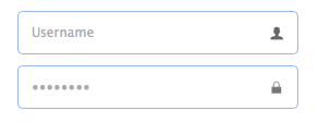
The TextBox component is a enhanced input field that allows users build their form easily. It is the base component for building other complex components such as combo,datebox,spinner,etc.
Create textbox from markup.
Create textbox by using javascript.
The properties extend from validatebox, below is the added properties for textbox:
| Name | Type | Description | Default |
|---|---|---|---|
| width | number | The width of the component. | auto |
| height | number | The height of the component. | 22 |
| prompt | string | The prompt message to be displayed in input box. | ‘‘ |
| value | string | The default value. | |
| type | string | The textbox type. Possible values are ‘text‘ and ‘password‘. | text |
| multiline | boolean | Defines if this is a multiline textbox. | false |
| editable | boolean | Defines if user can type text directly into the field. | true |
| disabled | boolean | Defines if to disable the field. | false |
| readonly | boolean | Defines if the component is read-only. | false |
| icons | array | The icons attached to the textbox. Each item has the following properties: iconCls: string, the icon class. disabled: boolean, indicate if the icon is disabled. handler: function, the function to process the clicking action on this icon. Code example: $(‘#tb‘).textbox({
icons: [{
iconCls:‘icon-add‘,
handler: function(e){
$(e.data.target).textbox(‘setValue‘, ‘Something added!‘);
}
},{
iconCls:‘icon-remove‘,
handler: function(e){
$(e.data.target).textbox(‘clear‘);
}
}]
})
|
[] |
| iconCls | string | The background icon displayed on the textbox. | null |
| iconAlign | string | Position of the icons. Possible values are ‘left‘,‘right‘. | right |
| iconWidth | number | The icon width. | 18 |
| buttonText | string | The displaying text of button that attached to the textbox. | |
| buttonIcon | string | The displaying icon of button that attached to the textbox. | null |
| buttonAlign | string | Position of the button. Possible values are ‘left‘,‘right‘. | right |
The events extend from validatebox, below is the added events for textbox.
| Name | Parameters | Description |
|---|---|---|
| onChange | newValue,oldValue | Fires when the field value is changed. |
| onResize | width,height | Fires when the textbox is resized. |
| onClickButton | none | Fires when the user click the button. |
| onClickIcon | index | Fires when the user click a icon. |
The methods extend from validatebox, below is the added methods for textbox.
| Name | Parameter | Description |
|---|---|---|
| options | none | Return the options object. |
| textbox | none | Return the textbox object. The user can bind any events to this editing box.
Code example: var t = $(‘#tt‘);
t.textbox(‘textbox‘).bind(‘keydown‘, function(e){
if (e.keyCode == 13){ // when press ENTER key, accept the inputed value.
t.textbox(‘setValue‘, $(this).val());
}
});
|
| button | none | Return the button object. |
| destroy | none | Destroy the textbox component. |
| resize | width | Resize the component width. |
| disable | none | Disable the component. |
| enable | none | Enable the component. |
| readonly | mode | Enable/Disable readonly mode.
Code example: $(‘#tb‘).textbox(‘readonly‘); // enable readonly mode $(‘#tb‘).textbox(‘readonly‘,true); // eanble readonly mode $(‘#tb‘).textbox(‘readonly‘,false); // disable readonly mode |
| clear | none | Clear the component value. |
| reset | none | Reset the component value. |
| initValue | value | Initialize the component value. Calling this method does not trigger the ‘onChange‘ event. |
| setText | text | Set the displaying text value. |
| getText | none | Get the displaying text value. |
| setValue | value | Set the component value. |
| getValue | none | Get the component value. |
| getIcon | index | Get specified icon object. |
原文:http://www.jeasyui.com/documentation/index.php#
标签:
原文地址:http://www.cnblogs.com/langtianya/p/4882047.html