标签:
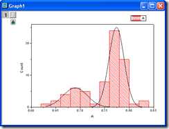
Origin allows you to fit the peaks from the result of frequency count. Also, fitted curves can added into the new layer in the Histogram.
Copy and paste the sample data into Origin and set the column as Y (Highlight the column and choose Column: Set As Y from the Origin menu). Plot this data as a Histogram by clicking Plot: Statistics: Histogram from the menu.
In order to show all three panels in Plot Setup dialog, please expand Plot Type panel by clicking ![]() and expand Available Datapanel by clicking
and expand Available Datapanel by clicking ![]() again.
again.
Please refer to Plotting using Plot Setup for more information.

0.631
0.642
0.652
0.662
0.669
0.676
0.677
0.69
0.691
0.696
0.697
0.699
0.699
0.7
0.7
0.708
0.712
0.718
0.731
0.744
0.749
0.751
0.752
0.753
0.758
0.758
0.759
0.761
0.761
0.763
0.763
0.763
0.765
0.767
0.768
0.768
0.769
0.769
0.77
0.771
0.771
0.772
0.774
0.775
0.775
0.776
0.776
0.776
0.777
0.778
0.779
0.78
0.78
0.781
0.784
0.784
0.785
0.785
0.789
0.789
0.791
0.794
0.795
0.796
0.798
0.798
0.803
0.82
0.831
? OriginLab Corporation. All rights reserved.
Site Map | Privacy Policy | Terms of Use
origin Add multiple fitted curves in a Histogram
标签:
原文地址:http://www.cnblogs.com/qqcwannagraduate/p/4944806.html