标签:
一 圆角框
1 固定宽度的圆角框
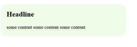
<style>
    .box{ width: 418px; background: #effce7 url(img/bottom.gif) no-repeat left bottom;}
    .box h2{ background: url(img/top.gif) no-repeat left top; padding: 20px 20px 0px 20px ;}
    .box p{ padding: 0 20px 20px 20px;}
</style>
<div class="box">
  <h2>Headline</h2>
    <p>some content some content some content</p>
</div>
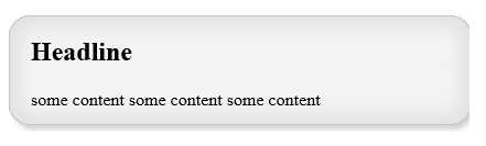
<style>
        .box{ width: 418px; background: #effce7 url(img/tile2.gif) repeat-y ;}
        .box h2{ background: url(img/top2.gif) no-repeat left top; padding: 20px 20px 0px 20px ;}
        .box .last{background : url(img/bottom2.gif) no-repeat left bottom;}
        .box p{ padding: 0 20px 20px 20px;}
    </style>


<div class="box">
  <h2>Headline</h2>
    <p class = "last">some content some content some content</p>
</div>
2 宽度可变的圆角框
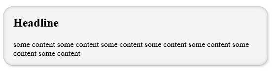
<style>
        .box{
            width:40%;/*根据浏览器窗口尺寸扩展或收缩*/
            background: url(img/bottom-left.gif) no-repeat left bottom;
            }
        .box-inner{
            background: url(img/top-left.gif) no-repeat left top;
            }
        .box h2{
            background: url(img/top-right.gif) no-repeat right top;
            padding:20px 20px 0 20px;
            }
        .box-outer{
            background: url(img/bottom-right.gif) no-repeat right bottom;
            }
        .box  p{padding:0px 20px 20px 20px;}
    </style>
<div class="box">
<div class="box-outer">
   <div class="box-inner">
      <h2>Headline</h2>
      <p>some content some content some content some content some content some content some content</p>
  </div>
</div>
</div>
二 山顶角
原理是利用白色蒙版覆盖背景颜色,产生简单曲线效果。由于蒙版是位图,大曲线会产生锯齿。
css:相似于上宽度可变圆角框,区别在于除了使用的图像不同外,在主框添加了背景颜色,因此可以方便的修改颜色。
三 一些CSS3特性
1 多个背景图像:以上代码中添加了多余标记,是因为一个元素只能添加一个图像,在CSS3 中则可以添加多个图像。IE不支持多背景图像,但只是显示直角框。
例:
{
    background-image:url(),url(),url();
    background-repeat:no-repeat, no-repeat, no-repeat,;
   background-position:top right,top left,bottom left;
}
2 border-radius:(CSS3)设置边框角半径。
3 border-image:允许指定一个图像作为元素的边框。利用九分法缩放,可以有助于避免调整圆角框大小时产生的失真。
标签:
原文地址:http://www.cnblogs.com/houxiaohang/p/4967997.html