标签:
两列布局的实现方式有很多,现根据不同需求列出常用的几种
一、两列固定布局
1、普通的浮动布局
两列固定布局,已知左列和右列内容的宽度,可以用float来实现
html:
   <div class="wrap clearfix">
        <div class="left">
            <p>左侧固定宽度</p>
            <p>左侧固定宽度</p>
            <p>左侧固定宽度</p>
            <p>左侧固定宽度</p>
            <p>左侧固定宽度</p>
        </div>
        <div class="right">
            <p>右侧固定宽度</p>
            <p>右侧固定宽度</p>
            <p>右侧固定宽度</p>
        </div>
    </div>
CSS:
.clearfix:before,.clearfix:after{content:" ";display:table;}.clearfix:after{clear:both;}.clearfix{*zoom:1;}
.wrap{width:1000px;margin:0 auto;background:#eee;}
.wrap .left{float:left;width:280px;background:#cf0;}
.wrap .right{float:right;width:700px;background:#fdc6bb;}
效果图如下:

这种布局方法兼容所有浏览器,父元素需要写clearfix样式来清除浮动,如要实现等高布局还需要再设置固定高度。
2、负margin布局
比上个布局多嵌套了一个div
html:
<div class="wrap clearfix">
		<div class="main-wrap">
			<div class="main">
				<p>右侧固定宽度</p>
				<p>右侧固定宽度</p>
				<p>右侧固定宽度</p>
			</div>
		</div>
		<div class="side">
			<p>左侧固定宽度</p>
			<p>左侧固定宽度</p>
			<p>左侧固定宽度</p>
			<p>左侧固定宽度</p>
			<p>左侧固定宽度</p>
		</div>
	</div>
CSS
.wrap{width:1000px;margin:0 auto;background:#eee;}
.wrap .main-wrap{width:100%;float:left;}
.wrap .main-wrap .main{margin-left:300px;background:#cf0;}
.wrap .side{width:280px;float:left;margin-left:-1000px;background:#fdc6bb;_display:inline;zoom:1;}
效果和上个布局一样,side的margin-left值是父元素的宽度,并为负值。
负margin布局的第二种写法
html和上面一样,CSS如下
.wrap{width:1000px;margin:0 auto;background:#eee;}
.wrap .main-wrap{width:100%;float:right;}
.wrap .main-wrap .main{margin-left:300px;background:#cf0;}
.wrap .side{width:280px;float:right;margin-right:-280px;background:#fdc6bb;_display:inline;zoom:1;}
main-wrap设置为右浮动,side也设置为右浮动,margin-right设置为side宽度的负值。
负margin布局的第三种写法
html和上面一样,CSS如下
.wrap{width:1000px;margin:0 auto;background:#eee;}
.wrap .main-wrap{width:100%;float:right;margin-right:-300px;display:inline;}
.wrap .main-wrap .main{margin-right:300px;background:#cf0;}
.wrap .side{width:280px;float:left;background:#fdc6bb;}
main-wrap设置为右浮动并且设置margin-right为负值,这个负值是左侧内容+左右侧间距的宽度,main设置margin-right为正值,也为左侧内容+左右侧间距的宽度
负margin布局的第四种写法
html:
      <div class="wrap clearfix">
		<div class="main">
			<p>右侧固定宽度</p>
			<p>右侧固定宽度</p>
			<p>右侧固定宽度</p>
			<div class="clearfix">clearfixclearfix</div>
			<div style="clear:both">clear:both;clear:both;</div>
		</div>
		<div class="side">
			<p>左侧固定宽度</p>
			<p>左侧固定宽度</p>
			<p>左侧固定宽度</p>
			<p>左侧固定宽度</p>
			<p>左侧固定宽度</p>
			<div class="clearfix">clearfixclearfix</div>
			<div style="clear:both">clear:both;clear:both;</div>
		</div>
	</div>
html少了一层,main-wrap
CSS:
.wrap{width:1000px;margin:0 auto;background:#eee;}
.wrap .main{width:700px;float:left;display:inline;margin-right:-100%;margin-left:300px;zoom:1;background:#cf0;}
.wrap .side{width:280px;float:left;margin-left:0;margin-right:-280px;display:inline;background:#fdc6bb;}
总结:前三种负margin布局可以实现一列定宽,一列自适应布局,第四种布局是两列都定宽布局,但是层级比前三种少一层div
这几种布局都兼容所有的浏览器,包括IE6
二、一列固宽,一列自适应布局
1、普通的margin布局
一列设置定宽,一列设置margin值
html:
<div class="wrap clearfix">
  <div class="left">
    <p>左侧固定宽度</p>
    <p>左侧固定宽度</p>
    <p>左侧固定宽度</p>
    <p>左侧固定宽度</p>
    <p>左侧固定宽度</p>
    <p>左侧固定宽度</p>
  </div>
  <div class="main">
    <p>右侧不固定宽度</p>
    <p>右侧不固定宽度</p>
    <div class="clearfix">clearfixclearfixclearfixclearfixclearfix</div>
    <div style="clear:both">clear:both;clear:both;clear:both;clear:both;clear:both</div>
    <p>文字文字文字文字文字文字文字文字</p>
    <p>文字文字文字文字文字文字文字文字</p>
  </div>
</div>
CSS:
.clearfix:before,.clearfix:after{content:" ";display:table;}.clearfix:after{clear:both;}.clearfix{*zoom:1;}
.wrap{width:1000px;margin:0 auto;background:#eee;}
.wrap .left{width:300px;float:left;background:#cf0;}
.wrap .main{margin-left:300px;background:#fdc6bb;}
效果如下
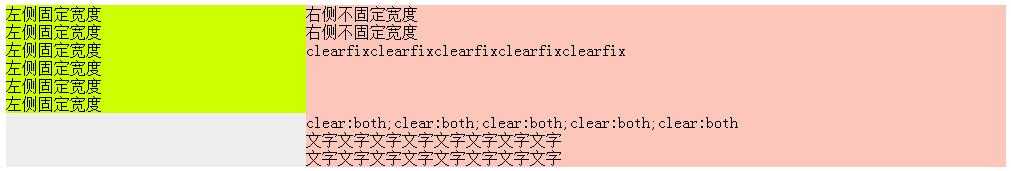
这种布局兼容所有浏览器,包括ie6,但有一个问题:
当左侧浮动固定内容高度>右侧不浮动内容高度的时候,右侧不浮动内容里面如果有clearfix的内容或clear:both的内容,内容会掉下来,在左侧内容高度的下面开始显示。
左侧有clearfix的内容或clear:both的内容不受影响。
2、负margin布局
如上前三种可以实现
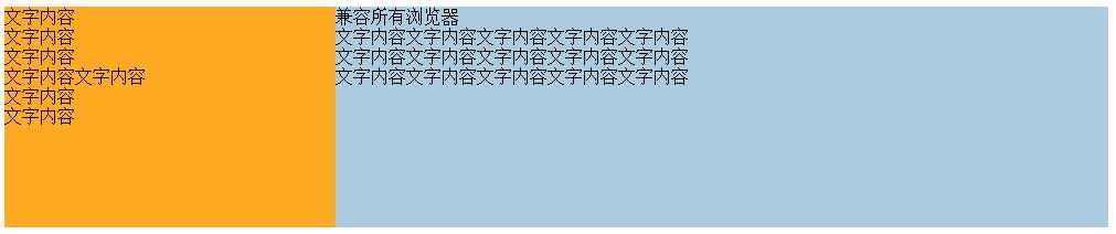
3、overflow:auto 布局
html
    <div class="wrap clearfix">
		<div class="left">
			<p>文字内容</p>
			<p>文字内容</p>
			<p>文字内容</p>
			<p>文字内容文字内容</p>
			<p>文字内容</p>
			<p>文字内容</p>
		</div>
		<div class="right">
			<p>兼容所有浏览器</p>
			<p>文字内容文字内容文字内容文字内容文字内容</p>
			<p>文字内容文字内容文字内容文字内容文字内容</p>
			<p>文字内容文字内容文字内容文字内容文字内容</p>
			<p>文字内容文字内容文字内容文字内容文字内容</p>
			<p>文字内容文字内容文字内容文字内容文字内字内asdfasdfadfafd容文字内容文字内容文字内容字内容文字内容文字内容文字内容容</p>
			<p>文字内容文字内容文字内容文字内容文字内容</p>
			<p>文字内容文字内容文字内容文字内容文字内容</p>
		</div>
	</div>
CSS:
.wrap{width:1000px;margin:0 auto;background:#eee;}
.wrap .left{float:left;width:300px;background:#fce;}
.wrap .right{overflow:auto;zoom:1;background:#acd;}
效果如下:
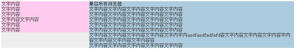
兼容所有浏览器这种方式也可以实现两列自适应布局
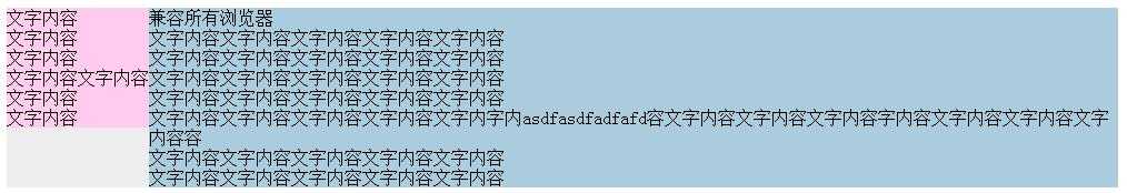
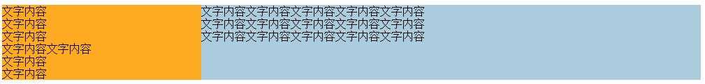
CSS
.wrap{width:1000px;margin:0 auto;background:#eee;}
.wrap .left{float:left;background:#fce;}
.wrap .right{overflow:auto;zoom:1;background:#acd;}
两列都没有设置宽度,宽度根据内容的宽度自适应。
效果:
三、两列等高布局
1、普通嵌套方法
html:
    <div class="container2">
	<div class="container1">
		<div class="col1">
			<p>Column 1</p>
			<p>Column 1</p>
			<p>Column 1</p>
			<p>Column 1</p>
			<p>Column 1</p>
		</div>
		<div class="col2">
			<p>Column 2</p>
			<p>Column 2</p>
			<p>Column 2</p>
			<p>Column 2</p>
			<p>Column 2</p>
			<p>Column 2</p>
			<p>Column 2</p>
			<p>Column 2</p>
		</div>
	</div>
  </div>
CSS:
.container2{position:relative;overflow:hidden;width:1000px;margin:0 auto;background:orange;}
.container1{float:left;width:100%;position:relative;left:-300px;background:green;}
.col1{width:700px;float:left;position:relative;left:300px;}
.col2{width:300px;float:left;position:relative;left:300px;}
效果:
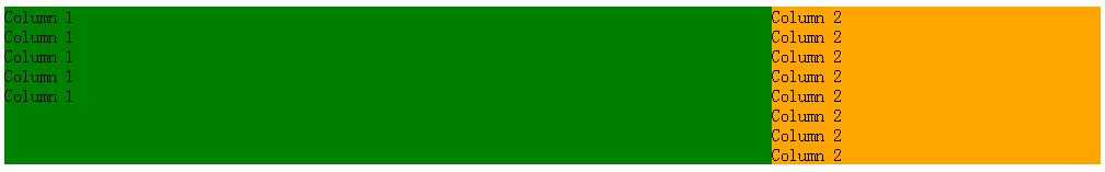
最外层container2设置总宽度、overflow:hidden及右侧背景色,
第二层container1设置左浮动,宽度100%,left设置负值,这个值等于右侧内容的宽度
col1设置左浮动、宽度,left值再设置正值=右侧内容的宽度
col2设置左浮动、宽度,left值也设置正值=右侧内容的宽度
兼容所有浏览器,包括IE6.
2、采用定位的方法
html:
    <div class="wrap clearfix">
		<div class="left">
			<p>文字内容</p>
			<p>文字内容</p>
			<p>文字内容</p>
			<p>文字内容文字内容</p>
			<p>文字内容</p>
			<p>文字内容</p>
		</div>
		<div class="right">
			<p>兼容所有浏览器</p>
			<p>文字内容文字内容文字内容文字内容文字内容</p>
			<p>文字内容文字内容文字内容文字内容文字内容</p>
			<p>文字内容文字内容文字内容文字内容文字内容</p>
		</div>
	</div>
CSS:
.clearfix:before,.clearfix:after{content:" ";display:table;}.clearfix:after{clear:both;}.clearfix{*zoom:1;}
.wrap{width:1000px;margin:0 auto;position:relative;height:200px;background:#eee;}
.wrap .left{position:absolute;top:0;bottom:0;left:0;width:300px;background:#fa2;_height:100%;}
.wrap .right{position:absolute;top:0;bottom:0;right:0;width:700px;background:#acd;_height:100%;}
效果:
在ie6下需要左右两列需要加height:100%,这样可以兼容所有的浏览器
四、两列自适应布局
1、overflow:auto 布局
html:
    <div class="wrap clearfix">
		<div class="left">
			<p>文字内容</p>
			<p>文字内容</p>
			<p>文字内容</p>
			<p>文字内容文字内容</p>
			<p>文字内容</p>
			<p>文字内容</p>
		</div>
		<div class="right">
			<p>兼容所有浏览器</p>
			<p>文字内容文字内容文字内容文字内容文字内容</p>
			<p>文字内容文字内容文字内容文字内容文字内容</p>
			<p>文字内容文字内容文字内容文字内容文字内容</p>
			<p>文字内容文字内容文字内容文字内容文字内容</p>
			<p>文字内容文字内容文字内容文字内容文字内字内asdfasdfadfafd容文字内容文字内容文字内容字内容文字内容文字内容文字内容容</p>
			<p>文字内容文字内容文字内容文字内容文字内容</p>
			<p>文字内容文字内容文字内容文字内容文字内容</p>
		</div>
	</div>
CSS
.wrap{width:1000px;margin:0 auto;background:#eee;}
.wrap .left{float:left;background:#fce;}
.wrap .right{overflow:auto;zoom:1;background:#acd;}
两列都没有设置宽度,宽度根据内容的宽度自适应。 兼容所有浏览器包括ie6
2、类table布局
html
    <div class="wrap">
            <div class="left">
			<p>文字内容</p>
			<p>文字内容</p>
			<p>文字内容</p>
			<p>文字内容文字内容</p>
			<p>文字内容</p>
			<p>文字内容</p>
		</div>
		<div class="right">
			<p>文字内容文字内容文字内容文字内容文字内容</p>
			<p>文字内容文字内容文字内容文字内容文字内容</p>
			<p>文字内容文字内容文字内容文字内容文字内容</p>
		</div>
	</div>
CSS
.wrap{width:1000px;margin:0 auto;background:#eee;display:table;}
.wrap .left{display:table-cell;background:#fa2;}
.wrap .right{display:table-cell;background:#acd;}
效果:
此方法IE6、IE7不兼容。
也可以对left和right设置宽度。
标签:
原文地址:http://www.cnblogs.com/aimee2004/p/5140408.html