标签:
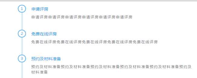
要实现类似QQ空间那样时光轴 时间轴效果
如图
====================
分析:左边 ul的border-left实现,这样会出现底部的 余出的线条,不美观,
所以考虑li的border-left实现。 li的padding-bottom撑开上下间距
h4标题的:before实现圆圈,定位到左边。
圆圈的实现使用绝对定位实现,注意下UL和LI实现方式下的,圆圈定位位置。
=========Ul实现边框=======
.money-process .process-list {
width: 90%;
height: 100%;
margin: 1.5rem auto 0;
padding-left: 2.5rem;
border-left: 2px #AAD8FC solid;
}
.process-list li h4:before {
content: ‘‘;
display: block;
width: 2.2rem;
height: 2.2rem;
line-height: 2.2rem;
border: 2px #52AFF9 solid;
border-radius: 50%;
text-align: center;
vertical-align: middle;
font-size: 1.2rem;
position: absolute;
left: -2.5rem;
top:-5px;
margin-left: -1.2rem;/*负值自身宽度一半,还有边框,所以也得计算添加边框宽度一半*/
background: #fff;
}
=========================
=================LI实现边框=====================
.process-list li {
position: relative;
padding-bottom: 2.5rem;
border-left: 2px #AAD8FC solid;
padding-left: 2.5rem;
}
.process-list li h4:before {
content: ‘‘;
display: block;
width: 2.2rem;
height: 2.2rem;
line-height: 1.8rem;
/*因为默认盒模型,公共样式里面设置了:before{box-sizing: border-box;},所以(22px-2*2px)是行高*/
border: 2px #52AFF9 solid;
-webkit-border-radius: 1.1rem;
border-radius: 1.1rem;
text-align: center;
vertical-align: middle;
font-size: 1.2rem;
position: absolute;
left: 0;
top: -6px;
margin-left: -1.2rem;
/*负值自身宽度一半,还有边框,所以也得计算添加边框宽度一半*/
background: #fff;
}
================================================
UL实现连接:http://files.cnblogs.com/files/leshao/%E6%97%B6%E9%97%B4%E8%BD%B4-UL.rar
LI实现链接:http://files.cnblogs.com/files/leshao/%E6%97%B6%E9%97%B4%E8%BD%B4-UL.rar
多谢酱油 ,简,一棵树,993
标签:
原文地址:http://www.cnblogs.com/leshao/p/5158634.html